What Color Walls Go With Beige Trim?
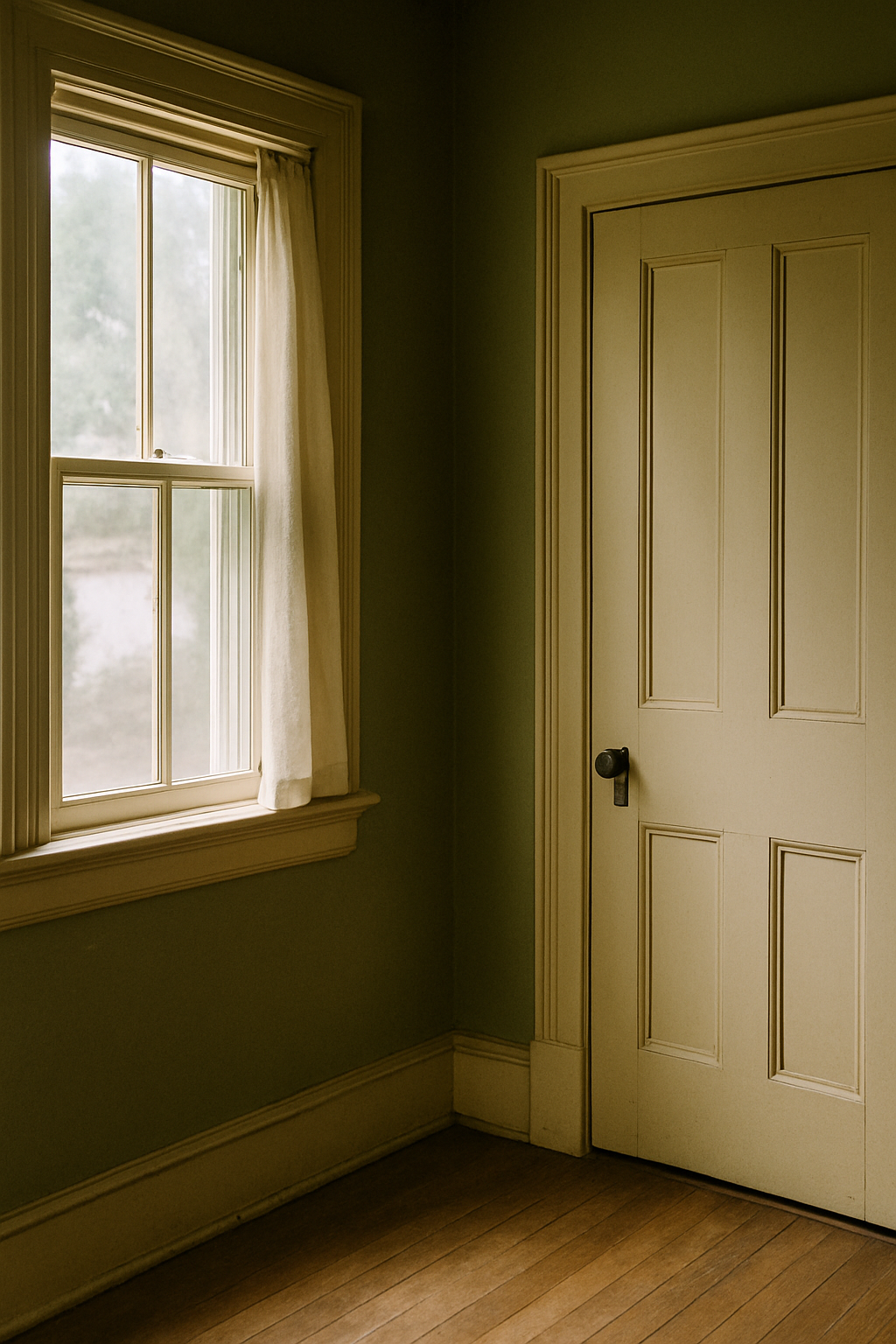
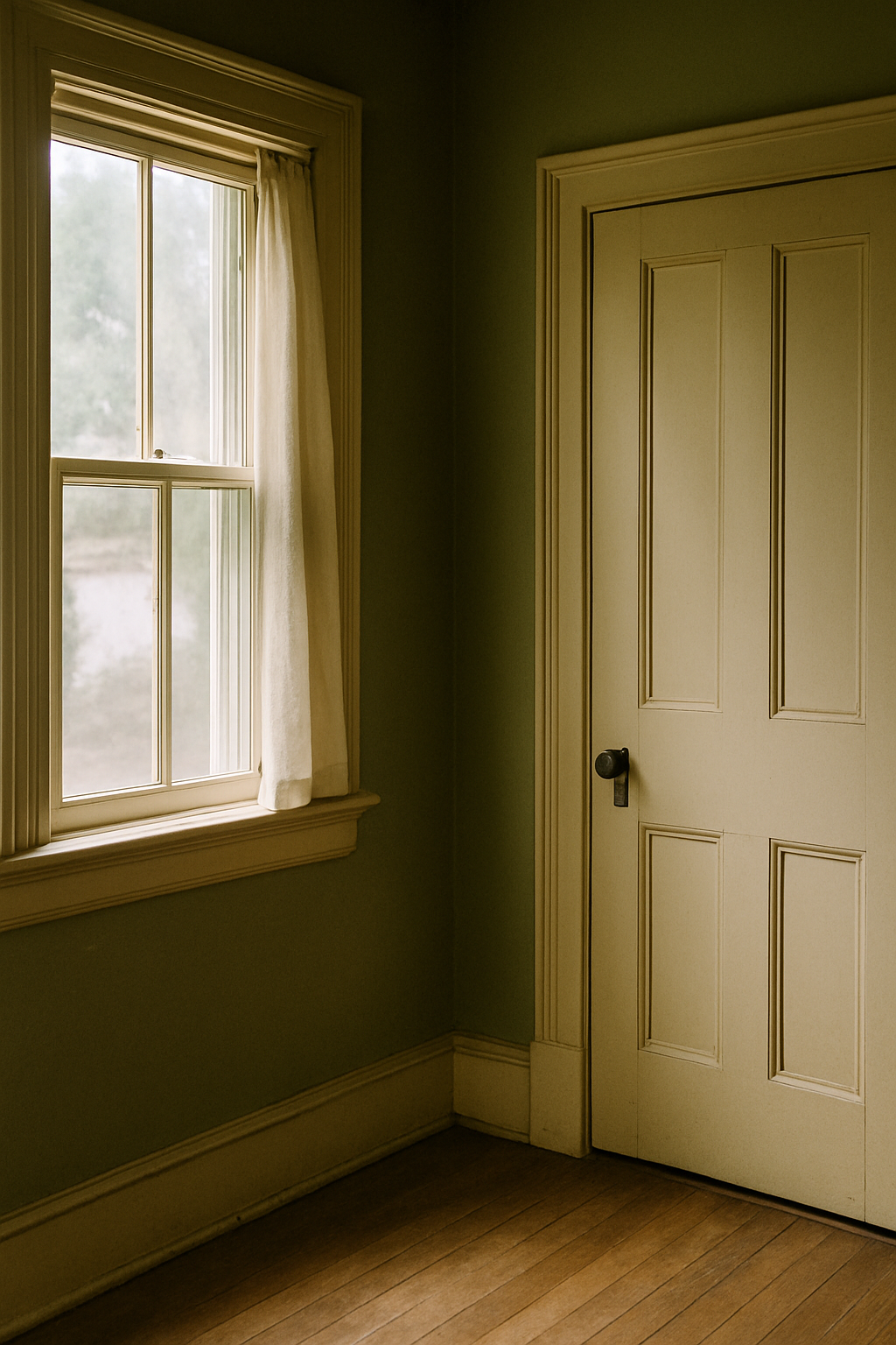
I painted my upstairs hallway a moody blue-green that looked absolutely stunning in every single inspiration photo I’d saved. Went up on a Saturday. By Sunday morning I was standing there with my coffee trying to figure out why it looked like the inside of a fish tank. The trim was pulling yellow. Hard. And the blue-green was fighting it into something murky and sad. I repainted that hallway eleven weeks later.
That was my second year in this house. I’ve since learned that beige trim isn’t a backdrop. It’s a participant. And if you don’t know which direction it’s pulling, you will lose.
Your Beige Trim Is Not One Color — Here’s How to Find Out What It Actually Is
This is the step the paint industry has zero financial incentive to teach you. They’d rather you buy two gallons, hate it, and buy two more. Skipping undertone identification is not a personality flaw or a lack of design sense. It’s a missing step. And it explains most of the repainting I’ve done in this house.
Here’s what you actually do. Between 10am and 2pm, find your most north-facing wall or window and hold a pure white sheet of printer paper flat against your trim. Stand back. Don’t squint, don’t analyze. Just look. Your eye will immediately register whether the trim reads yellow, pink, or greenish by comparison to the white paper. North-facing light is the most neutral you’ll get. Direct sun will lie to you.
For a second confirmation, bring home a sample pot of Benjamin Moore OC-17 White Dove. It’s a warm neutral baseline that reads creamy without committing hard to any undertone. Brush a two-inch stripe on your trim casing and look at the two side by side. Where does your trim go weird? Goes more yellow? Pink? That’s your answer. You can also do this with Sherwin-Williams SW 7015 Repose Gray on an adjacent wall card. Repose pulls pink in a lot of lighting conditions, and if your trim suddenly looks pinker next to it, you’ve just confirmed pink undertones in your trim. (I learned the Repose trick from a painter who’d been doing this for 22 years. She said she sees pink-undertone trim misread as neutral at least twice a week.)
Five minutes. One sheet of paper. Do this before you buy a single swatch.
Yellow-Undertone Trim: The Walls That Work and the Ones That Curdle
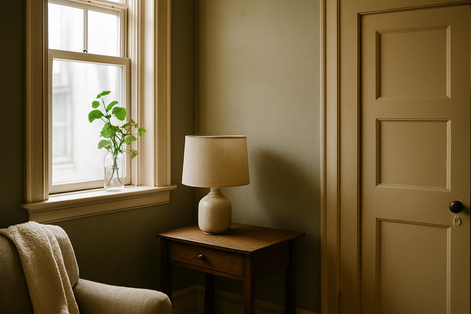
Yellow-undertone trim is honestly the easiest to work with once you stop trying to fight it. A lot of people’s first instinct is to “cool it down” with a blue-gray wall. Wrong almost every time. A cool gray throws the yellow in your trim into sharp relief. You don’t neutralize it. You spotlight it.
Leaning into the warmth works better. Benjamin Moore HC-172 Revere Pewter — yes, I know it’s been everywhere, and I don’t care — pulls green-gray in a way that harmonizes beautifully with yellow-cast trim rather than arguing with it. Both colors share enough earthy warmth that the whole room settles. It’s one of the few cases where the cliché actually earned its reputation.
Sherwin-Williams SW 6119 Antique White trim (very common in 1990s builds) pairs remarkably well with walls pulled from the SW 6120 through 6125 range, that whole family of warm taupes and earthy putties. All pulling in the same direction. Rooms done this way look considered rather than accidental.
What to avoid: cool blue-grays with an LRV below 40. In a room with yellow-undertone trim, those colors will make the trim look grimy and your walls look vaguely bruised. I had a sample of a beautiful slate blue up in my dining room for about three days before I admitted it was making the whole room look like something needed cleaning. The trim was the problem. Or rather, the mismatch was.
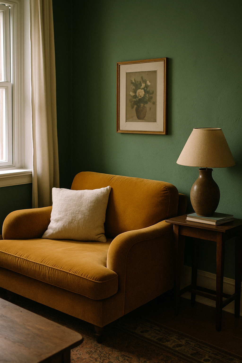
Ochres, warm clay, deep olive green, tobacco brown. That’s the direction. Rooms done this way look expensive without trying.
Pink and Peachy Trim Needs a Completely Different Strategy
Houses built between 1985 and 2005 have a solid chance of beige trim with pink undertones, whether you’ve named it that or not. Factory finishes called “almond” and “bisque” were everywhere in that era. They aged into something that reads distinctly rosy under most light, and a lot of homeowners just sort of… tolerate it.
Here’s my position: pink-undertone trim gets written off as dated and ugly, and that’s unfair. In the right context it reads sophisticated. Pair those peachy trim tones with terracotta walls, a deep wine, or even a dusty blush and the whole thing feels intentional, almost like a warm Italian interior. Benjamin Moore 2175-40 Dusty Mauve on walls is one of those counterintuitive choices that actually pulls pink trim into a cohesive scheme instead of fighting it. The trim stops looking like an accident and starts looking like a choice.
One structural note for smaller rooms: working in a space under 200 square feet with pink-cast trim, keep your wall LRV between 55 and 70. Pink trim in a small dark room will dominate everything. A lighter wall keeps it from crowding you.
Constantly I see someone decide the pink trim is the problem, paint it with a stark bright white, and leave the wall color unchanged. Results look patchy and unresolved. Old pink peeks through at the edges, and now you have a contrast that makes both colors look worse. Repainting the trim without a wall plan is how you end up doing the whole room twice.
The Gray-Wall-With-Beige-Trim Combination Is Usually a Mistake
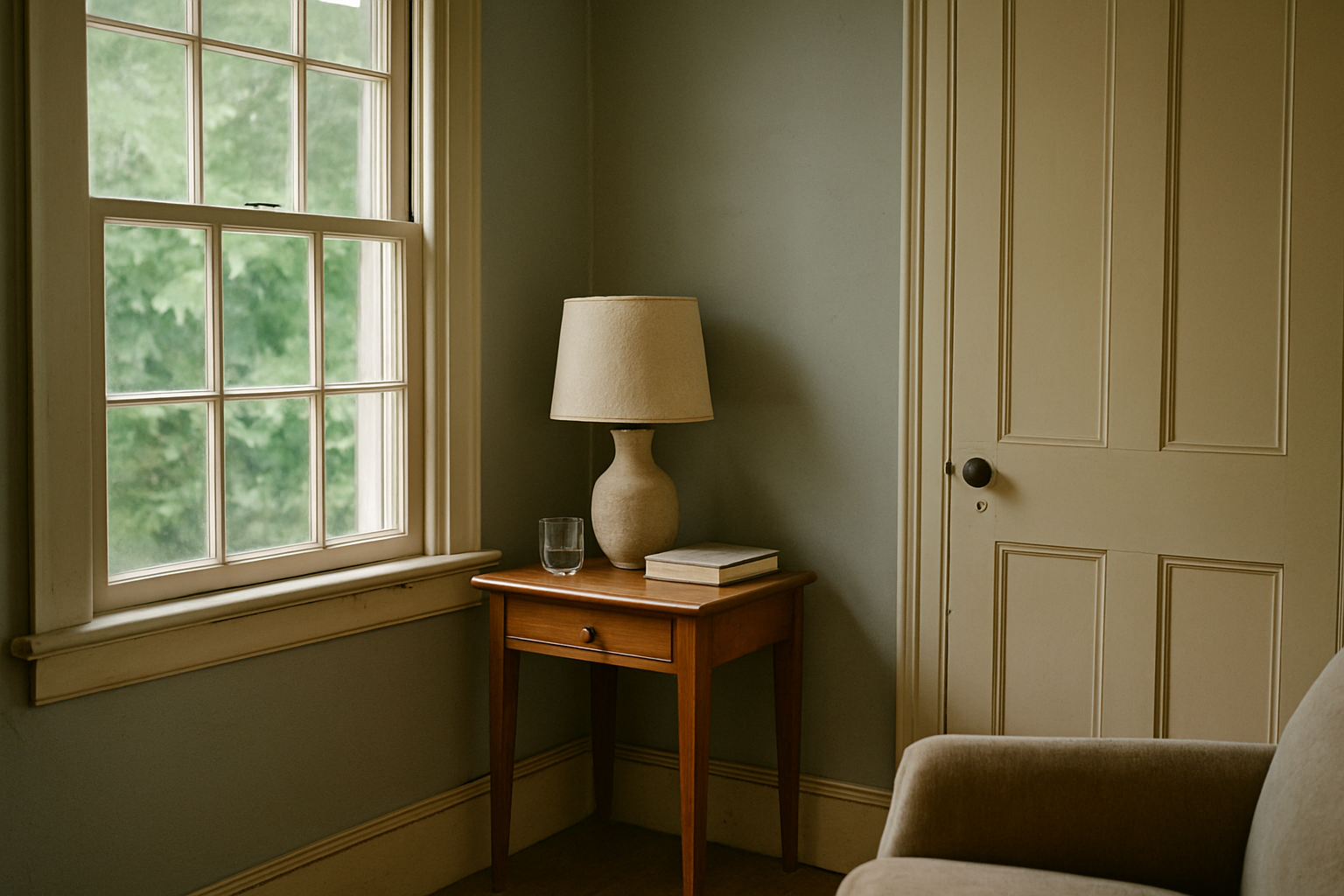
Paint bloggers won’t say this because they’re afraid of alienating half their audience, but gray walls with beige trim is almost always a bad combination. It became a Pinterest staple specifically because it photographs decently under controlled studio lighting. In actual rooms, with actual light bouncing around, it tends to go muddy. Or dated. Often both.
Worst clashes happen with cool grays that have an LRV above 65. Those light, airy grays that feel so safe on the chip — against yellow-undertone beige trim they look like a color correction that didn’t finish. Trim reads dingy. Walls read cold. Nothing is happy.
Exceptions exist. In a south-facing room with strong natural light, a gray with an LRV between 35 and 50 will pull warmer throughout the day and can coexist with beige trim without the whole thing looking like a mistake. And Sherwin-Williams SW 7069 Iron Ore, basically a near-black with gray undertones, is one of the few grays that genuinely works alongside warm beige trim. High contrast does something completely different than a mid-range gray. It makes the trim read as intentional rather than leftover.
But a medium cool gray at LRV 60? Against beige trim in an east-facing living room? Seen it dozens of times. Never looked right once.
Colors That Make Beige Trim Look Intentional and Expensive
Going darker on your walls than feels comfortable is the fastest path to making inherited beige trim look like a choice rather than an oversight. Not dramatic for drama’s sake. Just dark enough that the contrast between wall and trim creates its own logic.
Benjamin Moore HC-166 Hale Navy is my first recommendation for almost any beige trim with yellow or warm undertones. Deep enough that the trim reads as antique cream alongside it. Classic library look. Works in living rooms, dining rooms, bedrooms. I’ve seen it in a hallway that stopped me in my tracks.
Deep greens do the same thing. Sherwin-Williams SW 0015 Hunt Club has an LRV of 6, darker than most people are willing to go, but against warm beige trim it makes the trim glow. Trim becomes part of the design rather than something you’re apologizing for.
For something in the middle range, Farrow and Ball No. 80 Mole’s Breath runs about $115 a gallon, which I fully acknowledge is a lot. But it’s a complex greige that reads differently throughout the day, and it has enough warmth to sit alongside yellow-cast trim without fighting it. Whether it’s worth $115 to you is a separate conversation. (I have it in my bedroom. I don’t regret it.)
Room Function Changes Which Wall Colors Are Actually Livable
Decorators who only think about aesthetics lose me here. A color can be beautiful and still make a room genuinely unpleasant to exist in for eight hours a day.
Kitchens with beige trim and north-facing windows need wall colors with an LRV of at least 60. Below that threshold, you’re working against the light deficit and the room will feel like a cave regardless of how beautiful the color looks on a chip. Made this mistake in my own kitchen with a warm putty color I loved. LRV of 47. North-facing. I chopped vegetables in the dark for four months before I repainted.
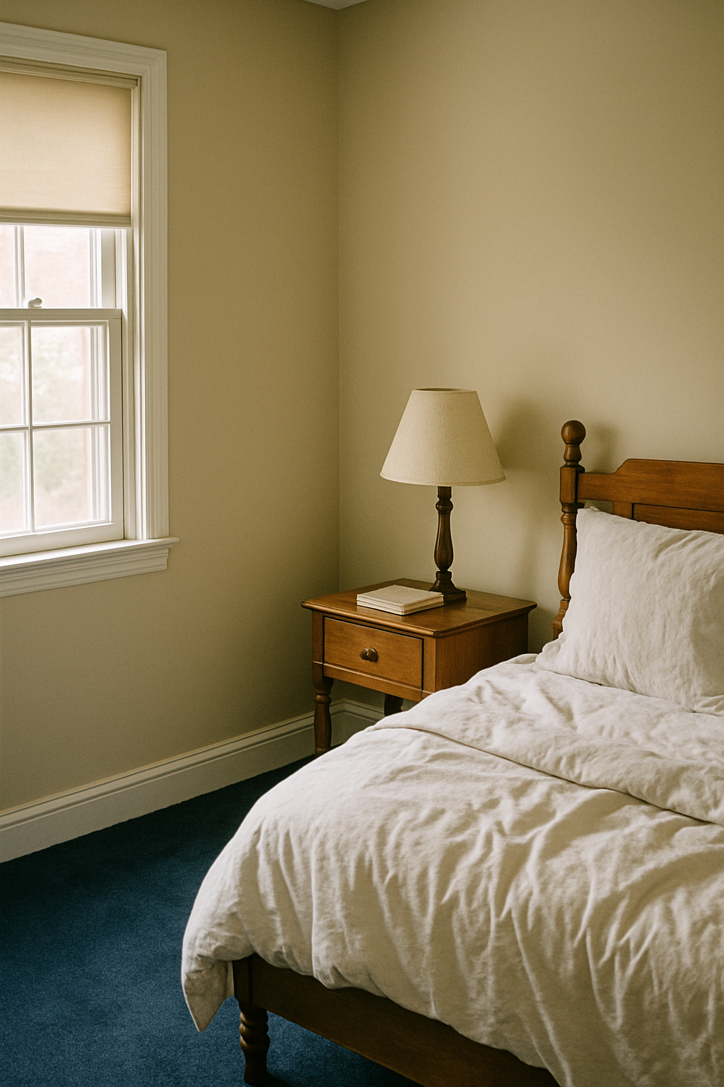
Bedrooms are different. Spending most of your time in there after dark with lamps on, you can go as low as LRV 20 without it feeling oppressive. Artificial light changes everything. My bedroom is dark and I sleep better for it. But that logic does not transfer to a windowless hallway.
Hallways under four feet wide should stay above LRV 55, full stop, regardless of trim color. A moody color that photographs beautifully in a generous bedroom becomes genuinely claustrophobic in a narrow pass-through. I’ve seen it. I’ve lived it. That hallway at the start of this post taught me both lessons simultaneously.
Pick the color for the room you actually have, not the room in the photo.
Testing Before Committing: The Swatch Method That Actually Works
That chip at the store is lying to you. Not maliciously. A one-inch square of color on a white card held in the middle of the room tells you almost nothing useful.
Paint your swatch directly on the wall. Minimum 12 by 12 inches, right next to the actual trim. Not on a sample board, not on poster board taped to the wall. Color reads differently on different surfaces, and you need to see it sitting against your specific trim in your specific light. I cannot stress this enough because I ignored it for the first three years I owned this house and repainted accordingly.
Observe the swatch at three times: 8am with morning light, around 1pm in full midday light, and 8pm with your artificial lights on. Same color can shift from “yes absolutely” to “what was I thinking” across those three windows. Write down your reaction each time. Don’t rely on memory.
Samplize peel-and-stick samples run $5.95 to $7.95 each and they’re worth every cent for one specific reason: they eliminate brush-stroke texture. When you brush a wall sample yourself, the texture of the brush marks catches light differently and skews how the color reads. Peel-and-stick gives you a clean, flat surface that shows you the actual color. Stick one right up against your trim edge and walk away for a full day before deciding.
Six dollars against a $200 gallon of paint and a weekend of your life. That’s the math. Swatch everything.