What Color Furniture Goes Well With Green Walls?
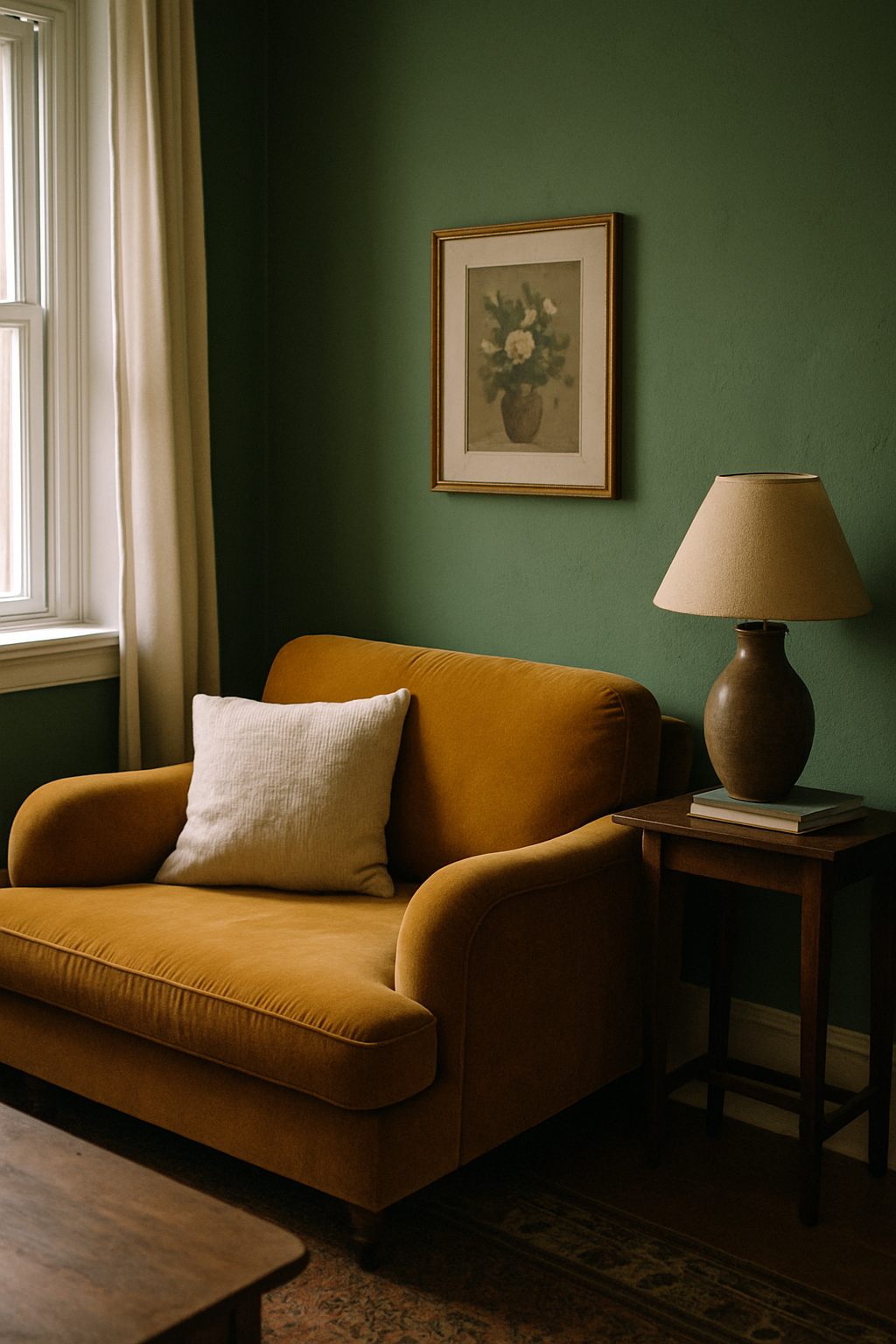
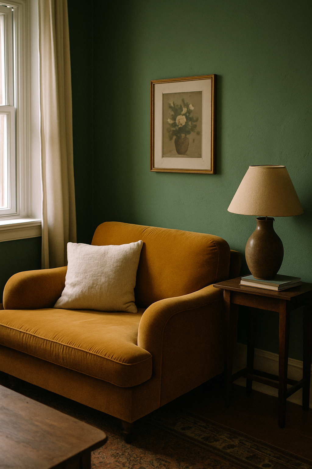
I bought a $3,000 cognac velvet sofa for my living room and watched it turn into a bruise. The walls were sage — or so I thought. What they actually were, at 3pm on a west-facing wall, was yellow. And cognac at 3pm is orange. Two warm tones crashing into each other and neither one winning. The sofa sat there looking injured for eight months before I finally admitted the problem wasn’t the sofa. It was that I’d never actually looked at my wall.
Your Green Has a Secret Undertone and It’s Overruling Every Choice You Make
Here’s the test. Tomorrow at noon, turn off every light in the room and hold a pure white piece of paper flat against your green wall. Not a paint chip. A sheet of printer paper. What color does the wall look next to it? If it pulls yellow, you’ve got a yellow-green. If it pulls blue or gray, you’ve got a blue-green. If the paper just looks white and the wall just looks green, you’re working with something closer to a neutral-green, and you have more flexibility than most people reading this.
This matters more than anything else here. Every recommendation you’ve read — white furniture, walnut, navy, black metal — was written for some imaginary green that lives in a vacuum. Your green doesn’t live in a vacuum. It lives in your specific room with your specific light, and if your paint has an LRV below 30, the undertone saturates dramatically as the light drops in the evening. What reads as a soft sage at noon can look almost olive-yellow by lamplight. Benjamin Moore’s Color Viewer shows undertone hex codes for any of their 3,500 colors if you want to verify what you’re seeing.
Skipping this step is the single most expensive decorating mistake you can make. Every mood board you’ve built is worthless until you know the answer. I’m not being dramatic. I’m being someone who bought that sofa.
Sage and Olive Greens: The Case Against White Furniture
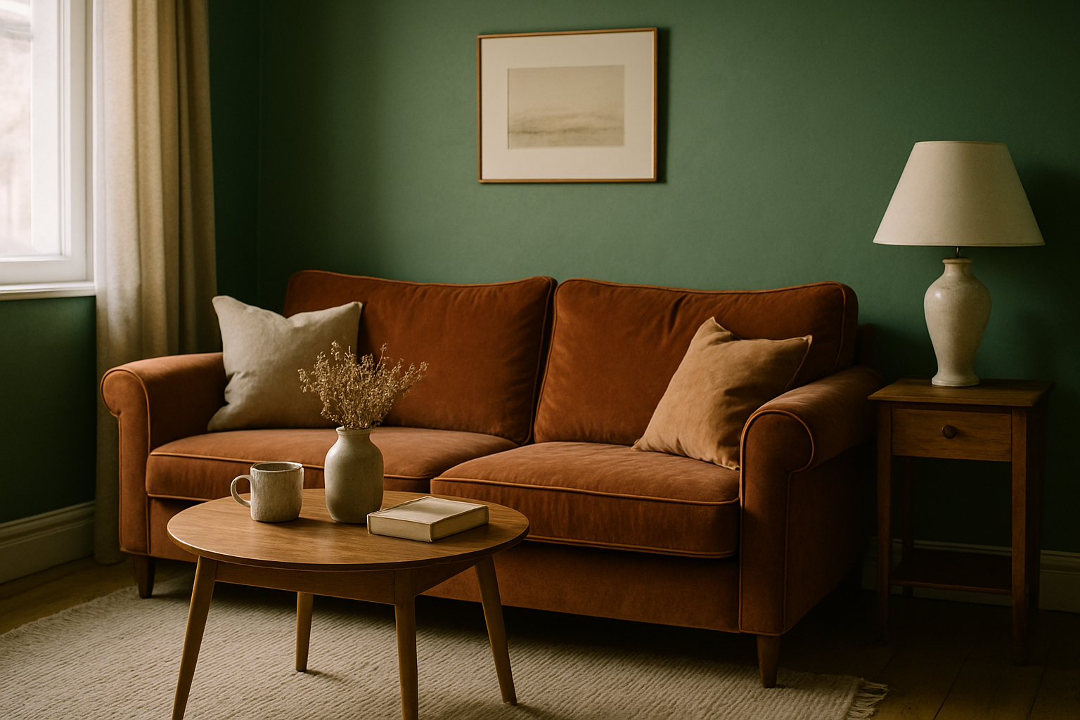
White furniture is the first thing every decorating site recommends for green walls. It’s also, for sage and olive specifically, frequently wrong.
Cool-toned whites — the crisp blue-based ones with LRV above 85, like Benjamin Moore Chantilly Lace OC-65 — create a visible gray-green clash against a yellow-base sage wall. You see it immediately in person and can never quite see it in photos, which is probably why the advice keeps getting recycled online. The white reads almost lavender next to yellow-green, and the whole room feels like it’s fighting itself.
What actually works is warm White or cream upholstery with a yellow undertone. Sherwin-Williams Delta White has a Y4 undertone rating and sits in that warm-cream territory that resolves the tension instead of amplifying it. Linen fabric in “natural” or “flax” colorways typically reads at Delta E 4–7 from warm white, which means it’s close enough to unify the palette without being matchy. It’s a quieter choice. It also looks better in ten years.
Crisp white furniture in a sage room is a Pinterest cliché. I’ve seen it look gorgeous in photos with professional lighting. I’ve never seen it look gorgeous in a real house at 7pm with the overhead light on — and in my house, with the trim being the brightest thing in the room, the contrast only makes it worse.
The Wood Tone Decision Tree for Green Walls
“Natural wood” is not a category. This is where most people go wrong.
Walnut’s Janka hardness rating of 1010 is completely irrelevant here. What matters is its Munsell hue value, which sits at 5YR to 7.5YR, firmly in the warm yellow-red range. It’s a brown that pulls orange. Against a yellow-green sage wall, that warmth can work beautifully, because both the wall and the wood are operating in the warm half of the color wheel and they’ll read as intentional.
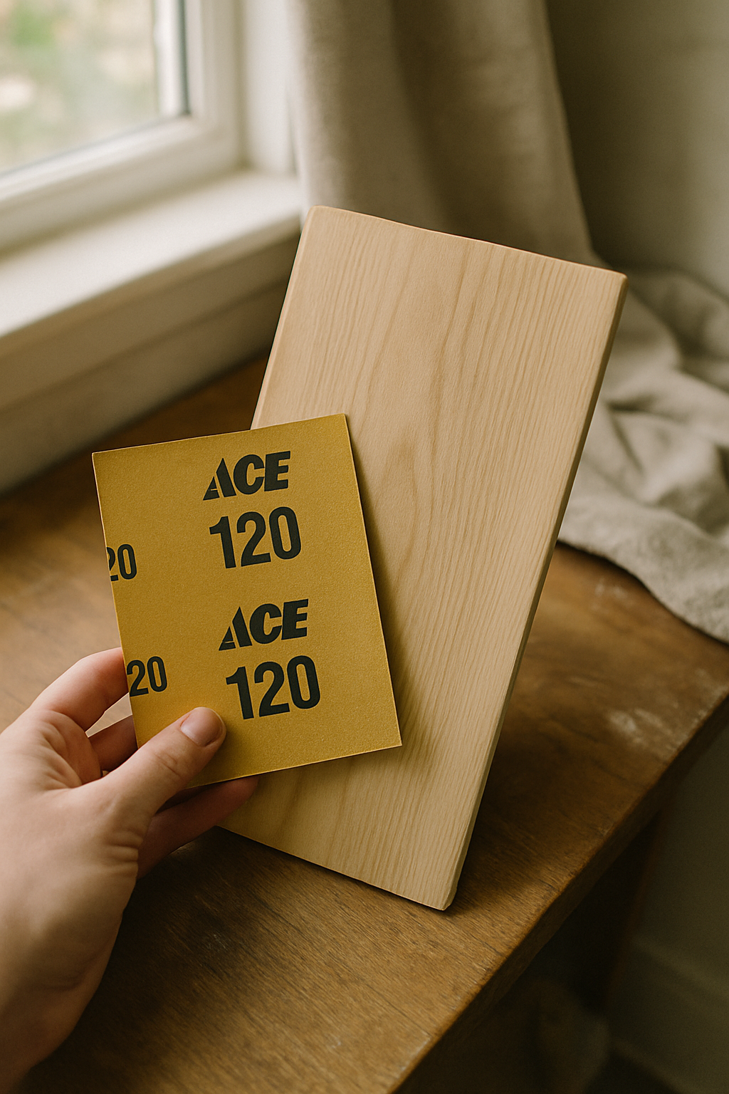
Blue-green walls are a different situation entirely. Teal or spruce-family greens have enough blue in them that warm walnut creates a jarring temperature contrast — not the good kind. For those walls, reach for white oak or ash. White oak sits at 2.5Y to 5Y on the Munsell scale, which makes it a genuine bridge tone. It works against sage and it works against teal, which is why I’d probably default to it if I were starting over. IKEA’s LISABO series in ash veneer runs around $150–$230 and reads as a cool-neutral wood. Honestly, it’s a low-stakes way to test the relationship before you buy a real piece.
Walnut with sage is so overused at this point that it’s basically decorating shorthand for “I found this on Instagram.” White oak does the same visual job and brings a little more thought to it. I say this as someone who has two walnut pieces in her house that I’m still happy with, so I’m not anti-walnut. I’m just pro-thinking about it.
Hunter and Jewel-Tone Greens Demand Furniture That Can Hold Its Own
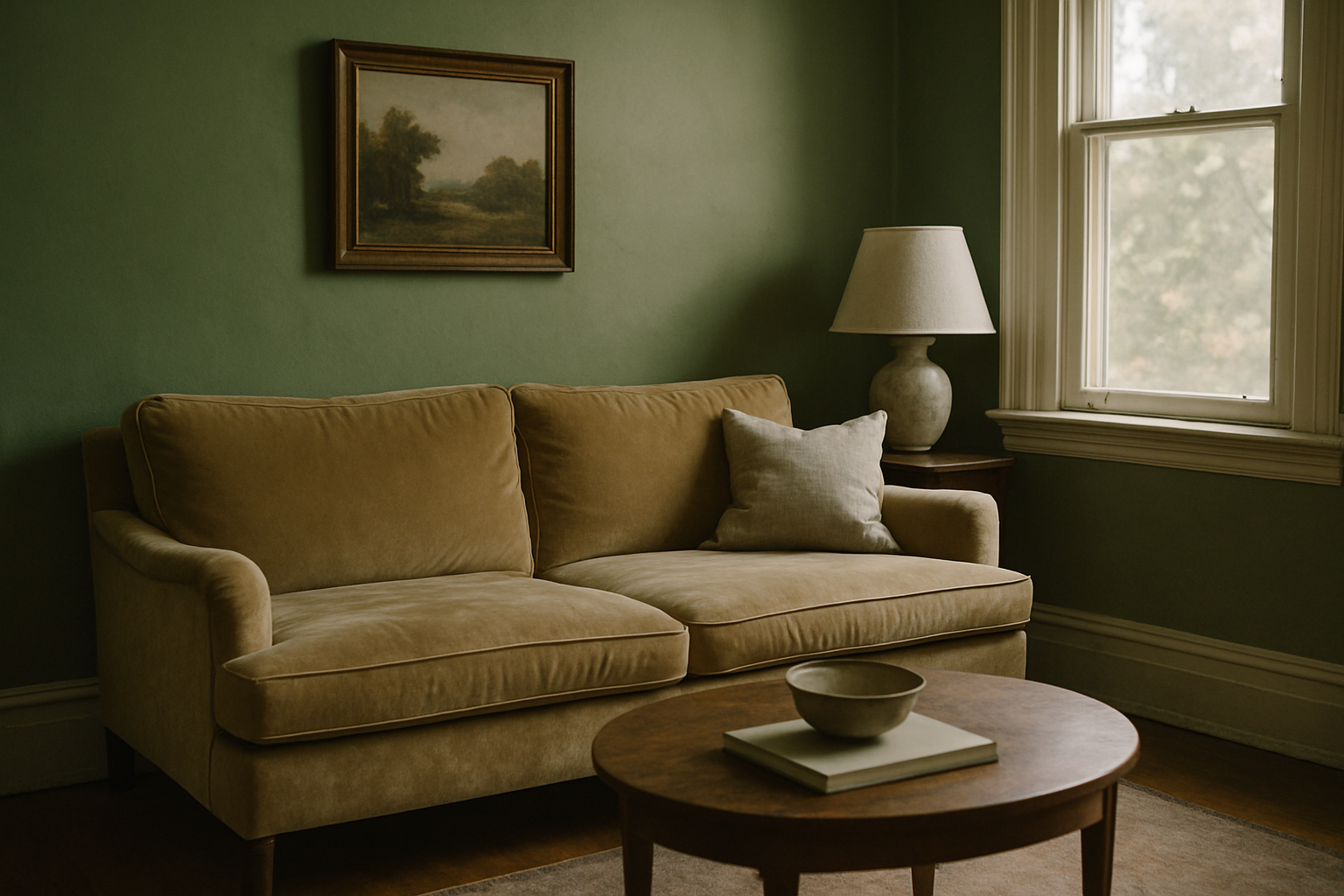
Dark green walls are not a backdrop. They’re the room. Farrow & Ball Studio Green No.93 has an LRV of 6, which means it absorbs more than 80% of ambient light. Put a blush sofa in that room and watch it disappear into a pink-gray smear. This is not a theory. I’ve stood in rooms where it happened.
What you need is contrast that’s substantial enough to register. A sofa in Benjamin Moore Tucson Tan HC-68 sits at LRV 48, which gives you a 42-point LRV gap from Studio Green. That’s roughly the minimum needed to prevent furniture from getting visually eaten by a dark wall. Terracotta works for the same reason: hunter green and terracotta sit approximately 180 degrees apart on the Munsell hue circle, making them true complements. They don’t fight. They answer each other.
Deep green rooms decorated with blush or millennial pink furniture already look dated. Terracotta ages better because it’s an earth tone with historical range. It was right in the 1970s, it’s right now, and it’ll probably be fine in a decade. Blush was a moment.
And if dark green walls make your room feel dim, that’s a lighting problem. You solve it with light sources, not by putting a cream sofa in and hoping. The furniture can’t fix the ceiling.
Metal Finishes Are Doing More Work Than Your Furniture Color
This is the thing nobody talks about and it’s the thing that makes a room feel subtly wrong even when every other decision was correct.
Unlacquered brass starts yellow-gold and shifts to warm brown-gold as it patinates, which happens over roughly 12 to 24 months. That means your metal finish is changing its relationship to the wall over time. Not a crisis, but worth knowing before you spec it everywhere. Against a blue-green wall, fresh unlacquered brass can look sharp and earthy. Two years later, the same hardware reads warmer and potentially muddier. Rejuvenation’s Powell Cabinet Pull in unlacquered brass is $14 per pull, which is actually cheap enough to buy two and live with them for a full season before you commit to a whole kitchen’s worth.
Matte black has an LRV of roughly 4–6. It’s not warm, it’s not cool. It acts as a visual anchor and it doesn’t broadcast a color temperature signal the way brass does. This is why it’s genuinely versatile and not just a trend. It works because it doesn’t have an opinion about your wall.
Brushed gold is the most over-specified finish in green rooms right now. In three years it will read as obviously dated as chrome did in 2005. I say this knowing full well there’s a brushed-gold faucet in my guest bathroom and I’m already a little tired of it.
Gray Furniture With Green Walls: A Conditional Yes
Gray furniture works with green walls in a narrow set of circumstances. Short version: cool blue-greens, high LRV walls, good natural light. Outside of that, it goes muddy.
Cool gray upholstery in the N (neutral) or B (blue) Munsell family — Sherwin-Williams Mindful Gray SW7016 is a decent reference point — can work against teal and spruce-family greens because the color temperatures agree. Both are cool. They coexist without grinding against each other.
Warm gray or greige is a different animal. Accessible Beige SW7036 reads yellow-green adjacent, and against a sage or olive wall it just creates a monotone fog. The room doesn’t look calm. It looks unfinished. I had greige curtains in my office for a solid year — every person who walked in said it felt “kind of gray in here.” The walls were Saybrook Sage. The curtains were the problem.
Rooms under 150 square feet with north-facing windows should skip gray furniture entirely, regardless of what the wall color is. I know this specifically because my hallway is exactly that situation — north-facing, under 120 square feet, and the one time I leaned a gray-upholstered chair against that wall to see how it read, the whole space turned into a single gray-green mass that no throw pillow on earth was going to rescue. Gray furniture with green walls is the pairing that looks most acceptable in a showroom and worst in a real house. It’s safe the way beige carpet is safe. Technically fine. Not actually good.
The One-Room Test Before You Buy Anything
Order a 12×12 inch fabric swatch minimum. The 4×4 swatches most retailers default to are not big enough to read against a painted wall. They’re big enough to hold up in a store and think “yeah, sure.” Fabric.com and Mood Fabrics both ship 1-yard minimums for roughly $8–$25 depending on the material. That’s the investment. Not the sofa yet.
Put the swatch flat against the wall and photograph it at 7am, 12pm, and 6pm. Manually set your phone camera to “Daylight” white balance, not Auto, which will compensate and lie to you. Compare the three shots side by side. If the relationship between swatch and wall changes dramatically across those three images, the pairing is too light-dependent to be reliable. You’ll love it in the morning and hate it at dinner and spend four years wondering what went wrong.
If it holds across all three, you’ve found something. You can also do this with a large paint sample from the hardware store if you’re testing a different wall color — same principle. The whole test costs you around $15 and a Saturday morning. Anyone who commits to a sofa without doing this is essentially paying furniture prices for a decorating mistake they could have caught for the cost of a fabric sample.
I did not do this test before the cognac sofa. I looked at a photo on my phone in the parking lot of the furniture store and thought it looked nice. It did not look nice. It looked like a bruise.