What Color Paint Goes With Navy Blue Carpet?
A designer I know repainted the same living room three times. Same carpet, same furniture, different paint each time, and each color looked perfect on the chip and then went visibly green, purple, or just flat-out muddy the second it hit the wall above her navy carpet. The third painter finally asked her one question she hadn’t been asked before: what undertone is your navy?
She didn’t know. Neither do most people. That’s where this whole mess starts.
How to Read Your Navy Carpet’s Undertone Before Touching a Paint Chip
Navy is not one color. This sounds obvious until you’re standing in a paint store holding seventeen blue-adjacent chips trying to figure out why nothing looks right. There are at least three distinct navies you might be living with: violet-navy, which pulls toward purple in certain lights; teal-navy, which has a blue-green cast you’ll see most clearly in direct sun; and ink-navy, which is closer to true blue with almost no secondary hue. Each one fights differently with paint.
Here’s the test I do before I even think about swatches. Grab a piece of plain white printer paper and hold it flat against the carpet pile in direct daylight, somewhere between 10am and 2pm. That’s when sunlight is most neutral and you’ll get the most accurate undertone read. Don’t do this at 5pm, don’t do it with a lamp on nearby. Look at what color the carpet throws back against the white paper. A faint lavender or purple cast means you’ve got violet-navy. A blue-green tint means teal-navy. If it reads clean and cool with no obvious lean, you’re probably working with ink-navy.
Violet-navy reflects an LRV of roughly 5 to 8, which makes it one of the darkest and most light-absorbing carpet situations you can have. Teal-navy sits closer to 10 to 12. Small difference on paper. Matters enormously when you’re choosing wall color. Skipping this step is the single reason most navy carpet paint choices fail, and I’d do it before you set foot in any paint store.
The mistake people make (and I’ve heard this repeated in every home improvement group I’ve ever been in) is thinking undertone doesn’t matter because navy is dark enough that any color works above it. The opposite is true. Darker floors influence everything above them more aggressively, not less.
Why Bright White Walls Usually Make Navy Carpet Look Cheap
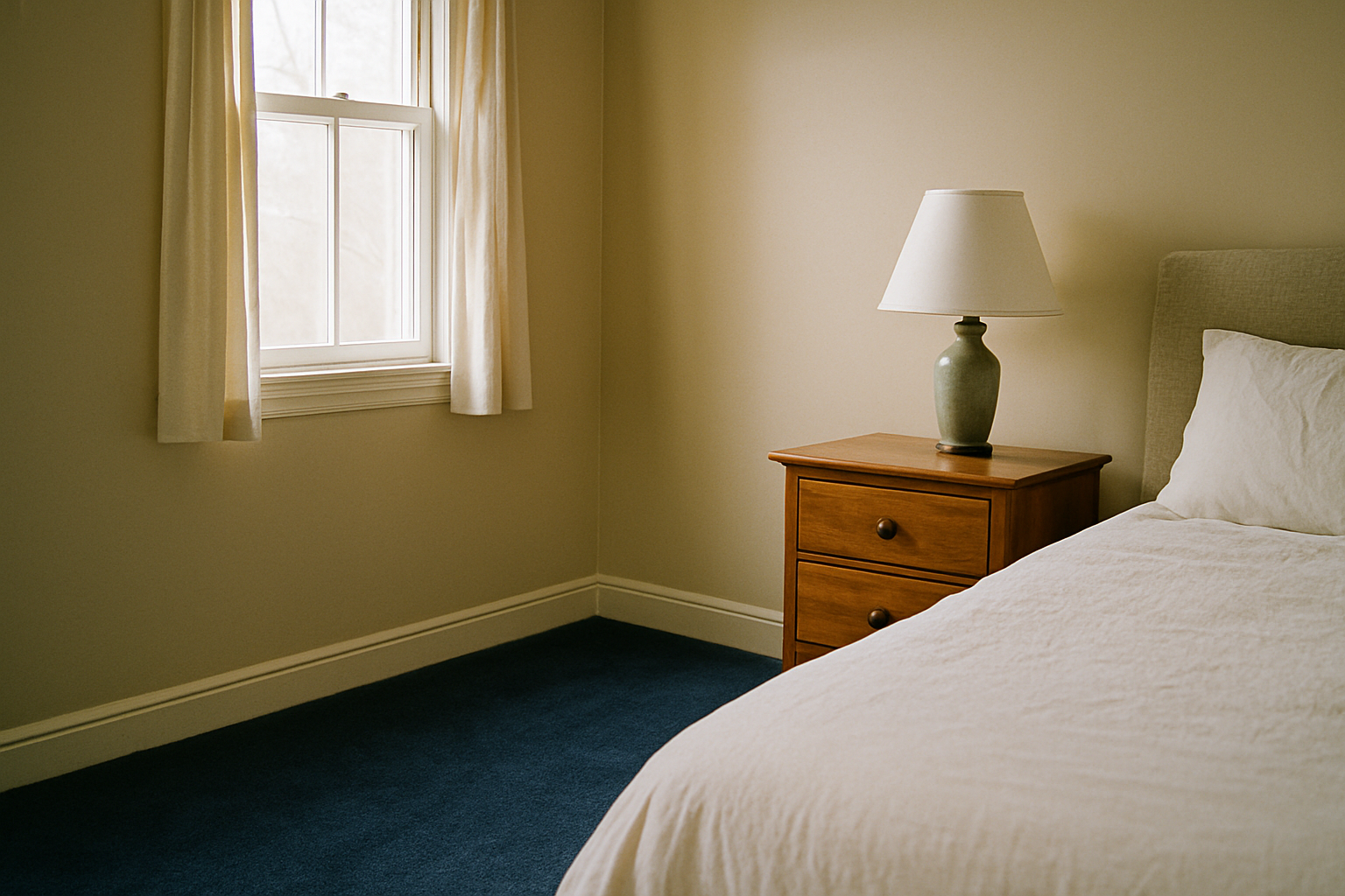
Bright white is the most recommended paint color for navy carpet. It is also, in my experience, the most frequently wrong one. I made this exact mistake in my upstairs hallway and lived with it for two years before I admitted the room looked like a high school gym.
High contrast between a bright wall and a very dark carpet sends your eye straight to the floor, and not in a good way. Wear patterns, seam lines, any inconsistency in the pile, all of it reads loudly when the walls are that bright. Benjamin Moore Chantilly Lace (OC-65) has an LRV of 92.2. That is too high for most navy carpet rooms. Contrast at that level doesn’t create drama. It creates clinical.
If you’re committed to white, Benjamin Moore White Dove (OC-17) at LRV 83.16 is about the ceiling most navy carpet rooms can tolerate. It has enough warmth to take the edge off without sliding into cream territory.
Rooms under 180 square feet are especially hurt by the bright white pairing. Small rooms with dark floors and stark white walls feel like a box, not a room. White isn’t a safe choice with navy carpet. It’s a lazy default that works on Pinterest and fails in real life.
The Greige Trap: When the Most Popular Neutral Turns Muddy
Greige became the answer to everything around 2015 and somehow it’s still being recommended for navy carpet in almost every article I’ve read. It worked beautifully on hardwood. Then people copied it wholesale into carpet contexts where it almost never belongs, and nobody stopped to ask why the rooms looked so dingy.
Sherwin-Williams Accessible Beige (SW 7036) is the top-selling greige in the country. It is one of the worst performers above violet-navy carpet. What happens is a color temperature collision: violet-navy carpet registers below 3000K on the warm scale, and when you put greige mixed for a 2700K warm environment above it, the two don’t blend into neutrality. They fight. The wall reads as a colorless gray-brown and the carpet goes slightly purple. The room looks unfinished in a way that’s hard to name but impossible to ignore.
Greige has a warm bias. Not middle-of-the-road warm. Just warm, every time. That bias is exactly what teal-navy and violet-navy carpets will expose.
If you’re testing greige anyway, paint actual 12×12 inch patches on the wall, not 3×5 swatches. A small swatch won’t show you what 80 square feet of that color does to the room.
Three Paint Families That Actually Work — and the Specific Condition Each Requires
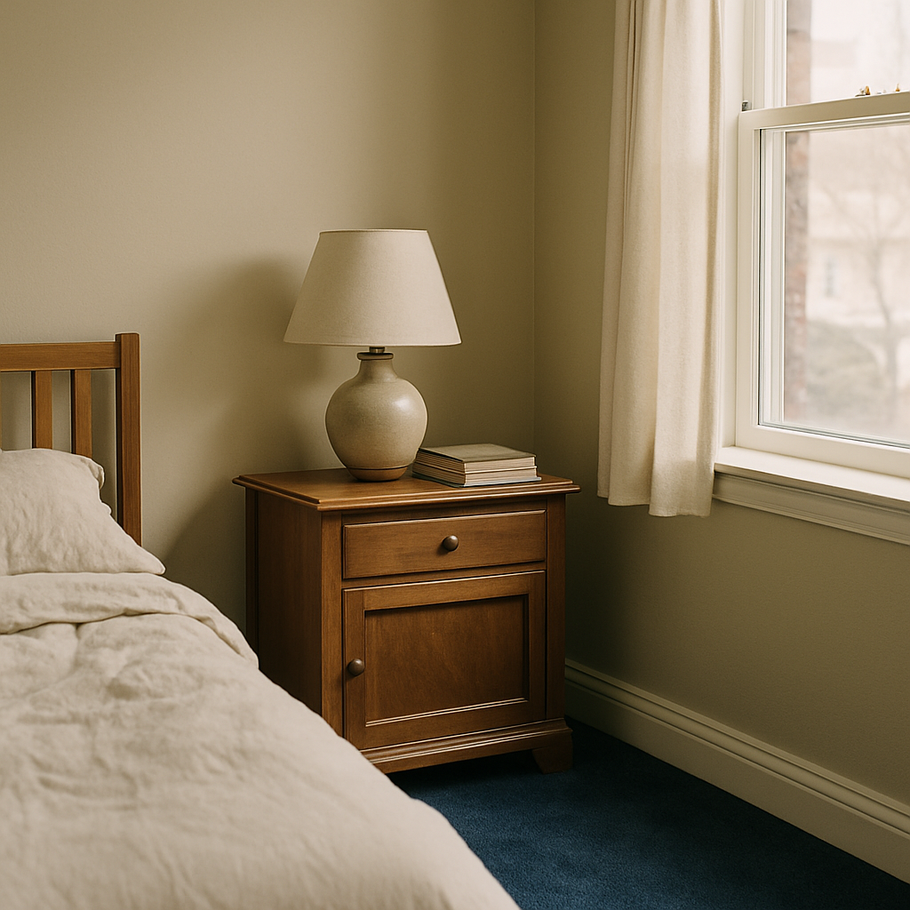
None of these are unconditional. That’s the point.
Soft blue-gray is the first direction I’d look, but only for the right carpet and the right room. Farrow & Ball Mizzle (No. 266) is one I’ve seen succeed specifically with teal-navy carpet in rooms with north-facing windows. Cool north light keeps Mizzle from going too gray, and it shares just enough of the teal carpet’s blue-green lean to feel coherent rather than matched. Put this same color above violet-navy carpet in a south-facing room and it gets weird fast.
Warm off-white with a yellow undertone is the pairing most people are afraid to try. Benjamin Moore Pale Oak (OC-20) is the one I’d use, but it requires two things: a violet-navy carpet (not teal) and ceilings at least 9 feet high. Pale Oak’s warmth softens the purple lean in violet-navy without turning the room gold. In a room with 8-foot ceilings, though, the warm ceiling feels low and the contrast with the dark floor feels compressed. It needs room to breathe.
Tone-on-tone is the most underused approach in this whole conversation. Take a grayed, lightened version of the carpet’s blue, not a match, just the same color family moved way up the value scale, and put it on the walls. The wall LRV needs to sit at least 20 points above the carpet LRV or it just flattens out. Done right, this approach outperforms every contrast pairing in rooms with poor natural light. The room reads as intentional and the carpet stops competing with the walls.
Artificial Light Changes Everything: Paint Samples Under Your Actual Bulbs
You can do everything right in daylight and still end up with a repaint if you don’t check your samples at night under the bulbs you actually use. I say this as someone who chose a beautiful warm gray for my living room, loved it at noon, and came home at 8pm to walls the color of old dishwater.
At 2700K (the warm amber bulbs most people have in living rooms) violet gets pushed into navy carpet. Teal undertones essentially disappear at night in a 2700K room. At 4000K the opposite happens: teal pulls back out and Warm Paint Colors look distinctly orange-cast. Choosing paint without testing it under your room’s actual bulbs at night is not a shortcut. It’s a guarantee of a repaint.
Paint the sample patch on the wall, let it dry, then photograph it at noon with daylight coming in and again at 9pm with only the room’s usual lights on. Pull both photos up side by side on the same screen. If those two photos look like different rooms, you have your answer. Some colors hold steady, some shift dramatically. You need to know which yours does before you commit to four gallons.
Accent Walls, Trim Color, and the Detail Decisions Most Posts Ignore
Nobody talks about trim in these articles and it drives me crazy, because trim is often what separates a navy carpet room that feels pulled-together from one that just feels unresolved.
bright white trim is the default, and in navy carpet rooms it frequently reads wrong. White trim narrower than 3.5 inches next to navy carpet and darker walls looks like a gap, not a frame. Too thin to register as intentional. Sherwin-Williams Alabaster (SW 7008) at LRV 82 is the warmest trim white that still reads as white under 3000K light. It’s the trim I’d use in almost any room I described above. (I repainted my own baseboards with it and it cost about $35 in paint. One of the cheapest and most effective changes I’ve made in this house.)
On accent walls: skip them in navy carpet rooms almost every time. The carpet is already a dominant element. Adding a strongly colored accent wall introduces a third strong statement in a room that doesn’t have room for one.
Ceiling color is worth one paragraph. Paint the ceiling 10 to 20% darker than the walls, adjusted by LRV, not by eye, and it visually lowers the room in a way that actually suits navy carpet. Dark floors, slightly dropped ceiling, mid-range walls. That layering is what makes a navy carpet room feel considered instead of accidental.
The Fastest Way to Eliminate Wrong Choices Before Buying Paint
Most people use samples as the discovery process. That’s why they end up buying eight of them and still feel unsure. Arrive at the store with a shortlist of three, not a fistful of guesses.
Do the undertone test first. Then pull LRV values on any color you’re considering and eliminate anything above 85 for most navy rooms, or anything with a warm bias if you have a cool-leaning navy. That alone kills most of the greige and bright white candidates before you’ve spent a dollar. Then look at your bulb type. If you have 2700K bulbs and a violet-navy carpet, take warm-toned colors off the table for night use.
By that point you should have two or three real candidates. Sample pots from most major brands run $4 to $8 and cover roughly 16 square feet. Buy three maximum. Paint two 12×12 patches on different walls, not both on the same wall. Light hits corners and center walls differently, and you want to see how the color performs in both. Don’t judge them immediately. Wait 72 hours after painting before making a final call. Paint shifts as it fully cures and what looks great wet can look cooler and flatter once it’s done off-gassing.
One more thing: don’t paint your sample patch directly on the existing wall color and judge it that way. Surrounding color contaminates your perception of the sample. Paint a piece of primed white foam board and tape it to the wall instead. What you see is the color, not the color fighting with what’s underneath it.