Okay, can we talk about gray walls for a minute? Because I get more emails about this one thing than almost anything else, and I completely understand why. You painted the walls a gorgeous greige, everyone told you it was the safe, timeless choice… and now you’re standing in the curtain aisle (or scrolling endlessly online) feeling like every single option looks slightly off. Too cold. Too matchy. Too “builder-grade rental.”
I’ve been there — in my own home and in about a hundred client living rooms here in Charlotte. So grab a coffee, and let me walk you through exactly how I choose curtains for gray walls every single time. By the end of this you’ll know your gray better than the paint-store guy, and you’ll have twelve colors you can trust.
First things first: not all grays are the same
Here’s the thing nobody tells you. “Gray” is not one color. It’s a whole family of colors wearing the same name tag. Some grays lean cool (a whisper of blue or violet), some lean warm (that beloved “greige” with a beige backbone), and a rare few are genuinely neutral. And the undertone is the whole ballgame — it decides which curtains will make your room sing and which will make it feel like a dentist’s waiting room.
My favorite five-second test: hold a piece of pure white printer paper flat against your wall in daylight. Suddenly the gray reveals itself. If it looks bluish or a little purple next to the crisp white, you’ve got a cool gray. If it looks soft and tan-ish, that’s a warm greige. If it just looks… gray, lucky you — you have a true neutral and almost anything works.
Why does this matter so much? Because pairing a warm curtain with a cool gray (or vice versa) is the exact reason a room feels “not quite right” even when you can’t put your finger on it. It’s the same principle I lean on when I help readers figure out what carpet goes with agreeable gray walls — get the undertone right and the whole scheme clicks into place.
My 12 go-to curtain colors for gray walls
These are the twelve I come back to again and again, sorted from “safe and serene” to “okay, let’s be a little brave.” I’ve grouped them below so you can jump to whatever mood you’re after.
The safe, always-elegant choices
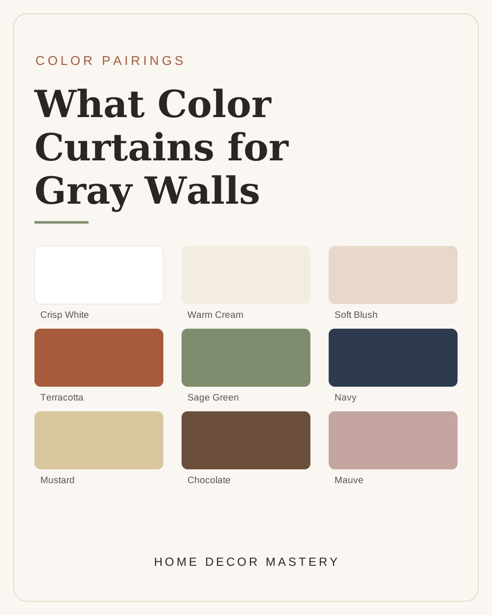
Crisp white and warm cream are where I send anyone who’s nervous. White keeps a gray room feeling fresh, gallery-like, and endlessly timeless — it’s the little black dress of curtains. Cream is the softer cousin, and it’s magic with greige because those warm undertones hold hands. If your gray leans cool, go whiter; if it leans warm, go creamier. This is honestly the same logic behind choosing wall colors around white furniture — you’re just matching temperatures.
The warm, cozy choices (my personal favorites)
This is where gray rooms come alive. Terracotta, camel, and mustard throw off warmth like a lit fireplace, and against a cool gray the contrast is downright delicious. I used terracotta linen curtains in my own reading corner and it single-handedly fixed the “why does this room feel flat?” problem. If you love this direction, you’ll probably also fall for the tones I gush about in my sage green kitchen ideas and the earthy palettes in these green-drenched living rooms.
Soft blush and mauve deserve a special shout-out too. They sound bold on paper but read almost like a warm neutral against gray, and they add that quiet, grown-up femininity I adore. They’re wonderful in bedrooms — pair them with the layered, calm look I walk through in my cozy bedroom ideas.
The moody, dramatic choices
Ready to be a little brave? Navy, charcoal, and chocolate turn a gray room into a boutique-hotel situation. Deep curtains frame a window like eyeliner frames an eye — instant polish. My one rule: use them in rooms with decent natural light so the space stays cozy, not cave-like. If moody is your love language, you’ll want to peek at these color-drenched bedrooms and the deep-blue rooms in my blue bedroom designs.
And dusty teal is my sleeper hit — it’s soft, a touch coastal, and it flatters cool grays beautifully. If you’re teal-curious, I basically wrote a love letter to it in this teal living room post.
The styling tricks that make cheap curtains look expensive
Color is only half the battle, friend. How you hang them matters just as much, and these are the little moves that separate “I tried” from “did you hire someone?”
- Hang high and wide. Mount the rod 4–6 inches above the window frame — even higher if your ceilings allow — and let it extend 8–12 inches past each side. This makes your windows (and the whole room) look grander. It’s the single most impactful thing you can do, and it costs nothing.
- Go long. Curtains should kiss the floor or “puddle” just slightly. Curtains that stop at the sill are the fastest way to make a room look unfinished — I say this with love.
- Match the mood, not the exact shade. Curtains one or two tones lighter or darker than your wall look far more designed than a dead-on match. Contrast is your friend.
- Echo the color once more. Repeat your curtain color somewhere else — a throw pillow, a vase, a piece of art — so it reads as intentional rather than random. This “rule of repetition” is the same trick I use when I style a console table.
- Mind the fabric weight. Linen and cotton feel relaxed and modern; velvet reads rich and dramatic. Both are lovely against gray — just pick the one that matches your room’s personality.
What if your furniture is already a strong color?
Great question, and one I hear constantly. If you’ve got dark brown or wood furniture, lean into warm curtains (cream, camel, terracotta) to tie the wood tones together — I break the whole thing down in what color walls go with dark brown furniture, and the same temperature logic applies to curtains. Got a green sofa or green accents? Cream or a deeper forest curtain will make them look intentional — more on that in pairing colors with green.
So… which one should you pick?
Here’s my honest, cut-to-the-chase advice. Figure out your undertone (do the white-paper test — it takes ten seconds). Decide on a mood: airy and serene, warm and cozy, or moody and dramatic. Then pick the color from that group that makes your heart do a little flip. Buy one panel first if you’re nervous, hang it, and live with it for a day. Trust me — you’ll know.
Gray walls are the ultimate team player. They’ll wear almost anything beautifully once you stop treating “gray” like a single color and start honoring its undertone. Start there, hang high and wide, repeat your color once, and I promise your room is going to look like it belongs in a magazine.
Now go grab that coffee refill and pick your color. You’ve got this. 🤍
— Savannah
More color help you’ll love