Okay, I have to come clean about something: the console table is my absolute favorite thing to style in a whole house. Behind a sofa, in an entryway, under a wall-mounted TV, in a hallway — it’s this perfect little stage where you get to tell a tiny story with a lamp, a stack of books, and something green. And unlike a whole-room makeover, you can restyle a console in fifteen minutes on a Tuesday and feel like a brand-new person.
But I know that blank console can also be weirdly intimidating. Too empty and it looks forgotten; too full and it looks like a junk drawer threw up. So let me hand you the exact formulas I use — the ones that work every single time — so you never stare at that surface feeling stuck again.
Start with the backbone: the rule of thirds
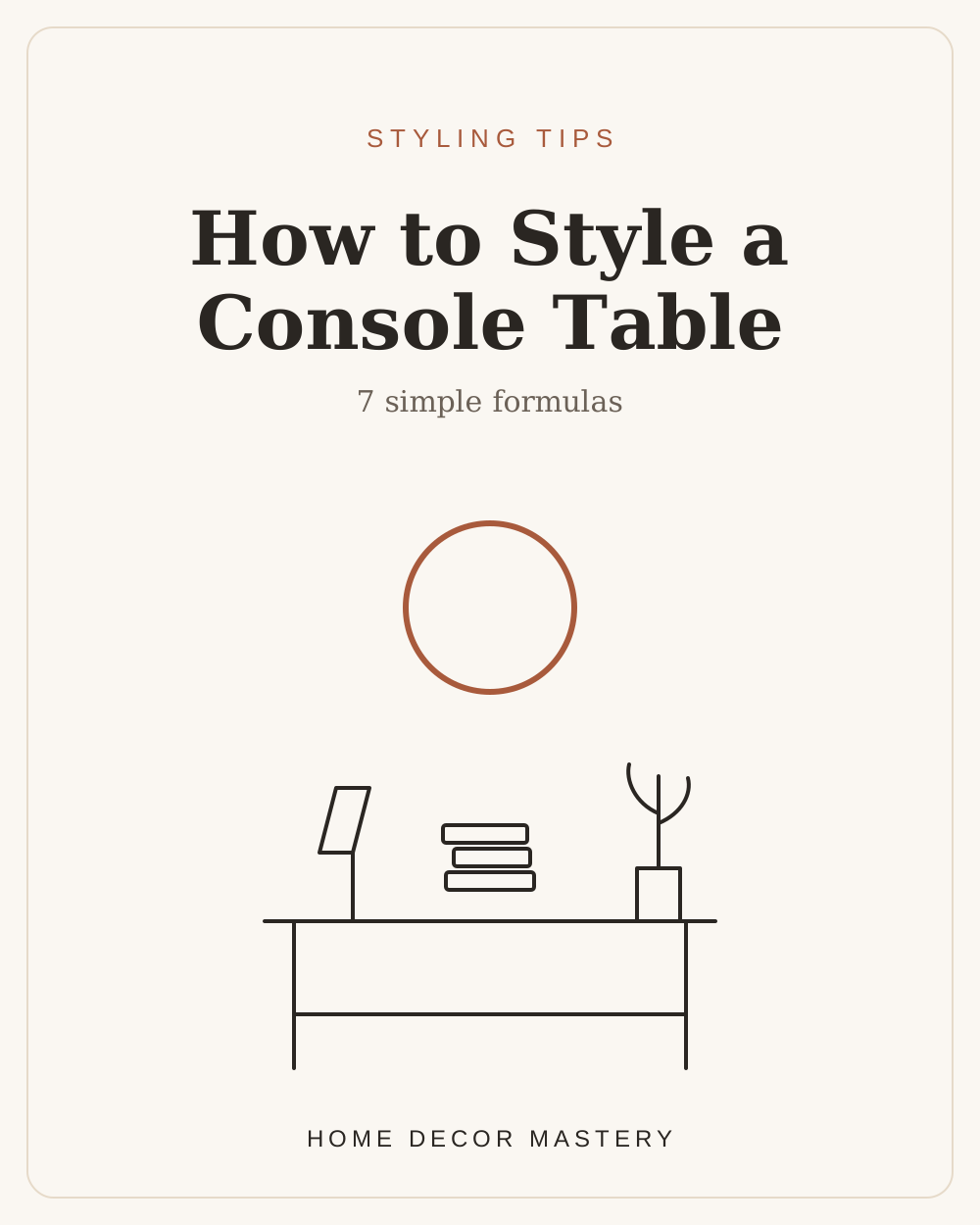
Before we talk objects, here’s the framework that makes everything else easy. Mentally divide your console into three zones — left, center, right. You’ll style two of the three more heavily and let the third stay lighter, so the arrangement feels balanced but not stiff. Symmetry is calming; a touch of asymmetry is what makes it look collected rather than staged.
That’s it. That’s the skeleton. Tall thing on one side, art or a mirror anchoring the middle, a medium moment on the other side, and something low and horizontal (a tray, a stack of books) to ground it. Once you see a console in these three zones, you can’t un-see it — and styling gets almost automatic.
7 foolproof console formulas
Now the fun part. Each of these works every time; just pick the one that matches your space and the pieces you already own. (You almost certainly already own enough — I promise you don’t need to buy a thing to start.)
If you only try one, make it #1 (mirror + a pair of lamps) for a formal entry, or #2 (art + one lamp + a trailing plant) for a relaxed, lived-in feel. Formula #6 is my secret weapon for entryways where you desperately need storage — two pretty baskets tucked underneath hide shoes and clutter while the top stays styled. Speaking of entries, this is exactly the thinking behind my 17 entryway console table ideas and the whole approach in transforming your entryway with simple decor.
Get the proportions right (this is where most people slip)
Beautiful objects styled in the wrong proportions still look “off,” so here are my three proportion rules:
- Height: your tallest element — or the art/mirror hung above — should reach roughly two-thirds of the wall space above the console. Too-small art floating way up high is the number-one console mistake I see.
- Layering, front to back: tall things at the back, medium in the middle, low in front, so nothing hides behind anything else. Think of it like a little group photo where everyone needs to be seen.
- Breathing room: leave some empty surface. Negative space is what makes a console look styled instead of stuffed. When in doubt, remove one thing.
The little details that make it look pulled-together
A few finishing touches I never skip: repeat one color somewhere on the console that also appears elsewhere in the room, so it feels connected rather than random (this “rule of repetition” is the same one I lean on for choosing curtains for gray walls). Vary your textures — pair something smooth (ceramic, glass) with something organic (wood, woven, a plant) and something with a little shine (brass, a mirror). And add life: a real or faux stem instantly warms up any arrangement. A leaning mirror above a console is a personal favorite for bouncing light — I’m obsessed with the version in my arched floor mirror bedroom, and the same move works over a console.
Console styling for every room
The beauty of these formulas is that they flex to any space. Behind a sofa in a compact living room, a slim console adds display and storage without eating floor — a trick I lean on hard in my small living room ideas. In a skinny hallway, a shallow console (or a wall ledge) becomes the whole entry — see small entryway ideas for narrow hallways. Even a console-style sideboard in a dining room gets the same treatment — the black-and-white styling in this dining room post is basically the rule of thirds in a bigger frame.
Your fifteen-minute challenge
Here’s your homework, and it’s genuinely fun: clear your console completely. Then rebuild it using the rule of thirds and just one of the seven formulas. Work in odd numbers, vary your heights, repeat one color, and leave a little space to breathe. Step back, remove one thing (there’s always one thing), and you’re done. Fifteen minutes, zero dollars, and a surface that looks like a designer stopped by.
Consoles are the easiest, most satisfying styling win in the whole house — the perfect place to experiment, express yourself, and feel that little hit of “ooh, I did that.” So go play. And yes, obviously, send me a photo. 🤍
— Savannah
Style more of your home