What Color Walls Go With White Furniture?
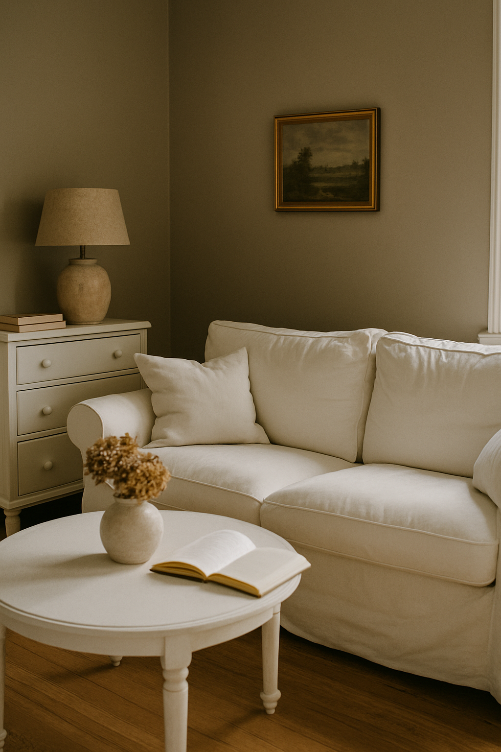
The gray wall behind my IKEA HEMNES dresser looked perfect on screen and looked like a bruise in real life. Nobody told me the dresser was a warm ivory, not a true white. I repainted that room twice in fourteen months. The second time I finally understood what I’d gotten wrong the first time, and it had nothing to do with the color family I chose.
White Furniture Has an Undertone — Find Yours Before Touching a Paint Deck
White furniture is not one thing. It runs from cool optical white (think stark lacquer, most IKEA pieces) all the way to warm cream or ivory, and that single fact overrides every color trend recommendation you’ll find online. Paint brands won’t tell you this. They’d rather you buy eight sample pots.
Here’s the fastest test I know: hold a sheet of regular printer paper against your furniture. Printer paper is a true cool white, LRV around 92-93. If your furniture looks yellowish next to it, you’ve got a warm piece. If they look identical, you’ve got optical or cool white. Simple. Obvious in hindsight. I didn’t know to do it until year three of making bad paint choices.
On the LRV scale, optical whites score roughly 90-94. Sherwin-Williams Extra White SW 7006 lives here. Warm ivories score lower, around 80-88 — Antique White SW 6119 is a classic example and reads as cream in almost any light. The gap between those two categories is where most decorating mistakes happen. Skipping this identification step is, genuinely, the single reason most white-furniture rooms fail.
Cool Blue-White Furniture: The Wall Colors That Work and the One Everyone Gets Wrong
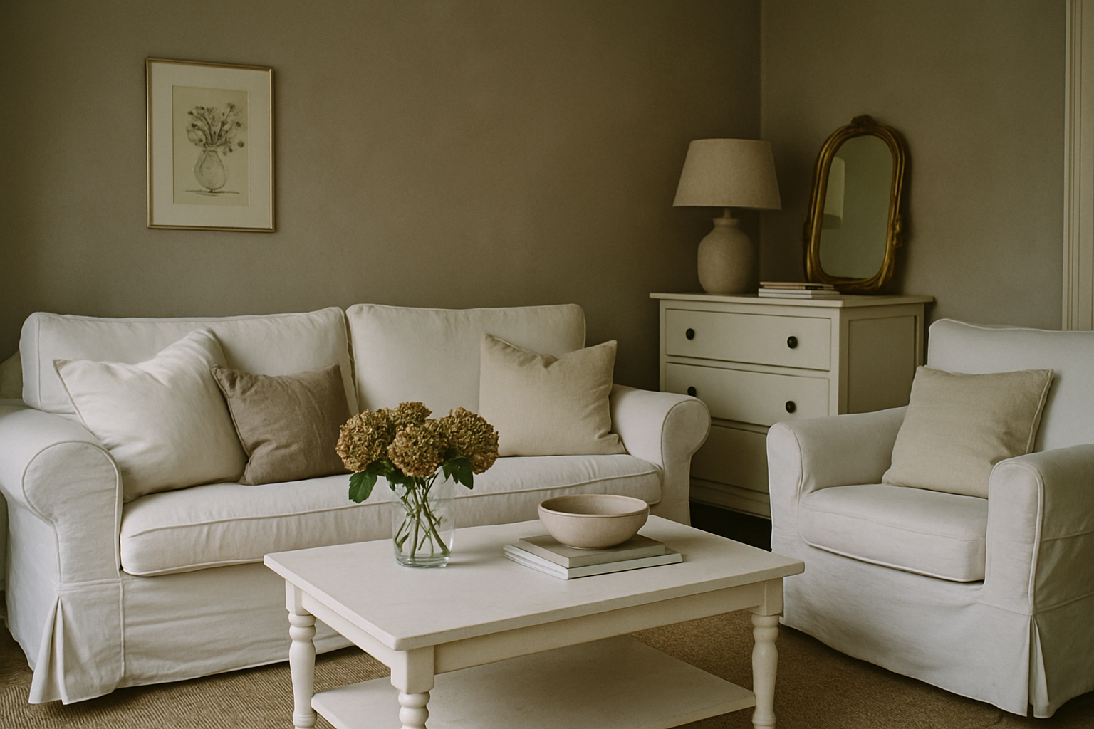
Cool white furniture — your IKEA KALLAX, your lacquered nightstands, anything that looks crisp and almost blue-tinted — needs warmth from the walls. Not a lot. Just enough to stop the room from feeling like a corridor in a medical office.
The IKEA Billy bookcase is optical white at approximately LRV 91. It’s a hard, clean white. And the most common mistake I see in rental apartments and first homes is pairing it with cool gray or gray-blue walls because they seem to “go.” They don’t go. They compound. Cool walls plus cool furniture plus overhead LED lighting and you’ve got a room that no amount of throw pillows will fix.
Benjamin Moore Pale Oak OC-20 is my go-to recommendation here. It’s a warm greige with a soft yellow-pink base, and it reduces the harshness of optical white furniture without muddying anything. The contrast feels intentional rather than accidental.
Avoid wall colors that read cool in the can: gray-blues, blue-greens, anything that sits below roughly 4500K on the color temperature scale. They will make a room with cool white furniture feel hollow.
Warm Ivory and Cream Furniture: Stop Putting It Against Bright White Walls
This one makes me a little crazy because it’s so common in expensive interior photos. Warm ivory furniture against bright white walls. Presented as clean and minimal. What it actually does is make the furniture look stained.
Cream furniture against pure white walls increases the perceived LRV contrast by roughly 8-10 points. Your eye reads the furniture as darker than it actually is. That ivory that looked elegant in the store now looks like something you forgot to bleach. Not minimalism. A decorating error wearing a minimalism costume.
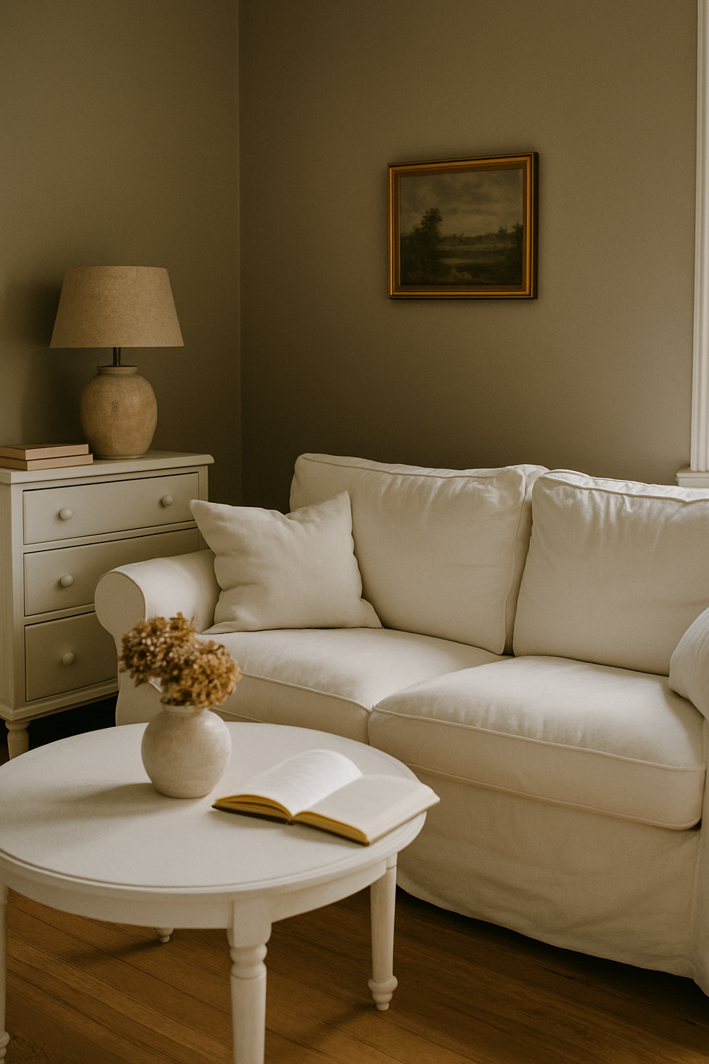
A wall with even 5% yellow undertone neutralizes the effect almost entirely. Farrow & Ball Elephant’s Breath No. 229 does this well. It’s a warm greige with enough gray to stay sophisticated but enough yellow-pink to let cream furniture settle in instead of fight. Terracotta works beautifully with warm ivory pieces too, as does deep sand and warm sage. What you’re looking for is a wall that shares the furniture’s temperature. Not the same value. The same warmth.
I had an antique white armoire in my bedroom for four years against Benjamin Moore Chantilly Lace OC-65. Gorgeous white. Wrong white. That armoire looked like I’d thrifted it and hadn’t decided whether to paint it yet. One coat of warm greige later, that same piece looked like I’d paid three times what I actually paid for it. (I paid $340 at an estate sale. After the repaint it looked like an $1,100 piece. Same armoire. One gallon of paint, about $58 at the time.)
Dark and Saturated Walls With White Furniture: Rules, Risks, and the 60-30-10 Trap
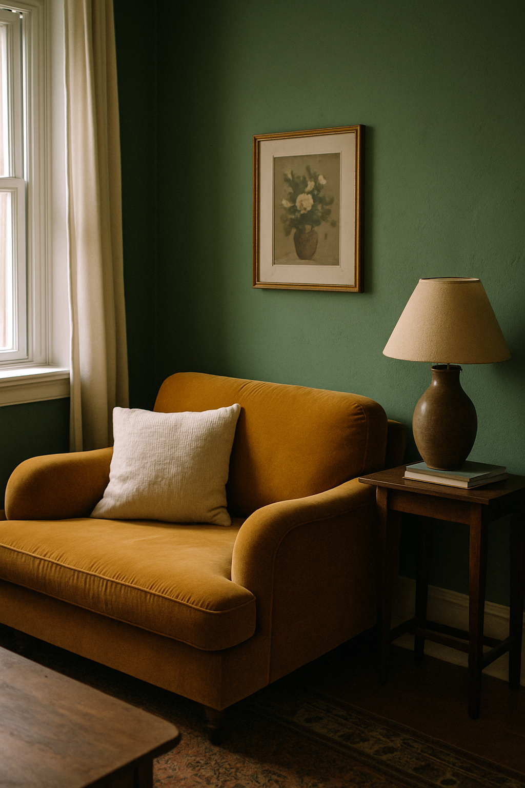
Dark walls with white furniture can be genuinely stunning. I want to say that clearly before I get into the caveats, because I think people avoid the combination out of fear when sometimes it’s exactly right.
But room size matters more than personal taste here. Full stop.
Benjamin Moore Hale Navy HC-154 against white furniture in a room with 9-foot ceilings and decent window coverage? Looks collected, intentional, rich. That same navy in a 120-square-foot bedroom with one 28-inch window? Suffocating.
The 60-30-10 rule, which decorators treat like gospel, breaks down in rooms under 150 square feet with dark walls. The math shifts. You end up closer to 70% wall coverage, and the white furniture starts to look like it’s shrinking into the room rather than standing in it. If you’re committed to a dark saturated wall in a small space, keep the ceiling in a white with LRV above 88. This is not optional. That ceiling white gives the eye somewhere to rest and prevents the compression effect that makes small dark rooms feel like a box.
One window per 12 square feet of floor space is a rough but useful threshold for whether a dark wall will work. Below that ratio, go one step lighter in value before committing.
Greige, Warm Gray, and the ‘Safe’ Middle Ground That Isn’t Always Safe
Greige gets recommended so reflexively that it’s basically become wallpaper advice. Background noise nobody questions. I’m here to question it.
Repose Gray SW 7015 has a purple undertone. Under LED lighting above 4000K (most of what’s in newer homes now), it reads lavender next to stark white furniture. I’ve seen this in person more times than I can count and watched homeowners insist the color looked fine on the chip. A chip is 2×3 inches. It cannot tell you what a color does under your actual light source. Test swatches at 8×10 inches minimum, paint directly on the wall, and live with them for at least 72 hours before buying a full gallon. A quart sample runs about $5-7. Use it.
Agreeable Gray SW 7029 is safer, but specifically for ivory-white furniture. Its warm beige undertone plays nicely with cream pieces. Pair it with optical white furniture and it can start to look dingy against the brightness. The greige isn’t wrong exactly. The combination is wrong.
My estimate, based on the rooms I’ve seen and the ones I’ve done myself: greige fails in roughly 30% of white-furniture pairings. That’s not a safe default. That’s a coin flip with worse odds.
How Room Light Changes Every Rule Above
Light direction is more determinative than color family. Any advice that doesn’t account for which way your windows face is incomplete at best.
North-facing rooms get cool, bluish indirect light all day. In those rooms, avoid wall colors below LRV 55 and anything with a blue or green undertone. They’ll deepen and go murky in a way that a south-facing room would never show. North-facing rooms with cool white furniture are particularly unforgiving. Warmth from the walls compensates for what the light isn’t giving you.
Artificial lighting matters just as much. LED bulbs at 2700K to 3000K warm up ivory furniture and make cool whites read as less stark. Shifting from halogen to a 5000K LED can move a wall color by the equivalent of one to two full chips on a fan deck. I’ve had the same paint look like two completely separate colors in my living room: noon versus 8pm, with a 2700K floor lamp fighting a 4000K overhead. Not a small difference.
Observe your paint swatch at 9am, 2pm, and 8pm. A color that holds through all three is a genuine match for your room.
The Specific Combinations Worth Committing To (and Exact Paint Codes)
Once you’ve identified your furniture’s undertone, you probably need two paint samples. Not ten. Paint companies benefit from your confusion, so here’s the shortlist.
For cool white furniture: the bold wall option I keep coming back to is Farrow & Ball Mole’s Breath No. 276, a warm brown-gray that gives cool white pieces something to stand against. For something softer, Benjamin Moore White Dove OC-17 brings warmth without heavy contrast. Skip anything in the blue-gray family entirely.
For warm ivory furniture: Sherwin-Williams Cavern Clay SW 7701 is the bold move, a terracotta that lets cream furniture look completely intentional. If that’s too much, Behr Antique Beige N310-2 is a quiet warm sand that doesn’t fight anything. Either way, stay away from bright whites on the walls.
For optical white furniture: Benjamin Moore Newburyport Blue HC-155 works as the bold option. It’s a blue with enough gray to keep the cool white from going clinical. For something softer, Sherwin-Williams Accessible Beige SW 7036 brings enough warmth to take the edge off without turning the room muddy.
One color to avoid regardless of undertone family: Benjamin Moore Boothbay Gray HC-165. Its green undertone fights with white furniture across the board. I learned this in my guest room with two full gallons already on the walls, about $72 I’ll never see again. Beautiful color in other contexts. With white furniture it goes swampy and strange, and no amount of good lighting fixes it.