Your Gray Wall Has an Undertone — Find It Before You Buy Anything
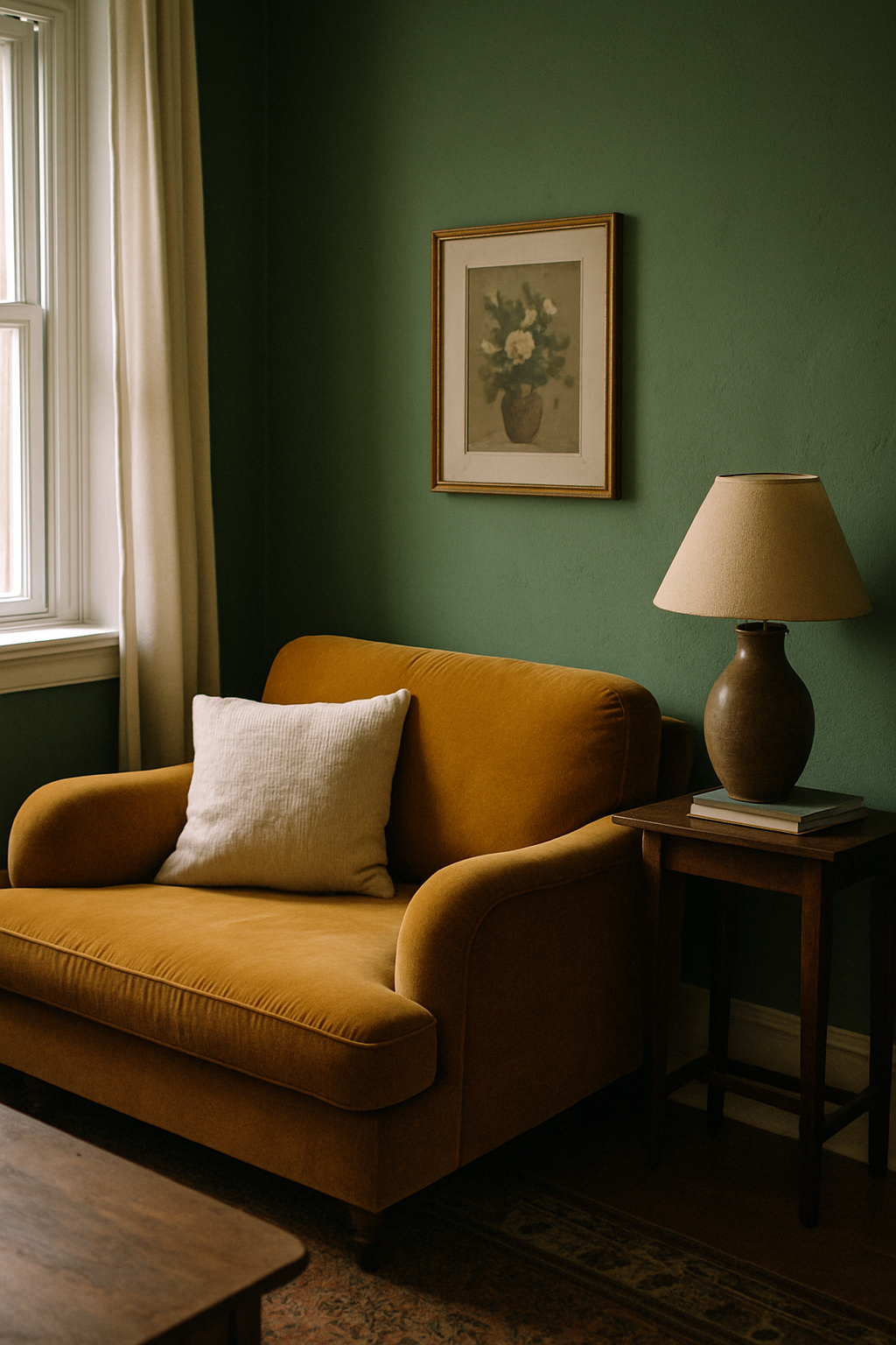
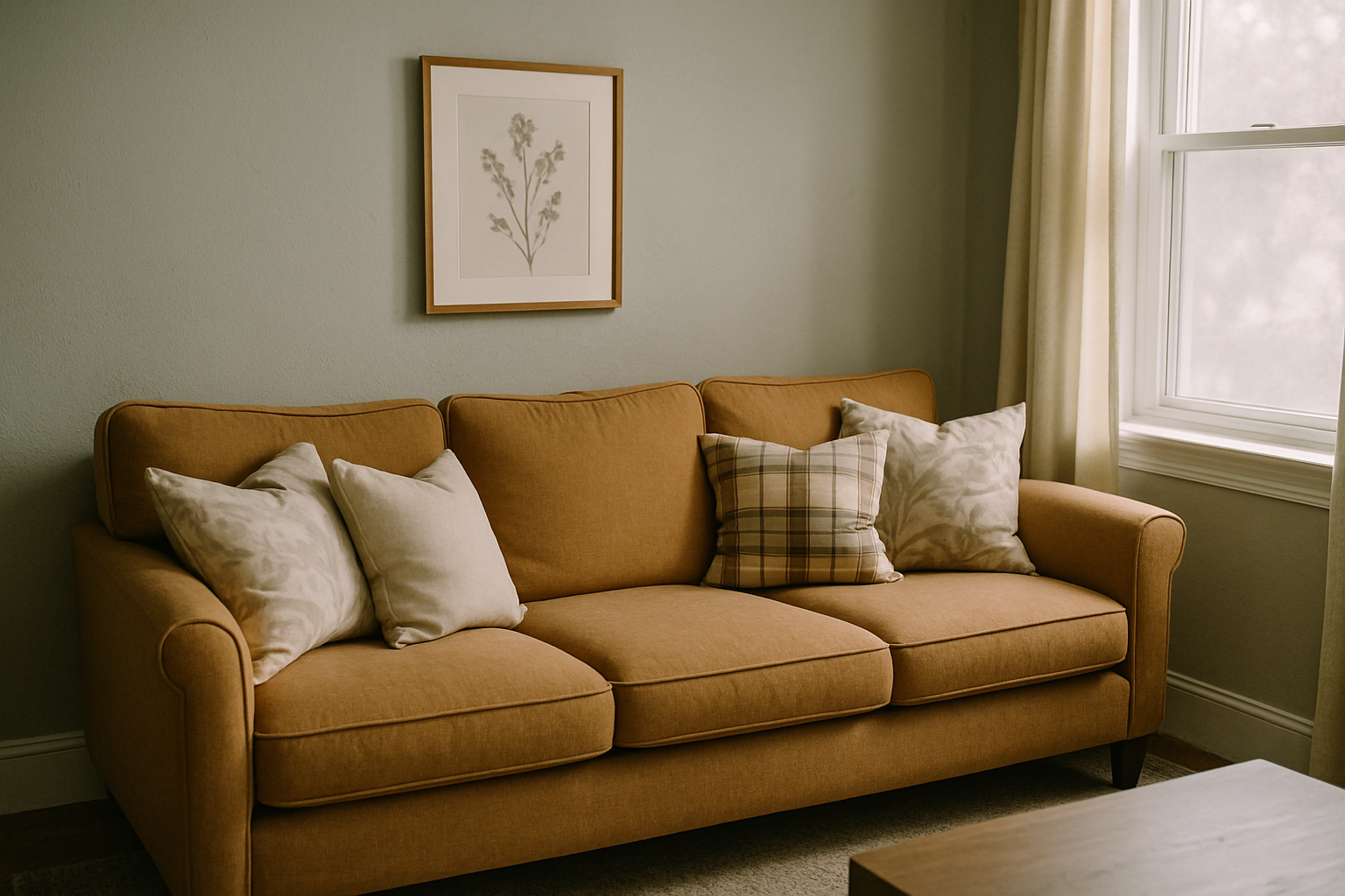
The mustard sofa looked perfect in the showroom. Warm, grounded, exactly the right weight for the room I was planning. Then the delivery guys carried it through my front door, set it down in front of my blue-gray walls, and it turned the color of old guacamole. I paid a restocking fee I will never fully forgive myself for.
Here’s the test I should have done first. It costs nothing. Take a piece of plain white printer paper — not cream, not off-white, actual bright white copy paper — and hold it flat against your wall in natural light. Do this at 10am or 2pm, not noon. Noon light is too direct and flattens everything. What you’re looking for is the color the wall looks like compared to the pure white in your hand. If the wall suddenly reads a little blue or teal next to that white, you have a blue-gray. If it pulls toward lavender, you have a violet-gray. If it goes slightly mossy or sage, that’s a green-gray. If it looks warmer and the white looks almost cold by comparison, you’re in greige territory.
Two paints I’ll name specifically because I’ve heard from so many people who were surprised: Benjamin Moore Gray Owl OC-52 reads green, especially in north-facing rooms. A lot of people pick it thinking “soft gray” and get “pale seafoam” once it’s on all four walls. Sherwin-Williams Repose Gray SW 7015 — probably the most popular gray sold in North America — reads violet-purple in cool or artificial light. It’s everywhere. It’s also the wall color behind half the “my gray sofa looks wrong” complaints I’ve seen. Honestly, I think half the people who own it still don’t know what hit them.
Light grays have stronger undertones than mid-tone grays, not weaker ones. Less pigment means less to absorb those undertone colors. So if you thought a pale gray was safe and neutral and would behave, it won’t. The lighter it is, the more its undertone will assert itself once it’s up.
Skipping this test and going straight to sofa shopping is the single most expensive mistake you can make in this whole process. A $2,000 sofa looks wrong in under 20 minutes if you didn’t do a free check first.
Blue-Gray Walls: The Undertone That Punishes Warm Sofas
Blue-gray is beautiful and deeply unforgiving. I love Farrow and Ball Mizzle No.266 — it’s this incredible complex blue-green-gray that reads almost like a color you’d find in old naval paintings. Benjamin Moore Van Deusen Blue HC-156 is more straightforwardly blue-gray, cleaner, less mossy. Both of them will do the same thing to a warm sofa: make it look like it’s struggling.
A warm beige sofa (say, something upholstered in the same family as Sherwin-Williams Accessible Beige) will read orange against true blue-gray walls. Not taupe. Orange. The cooler the wall, the more any warm tone next to it gets pushed toward the warm end of its range. That mustard sofa I mentioned? Same principle. The wall didn’t turn it green exactly. It pushed the yellow in the mustard toward the green-yellow range because everything warm in that room was fighting an uphill battle.
What actually works: cool whites, slate blue, charcoal, and yes, navy. I know the instinct is to avoid navy against blue-gray because it sounds like too much blue. It isn’t. A navy sofa against blue-gray walls is one of the most cohesive combinations you can put together. The fear of matching undertones to sofa color is genuinely overblown. What reads as “too matchy” is sameness in tone and value, not sameness in color family. Navy is dark. Blue-gray walls are light. That contrast is doing real work.
The advice to “warm up a cool room with a mustard or camel sofa” is repeated constantly and it’s wrong in this context. Undertones don’t cancel each other out. They compete. Your eye reads the tension, registers it as something being off, and you end up repositioning throw blankets for three years trying to figure out why the room never settles.
Warm Gray and Greige Walls Open the Door to Sofas Most People Are Afraid to Try
Sherwin-Williams Agreeable Gray SW 7029 is the best-selling greige in North America. It’s warm, it pulls toward tan in natural light, and it behaves completely differently than a cool gray. If your walls are in this family — warm-undertone grays, greiges, anything that reads more beige than blue — you have options that most people never consider because “gray walls” advice almost never gets this specific.
A cognac leather sofa anchors a greige room in a way that a gray or white sofa can’t. There’s something about the warmth-on-warmth relationship. The wall and the sofa are working with the same undertone, so instead of fighting, they deepen each other. You can find cognac leather sofas in the $800 to $1,400 range from Article or West Elm without a lot of trouble, and in a greige room they look like you spent significantly more. Not competing with the walls. Not the same color as the walls. Just genuinely at ease.
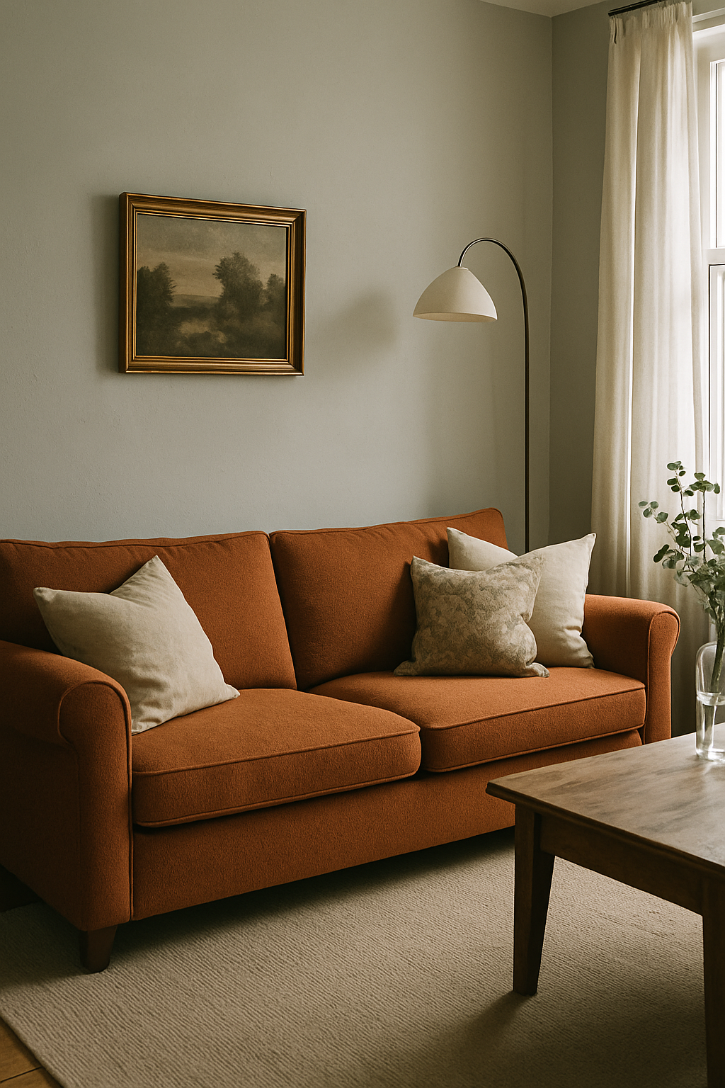
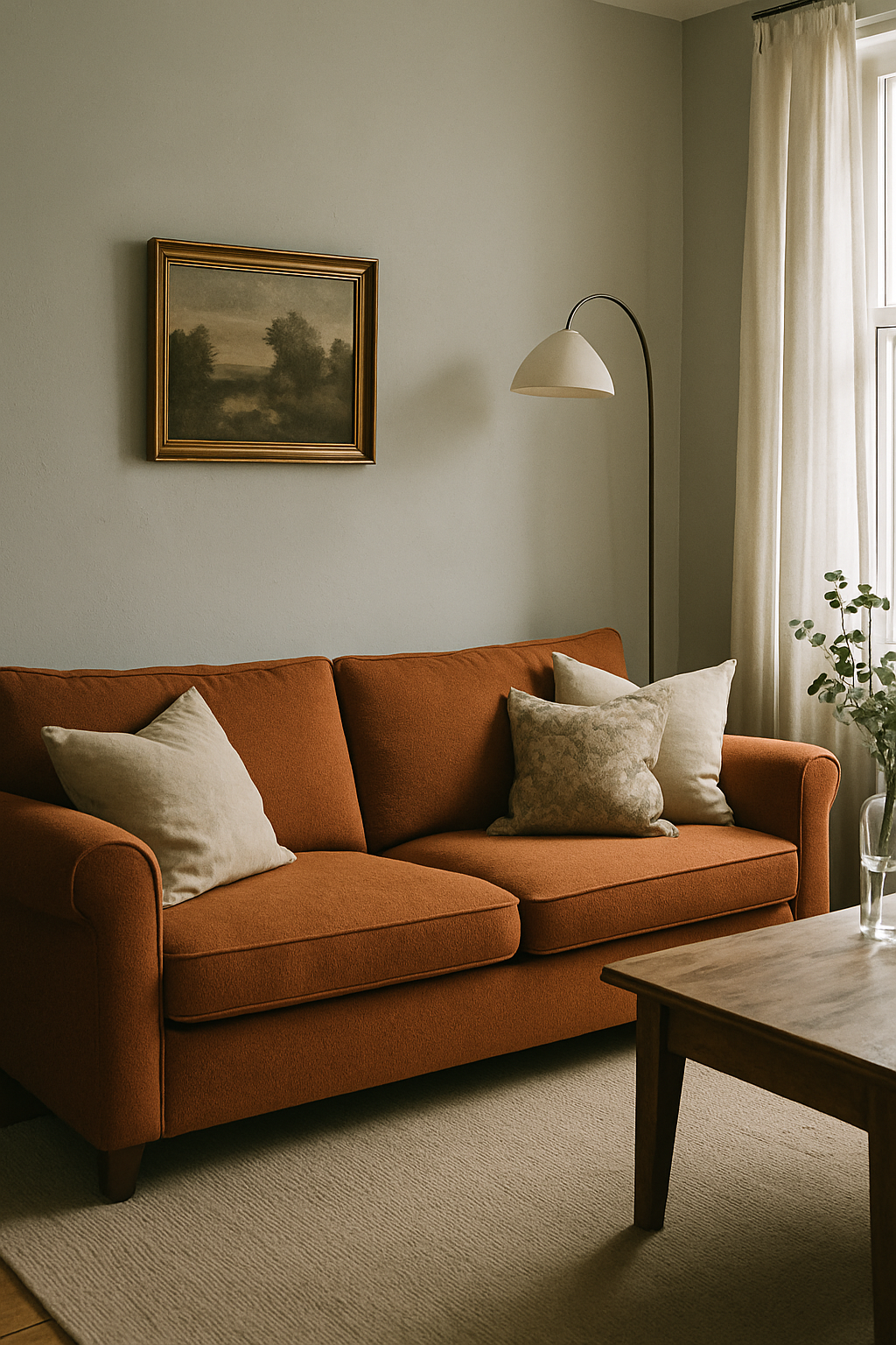
Terracotta works here too. So does rust, deep olive, burnt orange. All the colors that would look jarring against a blue-gray wall feel deliberate and grounded against greige. My honest take, having watched rooms in my house age over ten or eleven years: greige walls with a terracotta or rust sofa will look intentional in a decade. Greige walls with a gray or white sofa will look like you couldn’t decide. The warm combo doesn’t require repainting when trends shift because it was never about a trend. It was about undertone alignment.
The Gray-on-Gray Sofa Question Deserves a Straight Answer
Yes, a gray sofa can work with gray walls. It requires one thing and it’s non-negotiable: the sofa has to be at least two to three shades darker or lighter than the wall. Less separation than that and it doesn’t read as a choice. It reads as a mistake. Like you ran out of ideas at the last minute.
The IKEA Kivik sofa in Hillared anthracite against pale gray walls is a good example of it working. The charcoal is deep enough that your eye sees real contrast, and the room feels deliberate, grounded, almost architectural.
A mid-gray sofa against mid-gray walls is a different situation entirely. Muddy, flat, like the room has no horizon.
Gray-on-gray done with actual tonal commitment is one of the most calming room combinations available. I don’t mean that as faint praise. Calm is something a lot of people actively want from a living room and don’t know how to name. The instinct to “add a pop of color” to any gray room assumes everyone wants visual noise. Some people don’t, and that’s a completely legitimate preference, not a failure of creativity.
Commit to the contrast or pick a different sofa color. Those are really the only two paths.
Three Sofa Colors That Will Look Dated by 2027 Against Gray Walls
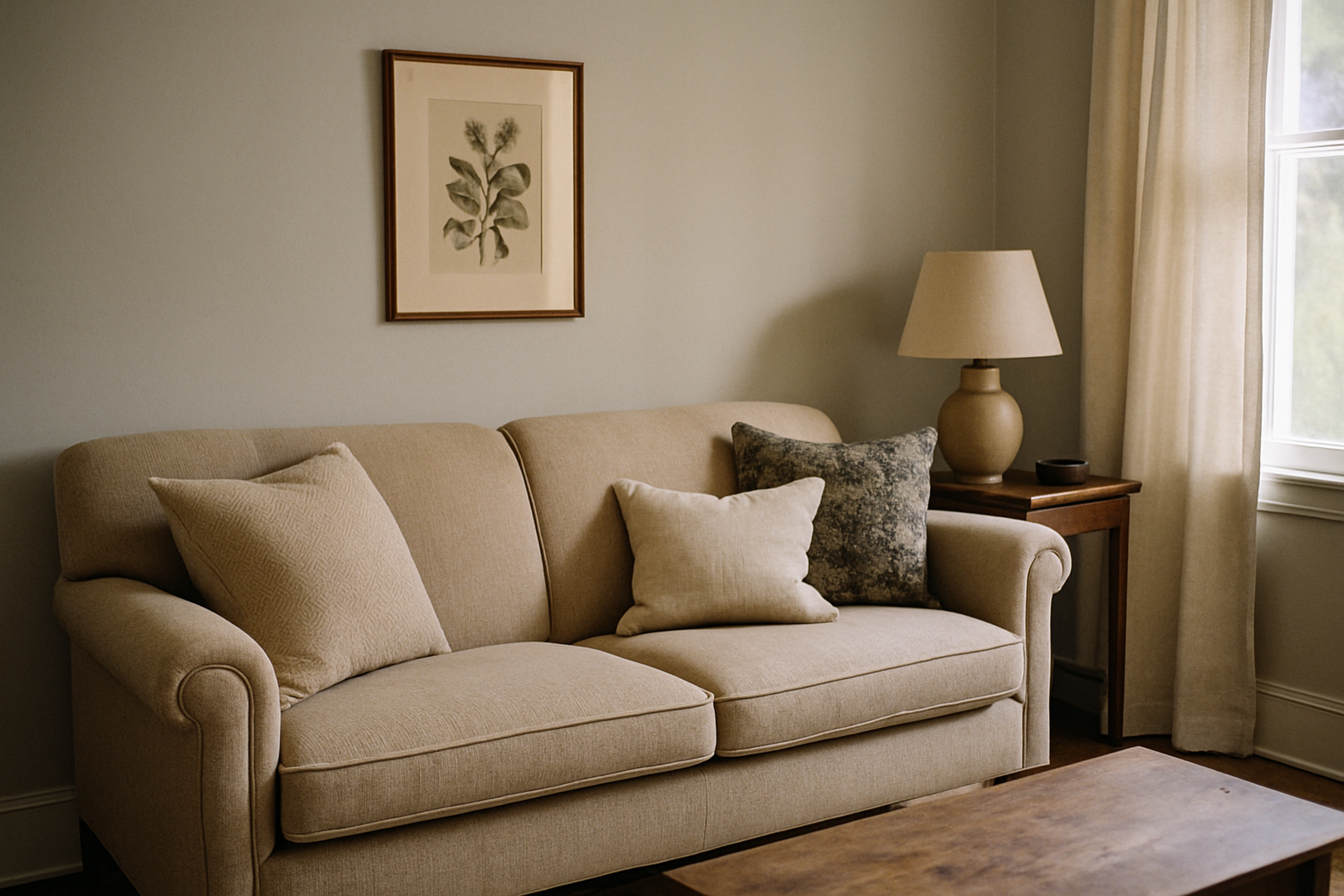
Blush velvet sofas peaked in Google Trends in 2019 and have declined 61% in search volume since. I’m not saying that to be smug — I almost bought one. They’re genuinely pretty. But buying a blush sofa for gray walls in 2025 is roughly equivalent to buying chevron wallpaper in 2014. Fine for two years. Exhausting for the next eight. You’ll start to resent the sofa around the same time you start noticing how many waiting rooms have the same one.
Millennial gray velvet — that particular medium-value cool gray that was everywhere from about 2017 to 2022 — is another one to avoid. Against gray walls it was always a tonal gamble, and now it also carries the weight of being visually associated with a very specific moment in mass-market furniture. West Elm and Wayfair moved so many of these that they’ve become wallpaper in the cultural sense.
Sage green is the one I’d watch most carefully right now. Muted mid-tone sage sofas are currently saturating Pinterest at the same rate blush did about three years before its decline. Based on that same pattern, sage sofas are projected to follow the same arc. They’re also genuinely tricky against gray walls. The green undertone in both can either harmonize or clash depending on your specific gray, and you only find out which after the sofa is in the room. Turns out “it looked fine on the website” covers a lot of expensive regrets.
Trend forecasting in home decor isn’t guesswork. When a color hits H&M Home, Target, and IKEA simultaneously, you’re usually 18 months from peak saturation and about 24 months from the point where it starts to feel tired. Mass retail is a reliable leading indicator if you pay attention to it.
How Lighting Conditions Change Which Sofa Color Is Correct for Your Room
North-facing rooms in the northern hemisphere get cool, indirect light all day. No direct sun, ever. I have one in my house — the room off the hallway that I repainted twice before I stopped fighting the undertone and just leaned into it. Whatever blue or violet undertone lives in your gray walls gets amplified from morning to night in a room like that, and any sofa color you introduce is being evaluated under that cool cast constantly. It’s not a detail. It changes which colors are actually viable.
LED bulb temperature does the same thing at night. Bulbs at 2700K (the warm white most people default to) push fabric colors toward yellow. A sofa that looked clean and neutral in the store under bright fluorescents will read warmer and slightly more yellow under your 2700K living room fixture. Bulbs at 4000K cool white shift fabric toward gray-blue, which can make a warm sofa color look unexpectedly flat or even a little dingy.
More sofa purchases go wrong because of ignored bulb color temperature than because of any actual color choice. I really believe that. A sofa that seems “wrong” in a gray room is frequently a lighting problem wearing a color problem’s clothes.
The fix is simple and almost no one does it: bring home a fabric swatch before you buy and test it under your actual ceiling light at night. Not just daylight. Night. Bringing paint swatches home is standard advice and everyone does it. Bringing a fabric swatch is the exact same logic and it’s treated like an unusual request. It isn’t. Most furniture stores will give you one. The ones that won’t should probably tell you something.
A Decision Framework That Replaces the Generic Color List
Any post that hands you a list of eight sofa colors without asking what undertone your wall has is not giving you advice. It’s showing you a catalog and calling it guidance. The list of colors is useless without the prior information, same as a doctor handing you a list of medications before asking what’s wrong.
Here’s a process that takes about 15 minutes and requires a $4 white posterboard from a dollar store.
Step one: hold the posterboard against your wall at 10am or 2pm in natural light. Identify what color the wall looks like relative to the pure white. Blue, violet, green, or warm. That’s your undertone.
Step two: identify which direction your room faces. North or east gives you cooler light. South or west gives you warmer, stronger light. This will amplify or soften whatever undertone you just identified.
Step three: decide your tolerance for contrast. High contrast means you want the sofa to read as clearly distinct from the wall. Low contrast means you want tonal closeness, which is valid, but requires the tonal commitment described earlier in the gray-on-gray section.
That sequence produces one of four sofa color families, not ten options. Cool walls with high contrast tolerance: go dark and cool (charcoal, navy, deep slate). Cool walls with low contrast tolerance: tonal gray with strong value difference, at least 3 shades apart. Warm walls with high contrast tolerance: terracotta, cognac, rust. Warm walls with low contrast tolerance: warm white or a greige sofa in a clearly different value than the wall.
Specificity that narrows your choices is more useful than a list that keeps all of them open. More options isn’t more helpful. It’s more paralysis — and it lets you avoid the actual work of figuring out what you’re dealing with.