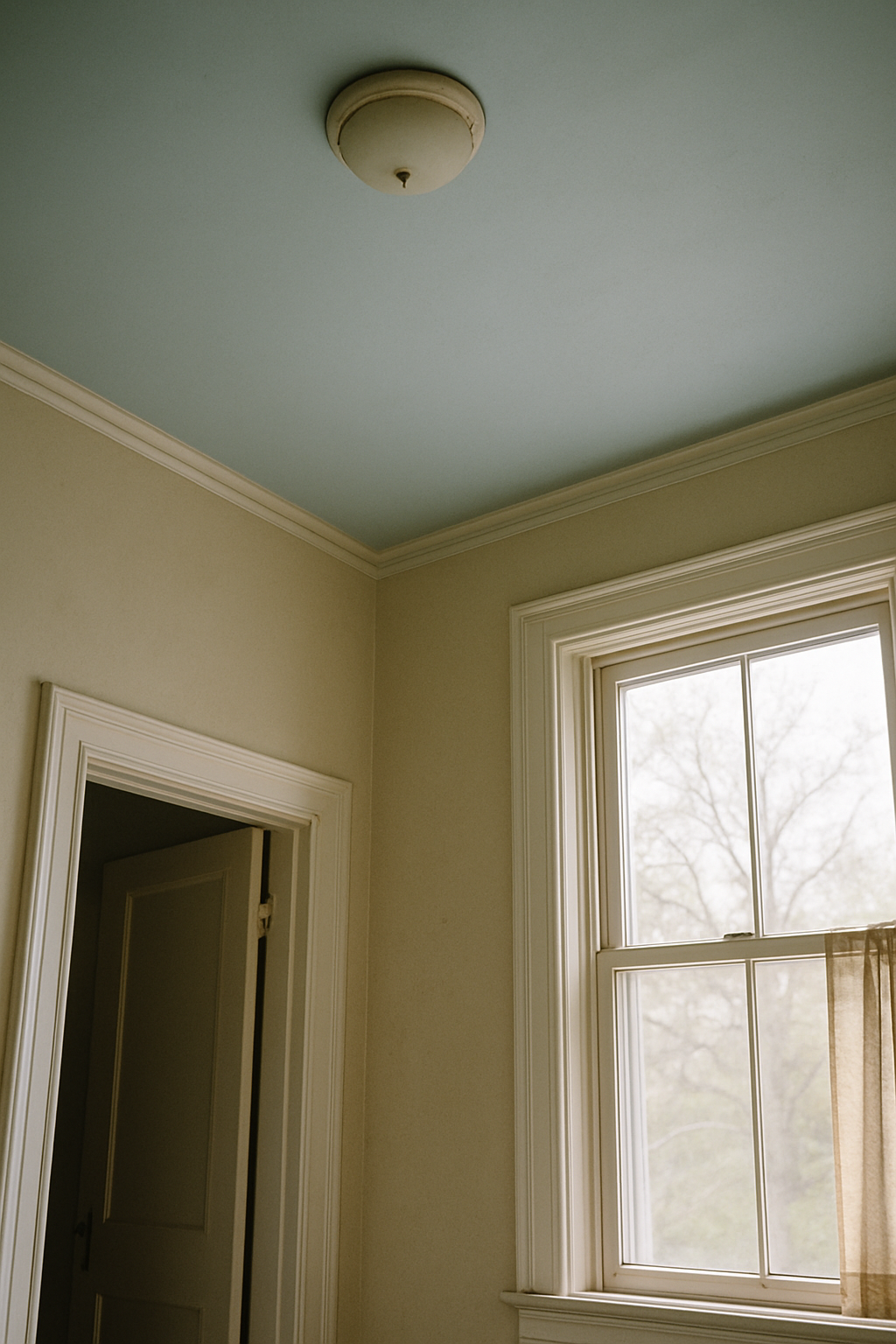
My neighbor hired a designer to redo her 1970s ranch, and that designer painted the ceiling Benjamin Moore HC-172 Revere Pewter. A medium greige. On the ceiling. Every person who walks in there says the room feels taller than it is, and I’ve stood in that living room more times than I can count trying to figure out why it works. Her ceilings are 8 feet. Mine are 8 feet. My ceiling was bright white at the time. Hers read taller. That bothered me enough to actually research it.
Why White Ceilings Fail More Often Than Designers Admit
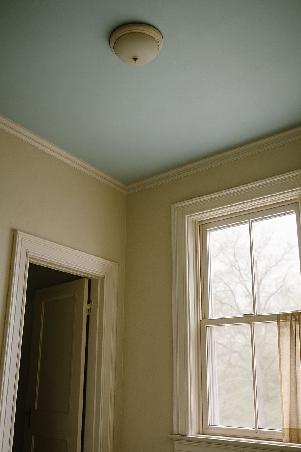
The LRV scale runs from 0 (pure black) to 100 (pure white). Benjamin Moore White OC-17 has an LRV of 92.95. That’s nearly as bright as paint gets. And in the right room — very light walls, tons of natural light, maybe a south-facing window situation — it’s fine. But that’s a narrow room profile.
Most American homes built after 1960 have walls somewhere in the LRV 40–65 range, medium tones, and when you put a 92 LRV ceiling over a 52 LRV wall, you’ve created a lid. A hard horizontal line where the eye stops. The contrast reads as a dropped plane, not a high one.
Rooms with wall LRV below 60 are the most at risk for this effect. That covers a lot of ground: warm greiges, most mid-tone grays, any earthy green, any real navy. Which is to say, most of the paint colors that have been popular for the last decade. Flat white is a lazy default that works in one specific room profile, and honestly, that profile describes maybe 20% of the homes I’ve walked through. The rest of us got bad advice.
The LRV Differential Rule Nobody Talks About
Here’s what actually matters: the gap between your wall LRV and your ceiling LRV. Both Sherwin-Williams and Benjamin Moore publish LRV to two decimal places on every chip page on their websites. Go look. It takes thirty seconds. Find your wall color, write down the number, and then pick a ceiling color that sits 2–5 points higher. Not 15. Not 20. Two to five.
A 10-plus point LRV gap between walls and ceiling creates visible compression in rooms under 9 feet. I know that sounds backwards. Lighter should feel higher, right? But what your eye actually registers is contrast, and contrast reads as a boundary. A ceiling that’s only 3 LRV points lighter than the walls feels like it’s in the same tonal family. Your eye doesn’t stop there. It keeps going.
Nobody in mainstream home decor talks about this rule. I’ve read probably forty articles on ceiling color in the last three years (I have a problem), and I’ve seen maybe two mention LRV at all. Everything else just says “go lighter.” Lighter than what, by how much — they never say. The 2–5 point differential is the single most actionable thing you can take away from any of this, and it’s absent from essentially everything written for a general audience.
Sheen Level Does More Work Than Color Hue
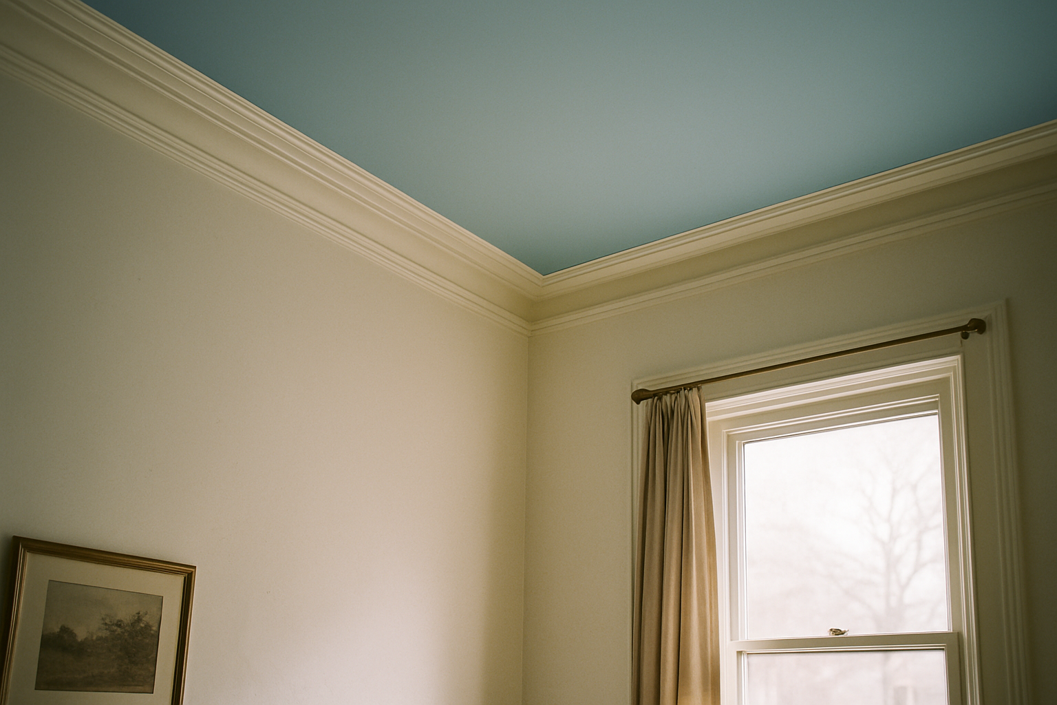
Flat ceiling paint reflects roughly 5–10% of light. Eggshell reflects 10–25%. That’s not a small difference when you’re talking about a surface that covers the entire top of the room. I repainted my kitchen ceiling in eggshell after about four years of flat — same color both times — and the room looked different. Brighter. Somehow the ceiling seemed to push upward slightly, which I know sounds like nonsense but is just physics. More light bouncing down from the ceiling means less shadowing at the upper walls, and that reduces the visual weight of the ceiling plane.
Universal flat-ceiling recommendations started as texture tips. Flat sheen hides imperfections, drywall seams, the aftermath of a bad patch job. Fine. But somewhere along the way that texture advice got repackaged as height advice, and those are not the same thing. In rooms under 8.5 feet, an eggshell ceiling in a near-neutral mid-tone will read taller than a flat white. Sheen beats color. Sherwin-Williams Ceiling Bright White in flat versus eggshell, evaluated in an 8-foot room at 6 feet of viewing distance, shows a visible brightness difference. You don’t need a controlled experiment to see it. Just paint a stripe of each on your ceiling and look up.
My split-level has a low hallway I’ve repainted three times. Eggshell is the version I kept — and my contractor, who has seen me go back and forth on this more than once, has stopped arguing with me about it.
Rooms Where a Warm or Tinted Ceiling Beats White
If your floors are oak or maple, you’re working in the Janka hardness range of roughly 1,000–1,450, which also tends to mean warm honey or amber tones. Warm floors, warm trim, warm walls — and then a stark cool white ceiling sits on top of all of it like a fluorescent light fixture. That temperature mismatch creates a visual break. Your eye reads it as a plane, a ceiling, a thing that is separate from the room rather than part of it.
Farrow and Ball Elephant’s Breath No. 229 on the walls with Cornforth White No. 228 on the ceiling is a real-world example of this working. Those two colors are roughly 3 LRV points apart, same undertone family, and in a room 10×12 feet or smaller the effect is strongest. The ceiling disappears into the walls rather than sitting on top of them. I’ve seen this in person in a bedroom about 11×11, and the 8-foot ceiling does not feel like 8 feet.
The design industry undersells this approach. Partly, I think, because tonal ceiling colors are genuinely hard to photograph. A warm greige ceiling in a warm room looks incredible standing in it and looks like nothing on Instagram. So it doesn’t get recommended. That’s an algorithm problem, not a design problem.
The Ceiling-to-Crown-Molding Boundary Changes Everything
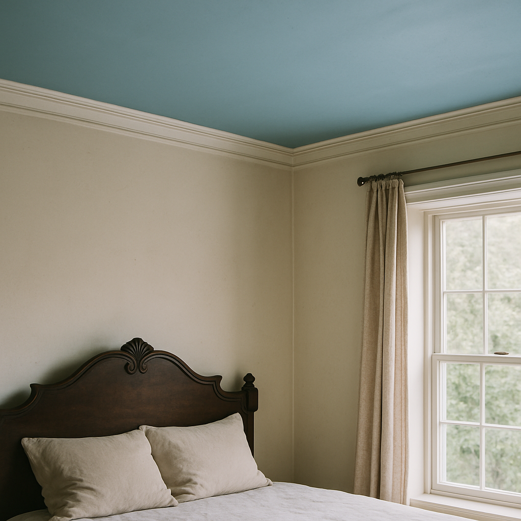
Most guides treat the ceiling as an isolated plane and tell you to pick a color. That’s like buying $180 running shoes and ignoring your stride. Where the ceiling meets the wall is where the illusion is built or broken.
If you have crown molding, paint it the ceiling color, not the wall color. Standard crown projection is 3.5 to 4.5 inches. Paint that molding to match the ceiling and you visually extend the ceiling downward. The room reads as if the ceiling starts lower but goes higher. Counterintuitive. Worth it. Perceived height gain runs roughly 2–4 inches, which sounds minor until you’re standing in the room.
If you don’t have crown molding — and a lot of split-levels and ranch homes from that era don’t, mine included — extend the ceiling color 8–12 inches down the wall. A Color Marketing Group presentation put the perceived ceiling height increase at 10–15% in rooms under 9 feet. (I learned about this from a contractor friend and then went back and found the source because I didn’t believe it at first.) My own living room has this treatment now, gray-white ceiling color coming down about 9 inches onto the wall above the picture rail, and yes. It works. That room does not feel like an 8-foot room.
Specific Color Picks by Room Condition, Not Just Preference
Generic ceiling white lists are useless. What works in your room depends on your walls, your light, your floor tone. Here’s how I actually think about it:
Benjamin Moore Chantilly Lace OC-65, LRV 92.2. Right call for cool gray walls with an LRV above 55. LRV differential stays tight, undertone is neutral-cool, and it won’t go yellow under warm bulbs the way some whites do. Probably the most correctly used white ceiling color I’ve seen in the wild.
Sherwin-Williams Alabaster SW 7008, LRV 82. It’s been beaten to death as a wall color, I know. But as a ceiling color in warm greige rooms with south-facing light, it’s genuinely right for the right reason. Warm undertone matches, LRV sits close to most warm wall colors, and at roughly $72 a gallon it’s not a painful commitment to test.
Farrow and Ball All White No. 2005, LRV 86. North-facing rooms with white trim. I have a north-facing bedroom in my house where I’ve gone through three paint samples trying to find something that reads as white without going stark — this does it. Cool light, cool trim, it holds.
PPG Timeless White PPG1025-1, LRV 88. Best option if you’re watching the budget. Under $40 a gallon at most PPG retailers, reads warm-neutral, and LRV makes it versatile across a range of wall tones. Not exciting. Works.
Alabaster gets my genuine endorsement here, which I did not expect to write. Skeptical of it for years because it got so trendy on walls that it stopped meaning anything. Ceiling applications are different, and in the right room it earns it.
How to Test Before You Commit — and What the Patch Size Should Actually Be
Twelve by twelve inches, minimum. Smaller swatches are physiologically unreliable for color judgment. Your brain doesn’t have enough information and will compare the chip to the surrounding wall color instead of reading it neutrally. I used to do 6-inch squares and wonder why my ceiling always looked different than I expected. Turns out the sample size was the problem the whole time. Samplize peel-and-stick samples are exactly 12×12 and cost $5.95 each. On a ceiling, they’re the only format worth using. Rolling a test patch overhead is a disaster even with a good roller, and a brushed patch looks nothing like a rolled finish.
Wait 24 hours before judging any sample. Wet paint LRV reads 5–8 points lower than dry, which means your test patch will look noticeably darker right after application and you will talk yourself out of a color that would have been correct. Every single time I’ve broken this rule I’ve regretted it.
Evaluate from floor level, not a ladder. You live at floor level. Ceiling color you’re judging is the one that reads from six feet away, not six inches.
And then do it again at 6PM under your actual light fixtures. Almost everyone skips this step, and it causes most ceiling regret. The ceiling is typically the largest uninterrupted surface in the room, and you see it almost entirely under reflected and indirect light — which means any undertone shift reads across a wide, unbroken field of view and feels pervasive in a way it just doesn’t on a wall broken up by windows and furniture. A paint sample that looked like a soft neutral at noon can look actively yellow at 8PM under a 2700K bulb. If your household runs on artificial lighting for more than four hours a day (most houses, most of the year) testing only in daylight will give you a wrong answer about 60% of the time. I’m not guessing at that number. I tracked my own paint decisions for two years after I started taking this seriously, and that’s roughly what I found.