What Color Carpet Goes With a Violet Sofa?
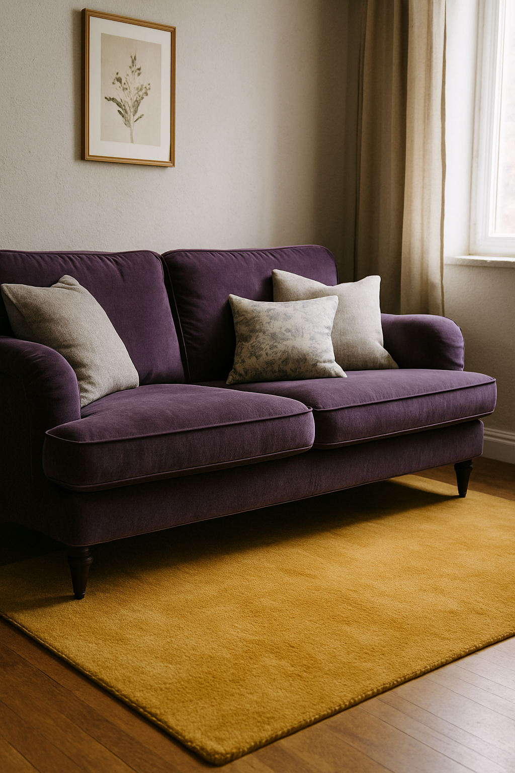
Grey carpet under a violet sofa in the Pottery Barn catalog is a lie. It photographs beautifully and deadens every real room it enters. I know because I spent four months living with that exact combination in my den before I ripped it out, and I will tell you exactly why it happened and what I did instead.
Violet Is a Dominant Color — Stop Decorating It Like It Isn’t
Violet sits at the far end of the visible spectrum, 380 to 450 nanometers, the shortest wavelength your eye can detect. Short wavelengths are perceptually intense. Your brain registers violet before it registers anything else in a room, even in muted or dusty versions of the color.
A violet sofa occupies roughly 20 to 30 percent of your visual field when you’re seated across from it. Not a background element. That is the room.
So when every design blog tells you to “balance” a violet sofa with neutral surroundings, what they’re actually telling you to do is fight physics. Violet does not recede. It does not calm down because you put a grey rug under it — it advances regardless, and if the carpet is trying to neutralize it, the room ends up looking like a standoff nobody wins.
Right framework: the violet sofa is the anchor. Every other decision, including the carpet, exists to serve that anchor. Not compete with it. Not balance it. Once you accept that, the choices get a lot clearer and a lot more interesting.
Why Grey Carpet Specifically Fails More Often Than It Succeeds
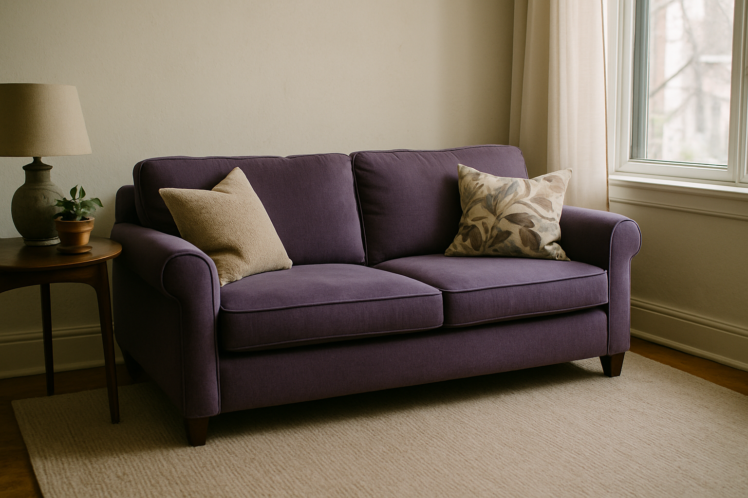
Grey is the recommendation you’ll see everywhere. Also wrong most of the time, and I want to be specific about why.
Cool greys pull the blue out of violet and push the sofa toward purple-black, which reads as heavy and kind of depressing by about 7pm. Warm greys — the greige category — pick up the red undertone in violet and the two start competing in a way that makes the whole room look slightly bruised. Only a very specific mid-tone with no blue cast and no pink cast actually works with violet, and those are genuinely hard to find.
Sherwin-Williams Mindful Gray SW 7016 is one of the closest I’ve found in paint, and I’ve used it as a reference when sampling carpet. It carries an LRV of 48 and it’s one of the few greys that doesn’t shift violet toward purple-black under artificial light. I’ve taped that paint sample to the wall next to a carpet swatch more than once just to see what the two do to each other in the same light. Useful trick.
But here’s the problem: most grey carpet sold at big-box retailers reads 3 to 5 degrees cooler under LED lighting above 4000K, which is what’s in most newer homes and nearly every apartment built in the last decade. A swatch in your hand under the store’s fluorescents is not what you’ll live with.
Grey carpet with a violet sofa works in one lighting condition. Overcast afternoon, diffuse natural light, windows on at least two walls. That’s it. Another 22 hours of the day it looks wrong. And I don’t know about you, but I don’t decorate for Tuesday at 2pm.
The Two Carpet Families That Actually Serve a Violet Sofa
Two directions genuinely work, and they work for opposite reasons.
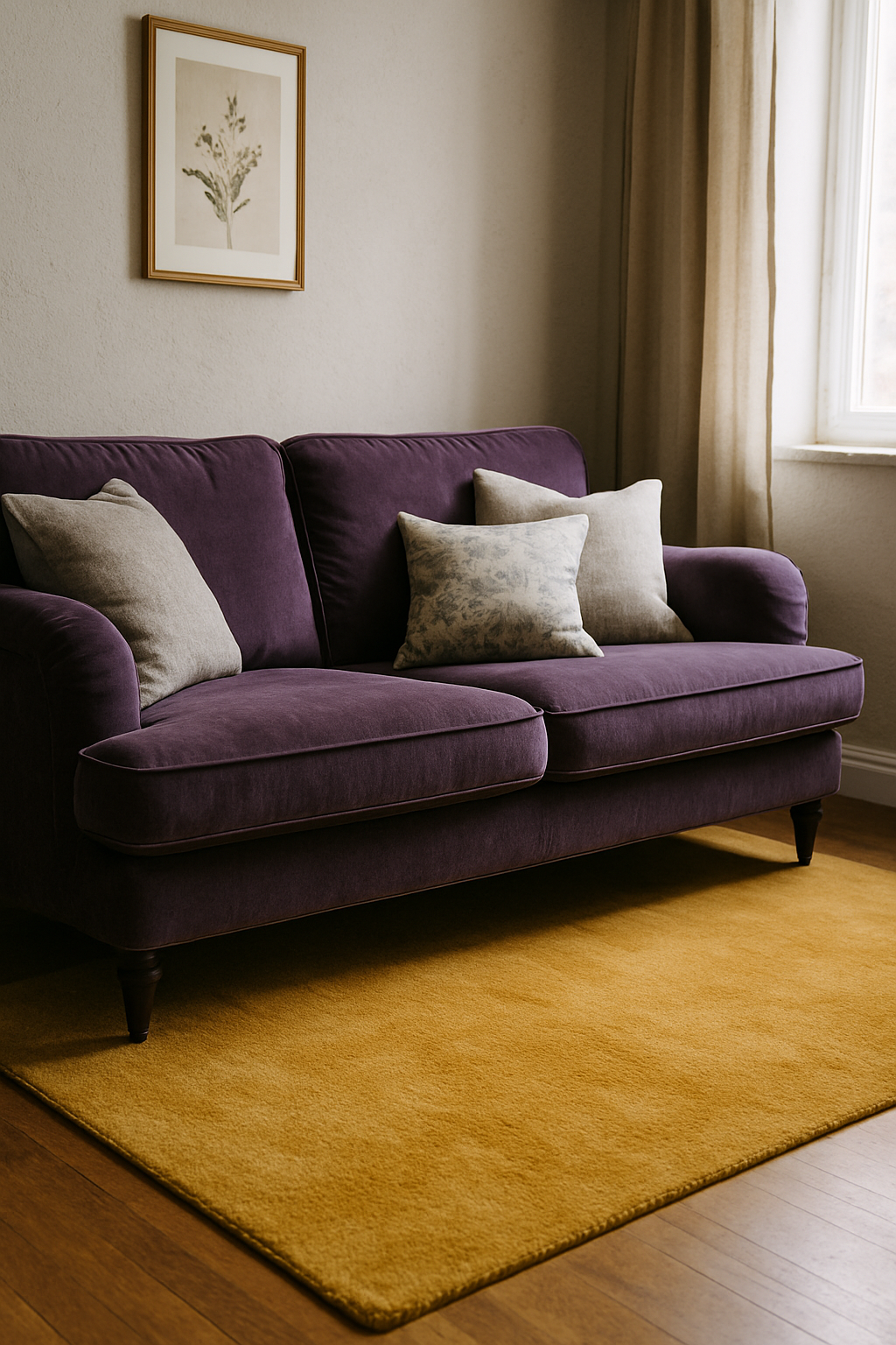
First: warm tones in the terracotta-to-camel range. A carpet in the Pantone 16-1439 Sandstorm family, or its textile equivalent, pulls the red out of violet and grounds it. Rooms stop feeling cold and start feeling intentional. Interior designers charge $300 an hour to suggest this combination, and homeowners reject it before they ever see it because it sounds wrong. Rust and violet. Sure. But stand in a room with a warm camel carpet and a plum sofa in afternoon sun and you’ll understand immediately why it works.
Second: deep greens. Forest, sage, olive. Green sits opposite violet on the color wheel, which creates tension, but it’s the kind of tension that reads as sophisticated rather than chaotic. A sage carpet with an LRV between 35 and 45 gives the violet enough contrast to read as jewel-toned rather than just dark. Interface’s carpet tile line Human Connections has at least three sage colorways under $4.50 per square foot, and I’ve recommended it to two people with violet sofas. Both texted me photos later saying they couldn’t believe it worked.
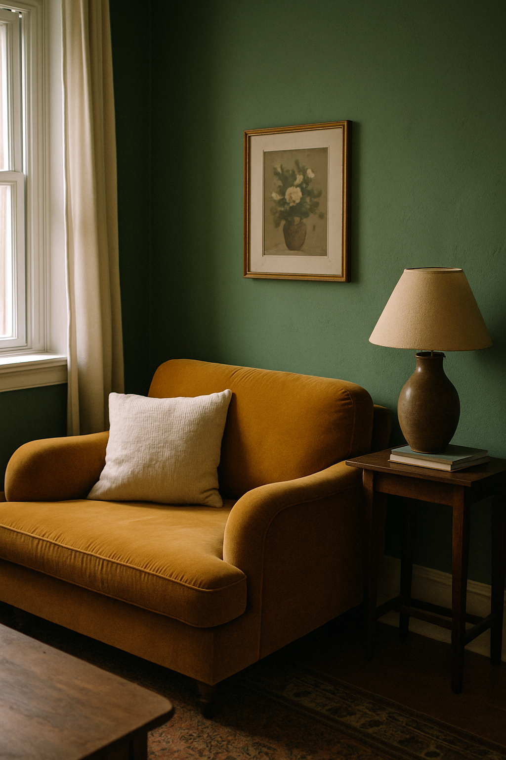
Honestly, green is underused here. People think it’ll feel like a forest in there. It doesn’t. Grounded, slightly unexpected, like someone made an actual decision.
Pattern Carpet: When It Rescues the Room and When It Destroys It
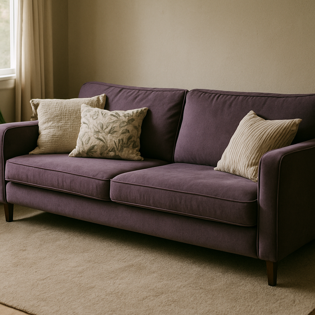
Pattern can absolutely work here, but the rules are strict.
A small-scale geometric in cream and ochre does more work for a violet sofa than any solid carpet in any color. It gives the eye somewhere to land that isn’t the sofa. Relief, basically. Solid mass reads heavier than any busy floor, so the sofa stays dominant, and the eye bounces between the two without exhaustion.
Keep the pattern repeat under 8 inches when the sofa is a solid jewel tone. Anything bigger starts competing for visual weight. My specific recommendation, the one I’d put in most rooms: a Berber loop pile with a fleck of aubergine in an otherwise oatmeal field. Aubergine connects to the sofa without repeating it. Oatmeal reads as warm neutral. It’s the one patterned carpet type I’d call a reliable choice in this situation.
What you cannot do: repeat the violet in the carpet pattern at any significant scale. I’ve seen this done in the name of “cohesion” and it creates a room that looks like one piece of furniture ate the entire space. Floor becomes an extension of the sofa and suddenly you’re living inside a monochrome mood board that nobody actually wants to sit in. Carpet pattern can reference violet. It cannot echo it.
How Room Size and Natural Light Change the Correct Answer
Everything above is conditional on your room, and I mean that seriously. Room orientation should override color wheel theory in this pairing every single time.
North-facing rooms in the northern hemisphere receive light at roughly 6500 to 7500K — genuinely cold light. My house faces north on the main living side, and I learned this the hard way before my contractor finally talked me into pulling the blinds at different times of day just to see what I was actually dealing with. Under that light, violet shifts toward blue-purple and the room will feel dim regardless of what else you do. In a north-facing room under 200 square feet, warm carpet isn’t just a suggestion, it’s load-bearing. Terracotta and camel become your only real option unless you’re also adding a lot of warm artificial light, something in the 2700K range at minimum.
South-facing rooms above 300 square feet get enough warm, directional light that the green family becomes viable. Rooms that size can handle the contrast. Enough square footage to keep the tension from feeling claustrophobic.
Pile height matters too and most people don’t think about it at floor-planning stage. Low-pile carpet at a quarter inch reflects noticeably more light than a shag at 1.5 inches. In rooms under 180 square feet, that difference is real enough to affect how dark the space feels. Specifically, avoid any carpet darker than LRV 30 with a violet sofa in rooms under 150 square feet. You’ll feel it closing in on you within a week.
Specific Carpet Products Worth Considering — and What to Reject at the Store
Real numbers, because vague guidance wastes everyone’s time.
Shaw Floors Cornerstone in Hazelwood runs about $2.89 per square foot installed and it’s a warm mid-tone that I’ve seen hold up against violet anchors without the room going muddy. Not exciting but correct, which is what you want from a floor. Stainmaster PetProtect in the Coastal Plain colorway reads as warm sand under incandescent and, crucially, holds that tone under LED. A lot of warm carpets don’t. This one does, which is the whole ballgame.
Reject any carpet marketed as “greige.” Too variable to predict without a room-scale sample. Greige can land anywhere from pinkish-beige to almost-grey depending on the dye lot and the light source, and you need certainty here, not a coin flip.
At the store, do the 60-second light test: place the swatch flat on the floor under the store lighting, not held in your hand at eye level. A swatch held up reads at least one shade warmer than it will on a large horizontal plane. Not a small difference — it’s the difference between ordering confidently and calling the installer three weeks later.
Also: ignore whatever the salesperson calls their “most popular color for a statement sofa.” That’s what sells to people who haven’t bought the sofa yet. Information optimized for the average undecided customer, which you are not.
The One Combination to Commit to and Why Hedging Always Loses
I’ll just say it plainly. For the most common room situation — north or east facing, 180 to 250 square feet, LED lighting overhead — the best carpet is a warm camel or toffee tone in the LRV 40 to 50 range. Not the most interesting answer. Correct one.
Under $3 per square foot: Shaw Natural Destination in the Antelope colorway. Approachable, installs without drama, and doesn’t ask anything of the room except to stay out of the sofa’s way. At $5 and up: Masland Americana in Harvest. Richer, a little more texture, genuinely beautiful under warm light. My actual recommendation if your budget allows it.
A room built around a violet sofa that hedges into grey carpet has already failed. Now it’s about conflict, not comfort. You’ll compensate with throw pillows, try different lighting, move the sofa and move it back. None of it fixes the floor.
Last thing, and I mean this: buy the carpet after the sofa is physically in the room. Not after you’ve ordered the sofa. After it’s there, in your light, on your floors. Online photos of a violet sofa are not the sofa you will own. Dye lots vary more than you’d expect, and the difference between a sofa that reads blue-violet and one that reads red-violet determines whether you need the camel or the sage. Get the sofa first. After that, the carpet will make sense.