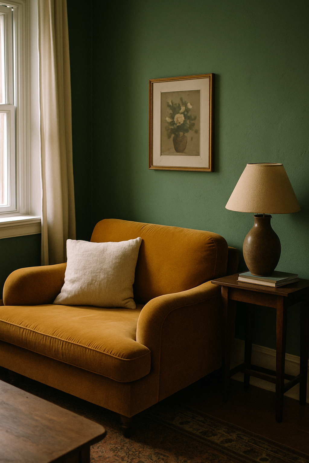
My forest-green velvet sofa looked stunning in the showroom and like a muddy rug in my living room. The taupe Berber carpet underneath had killed every ounce of its depth. The sofa wasn’t the problem. The carpet wasn’t even ugly. But together they just… cancelled each other out. Flat. Dull. Expensive. That mistake cost me about $1,400 in carpet I ripped out eighteen months later. So here’s what I actually learned.
Why Velvet Breaks Every Normal Color-Matching Rule
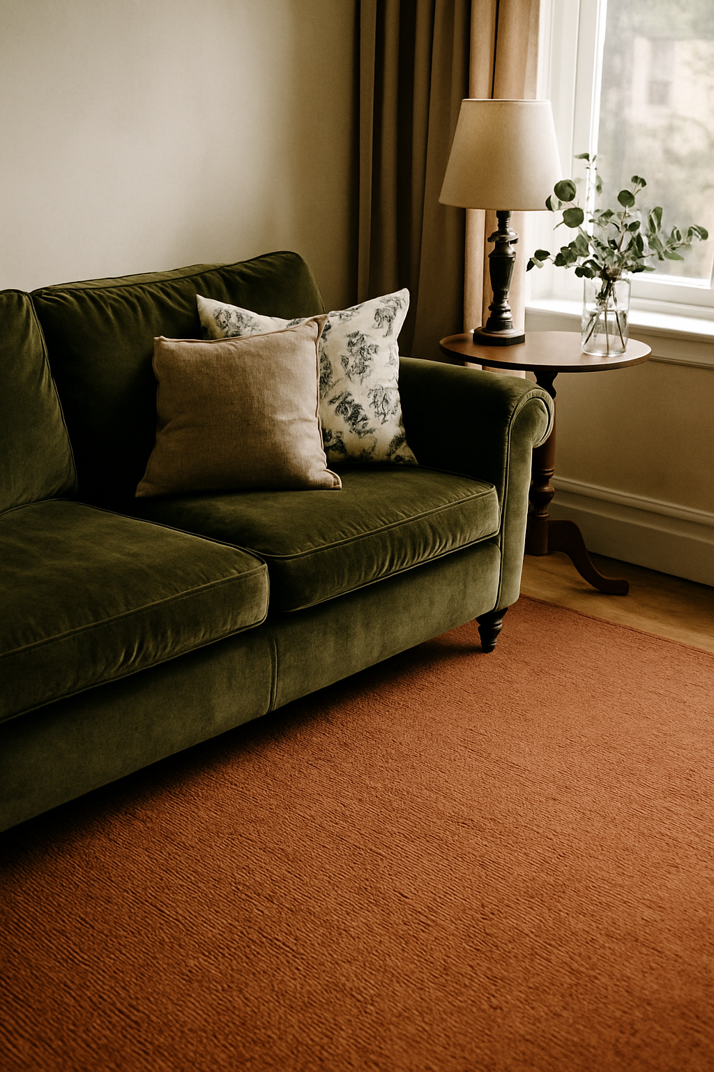
Most carpet advice treats velvet like it’s a painted wall — one fixed color, stable under all conditions, just pick something that goes with it. That is not how velvet works. Not even close.
Velvet has a pile structure, typically between 1.5mm and 4mm tall, and that pile reflects light directionally. Tilt the cushion, walk past the sofa, or shift a lamp across the room and the color you’re looking at changes. A sofa that’s a clear teal at noon reads closer to dark teal-black when light hits it from behind. We’re talking 2-3 shades of shift on a single piece of fabric, in a single afternoon. And if your room faces north? You’re losing roughly 30% of the sofa’s color vibrancy compared to a south-facing room. The cool, indirect light just drains it.
So when someone tells you to “match your carpet to your navy sofa,” what navy are they matching? The 2pm version or the 7pm version? The pile-facing-the-window version or the pile-facing-the-wall version?
Static color matching fails here. You need a different framework entirely.
Texture Contrast Is the Real Decision. Color Comes Second
This is the thing most decorating guides skip entirely because it doesn’t fit their sofa-color sorting system. Velvet is a high-sheen, directional pile fabric. It catches light. It shifts. It has real visual weight. And when you put it on top of a flat-pile carpet in a similar tone, the room goes visually soft in the worst way. Everything reads as the same surface, just at different heights.
What you need underneath it is friction. Not literally (though sisal carpet actually has a friction coefficient roughly 3x higher than velvet, which I find oddly satisfying as a metaphor). Visually, you need a surface that looks and feels nothing like what the sofa is made of.
A rough looped Berber, a coarse sisal, a cut-and-loop with visible texture variation. These create the separation the eye needs to read both elements as intentional choices. A flat cut-pile carpet in similar tonal weight to the sofa? That’s where rooms go to die. Cut pile residential carpet runs around 40-60 oz face weight, and at the lower end especially, it’s got almost no visual character of its own. It just sits there.
Loop pile Berber typically runs $3-$7 per square foot installed, which is reasonable for what it does. And what it does, under a velvet sofa, is save the whole room. Designers who jump straight to the color conversation without talking texture first are skipping the most important variable.
The Four Velvet Colors That Actually Require Different Carpet Strategies
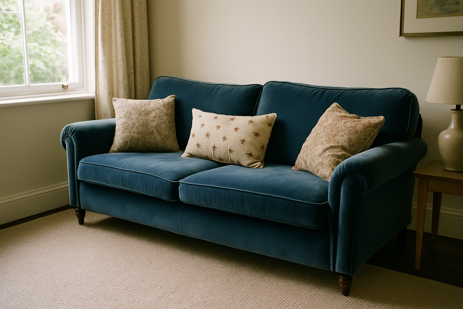
Navy and charcoal get lumped together constantly as “dark velvet sofas, use a light neutral.” That advice is lazy and it ignores the fact that these two colors have completely different undertone problems.
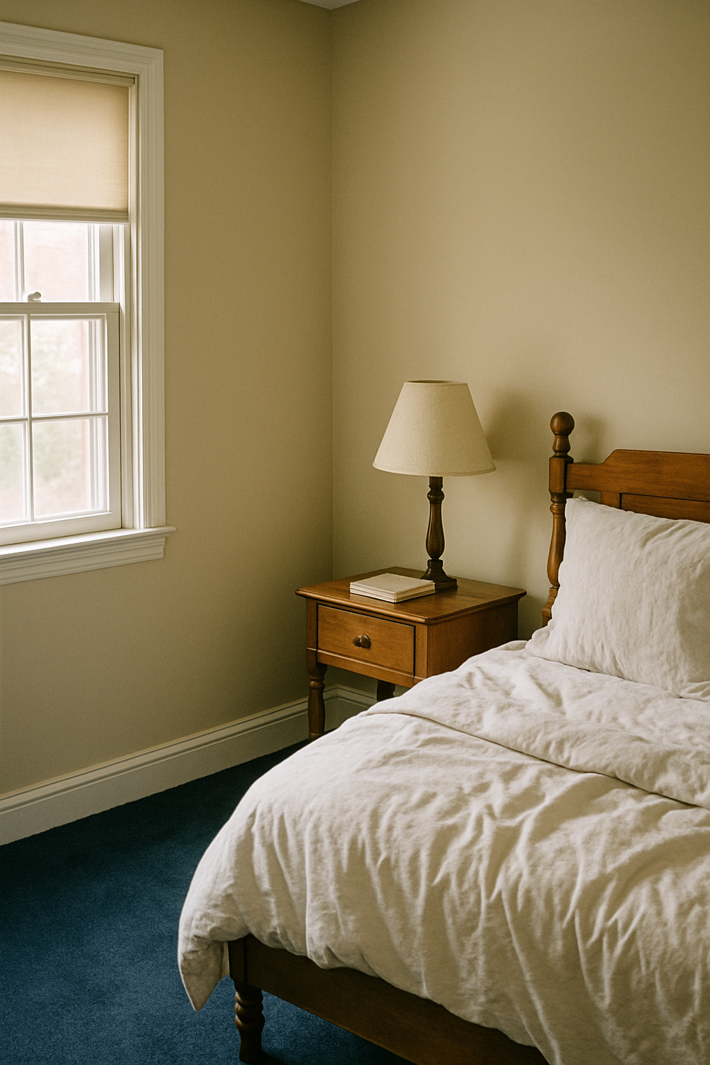
Navy velvet reflects up to about 8% of incident light (compared to 80% for a white surface), and it pulls cool and blue-toned. In a small room, it will dominate. The carpet needs to push warm to counterbalance. Oatmeal, warm flax, or a soft camel tone. You’re not matching; you’re correcting.
Charcoal velvet reads entirely differently. It has no strong undertone to fight. But in a room under 200 square feet, a charcoal sofa eats light, and you need a carpet with at least 60% LRV (light reflectance value) to keep the space from collapsing. Benjamin Moore’s White Dove OC-17 has an LRV of 85.08. That’s your benchmark for how light a light carpet actually is. If you’re shopping carpet and the sample looks “warm ivory,” check whether it actually reflects enough light before you commit.
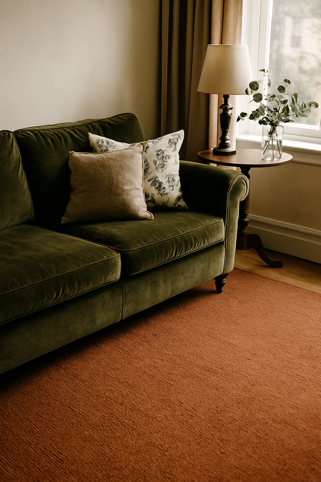
Emerald and forest green velvet sofas need a carpet that grounds the warmth in the green without going matchy. A sandy jute or a warm sisal pulls out the yellow in the green and makes it feel intentional rather than accidental.
Blush velvet is the one I see butchered most often. Every guide says grey carpet. Every single one. Grey is wrong. Grey reads cold next to blush and makes the whole room feel like an Instagram flat lay that nobody actually lives in. What blush velvet needs is a warm greige or a low-saturation terracotta, something that meets its warmth instead of competing with it or draining it out. I genuinely can’t figure out where the grey carpet consensus came from, but I’d like it to stop.
Patterns on the Carpet: When They Help and When They Compete
The overcorrection I see constantly: someone has a velvet sofa and they’re so nervous about visual chaos that they buy the flattest, plainest, most beige carpet they can find. The room looks like it’s afraid of itself.
Patterned carpet can absolutely live with velvet. The rule isn’t avoid pattern. It’s avoid high-contrast pattern. A geometric repeat under 4 inches typically reads as texture rather than pattern from standing height. You’re not aware of it as a design element; it just makes the floor look interesting. That’s exactly what you want.
Loloi’s Amber Lewis collection uses pile heights under 0.5 inches for exactly this reason. The pattern is there but it doesn’t shout. Tone-on-tone carved carpet works on the same principle. The carving creates dimension and shadow without introducing competing color. Honestly, I think it’s a smarter choice than a flat neutral. The “safe neutral” recommendation produces boring rooms, and boring rooms are their own kind of mistake.
The actual line to watch: if the carpet has more than 3 distinct colors in its pattern, it’s going to fight the sofa. Velvet is already doing a lot visually. You don’t need the floor doing a lot too. Keep the pattern muted, keep the repeat tight, and you’ve got something that adds without competing.
Room Size and Ceiling Height Change the Math Entirely
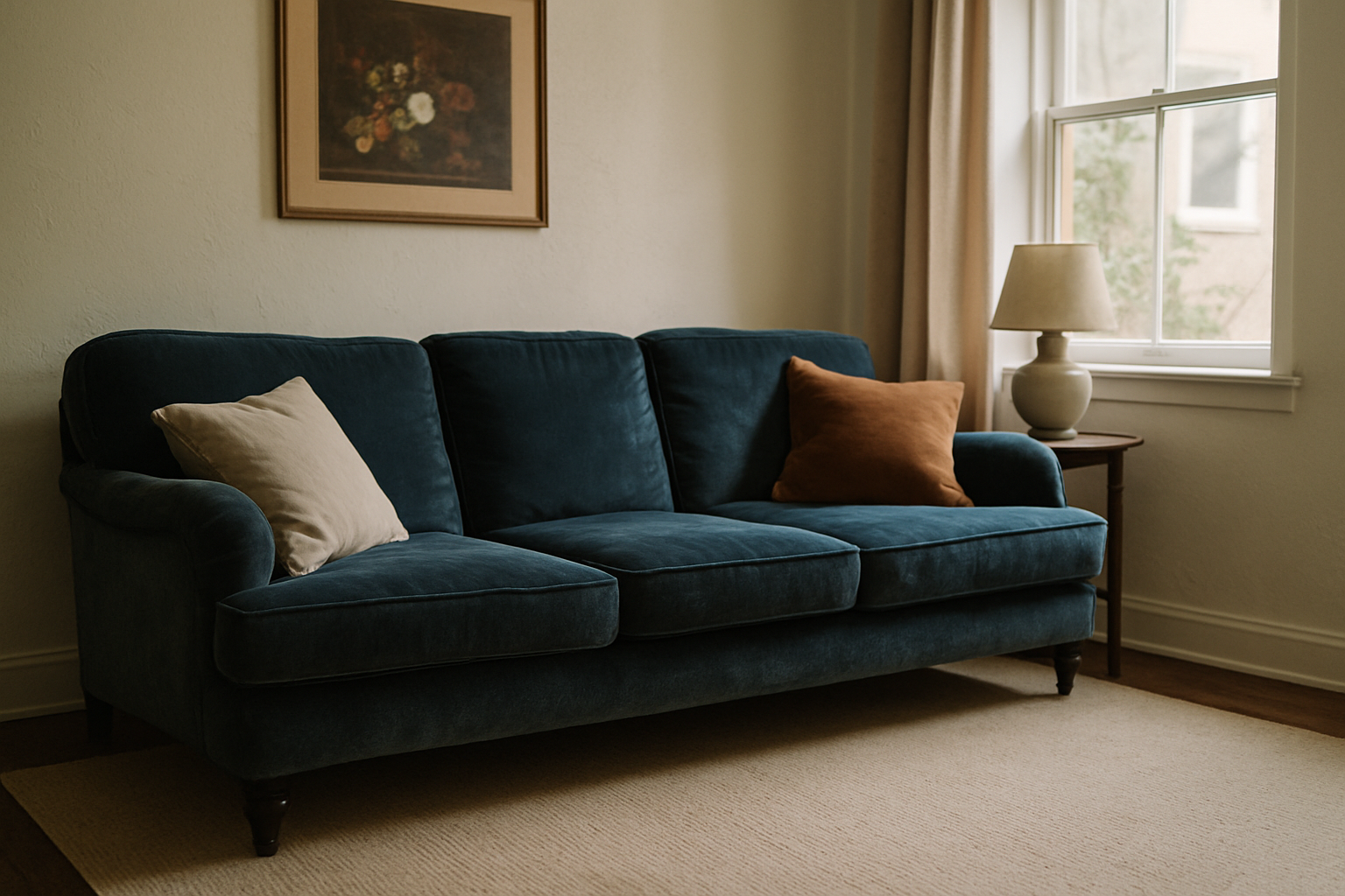
Small rooms change everything. In a room under 150 square feet, every dark flooring element chips away about 15% of perceived size. Add a charcoal velvet sofa and dark carpet and you’ve made a small room feel like a cave, which might be what you want but probably isn’t.
My rule for small rooms: the velvet sofa should always be the darkest element in the room. Always. That means the carpet goes lighter than feels intuitive, sometimes a lot lighter. It looks timid on the sample card. It looks right in the room. I’ve done this twice now and been surprised both times by how much it opened the space up.
Ceiling height matters more than most people account for. Standard eight-foot ceilings are pretty limiting. You’re working against compression already. At nine feet or higher, you can handle carpets that are 20-30% darker in value before the room starts to feel closed. It’s not magic; it’s just physics. Taller rooms have more vertical space to absorb the visual weight of a dark floor.
And if you’re using an area rug rather than wall-to-wall: a 5×8 rug creates a usable anchor zone of about 40 square feet under a standard three-seat sofa. That’s enough to define the seating area without carpeting the whole room, which is often the smarter call in small or awkward spaces.
Three Combinations That Actually Work (Tested in Real Rooms)
Not inspiration board stuff. Actual floors under actual sofas.
Shaw Floors Anso Caress in Antique White under a navy velvet sofa. This is the combination I keep coming back to. The Anso Caress has a soft loop texture that contrasts the velvet pile without being coarse, and the Antique White is warm enough to balance the cool navy without going yellow. It’s not exciting. But it’s correct in a way that will still look right in fifteen years, and that matters more than exciting when you’re spending real money. I’ve recommended this to three people and none of them have complained.
A hand-knotted wool carpet in Pantone 16-1318 (Toasted Coconut) under an emerald velvet sofa. The warm sandy tone pulls the yellow out of the green and the wool texture is the opposite of velvet in every way. Matte, nubby, slightly irregular. The contrast makes both surfaces read clearly. This is the combination I wish I’d had when I bought my forest-green sofa instead of the taupe Berber that started this whole story.
Stainmaster PetProtect Berber in Buff, around $4.50 per square foot installed, under a charcoal velvet sofa. I have a dog. I have kids. I’ve had both for eleven years in this house and I’ve learned that anything too light under a charcoal sofa shows every piece of lint the sofa sheds. Buff is warm enough to hide daily life and light enough to give the charcoal somewhere to land. The Berber loop texture is the right contrast. And at $4.50 installed, it’s not a financial disaster if it needs replacing in eight years.
One thing I’d avoid in all three scenarios: bright white or ivory carpet under any dark velvet sofa. The contrast is too stark and cold. It looks like a furniture showroom. Warm-white is fine; ice-white is not.
Before You Buy: The 48-Hour Carpet Sample Test for Velvet Rooms
Anyone who buys carpet based on a 2-inch swatch next to a phone photo of their sofa deserves the result they get. I say that with love, because I did exactly that and paid for it.
Order a proper sample. Minimum 12×12 inches. Anything smaller misrepresents how the color actually reads at scale. Most retailers offer free or $5 returnable samples, including Carpet One, Home Depot, and Wayfair. Five dollars is not the reason to skip this step.
Put the sample on the floor directly next to your actual sofa. Not next to a paint swatch, not on a different floor, not in the hallway. Next to the velvet itself. Then look at it at 8am, at noon, and at 8pm, under both natural light and your room’s actual artificial lighting. Those three time checks will show you whether the carpet reads muddy next to the sofa in the morning, or whether your evening lamps turn a neutral carpet orange. You will see things in that 48 hours that no showroom can show you.
What you’re specifically looking for: does the carpet texture read as visually distinct from the velvet, or do they merge? Does the carpet color shift toward the sofa’s undertone under warm artificial light? In a north-facing room, does the carpet go flat and grey in the afternoon?
If any of those answers is wrong, send it back and order the next candidate. It takes a week. It is completely worth it. The alternative is a $1,400 carpet you’re ripping up in eighteen months because you were impatient in October.
I know because that’s exactly what I did.