The Carpet Sample Looked Perfect in the Store
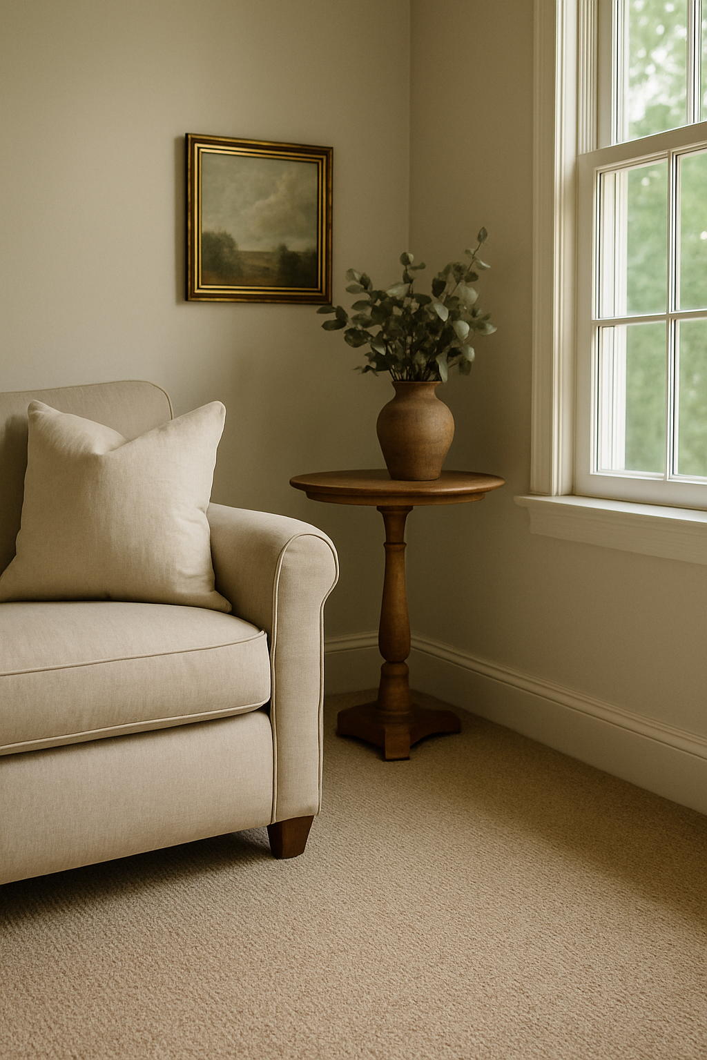
And then I installed it and my Edgecomb Gray walls turned the color of old mustard. I stood in the doorway of my living room genuinely confused, like I’d been deceived. The carpet was fine. The walls were the same walls. But together, under my actual windows with my actual afternoon light, the whole room looked like a bruise in beige.
That was nine years ago. I’ve since repainted, re-carpeted that room twice, and developed what my husband calls an unhealthy fixation on LRV charts.
So let me save you the bruise.
Edgecomb Gray’s Undertone Is the Only Thing That Actually Matters Here
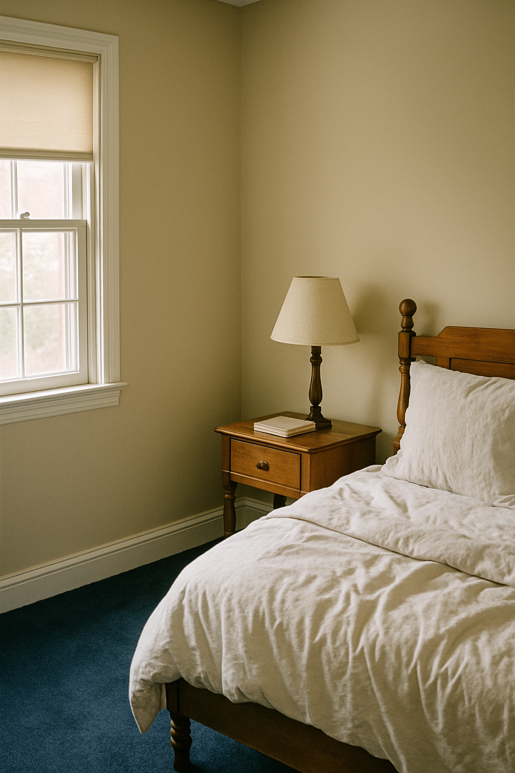
Edgecomb Gray HC-173 has an LRV of 63. That number means it reflects a lot of light, which sounds like a plus until you realize all that reflected light carries its undertone straight into your eyeballs. And that undertone is warm. Yellow-beige warm. Not a subtle hint of warmth — genuinely warm in a way that most guides completely fail to mention.
The “true greige” label that gets thrown at this color is misleading to the point of being harmful. Greige implies balance. Implies it reads halfway between gray and beige. Edgecomb Gray does not do that in most residential lighting. It reads as a warm beige with a gray quality, not the other way around. That distinction wrecks carpet decisions at scale.
In a north-facing room, it gets worse. North light is cool and blue, which strips the gray out and leaves you with something that reads greenish-yellow. Your perceived LRV drops by roughly 5 to 8 points and the undertone swings hard. That room that looked calm and sophisticated on the paint chip? In winter, facing north, it can look like split pea soup. I’m not exaggerating. My old guest room faced north and I spent two full years thinking I’d just bought bad paint.
Treat Edgecomb Gray as a warm beige when you’re choosing carpet. Full stop. Everything else follows from that.
The Safe Greige Carpet Recommendation Is a Trap
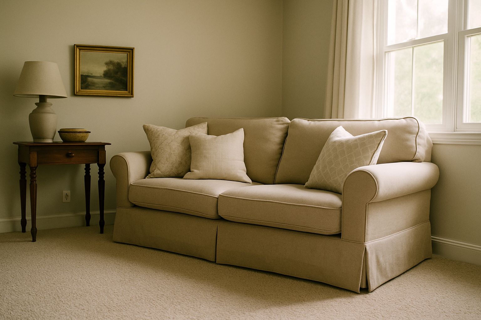
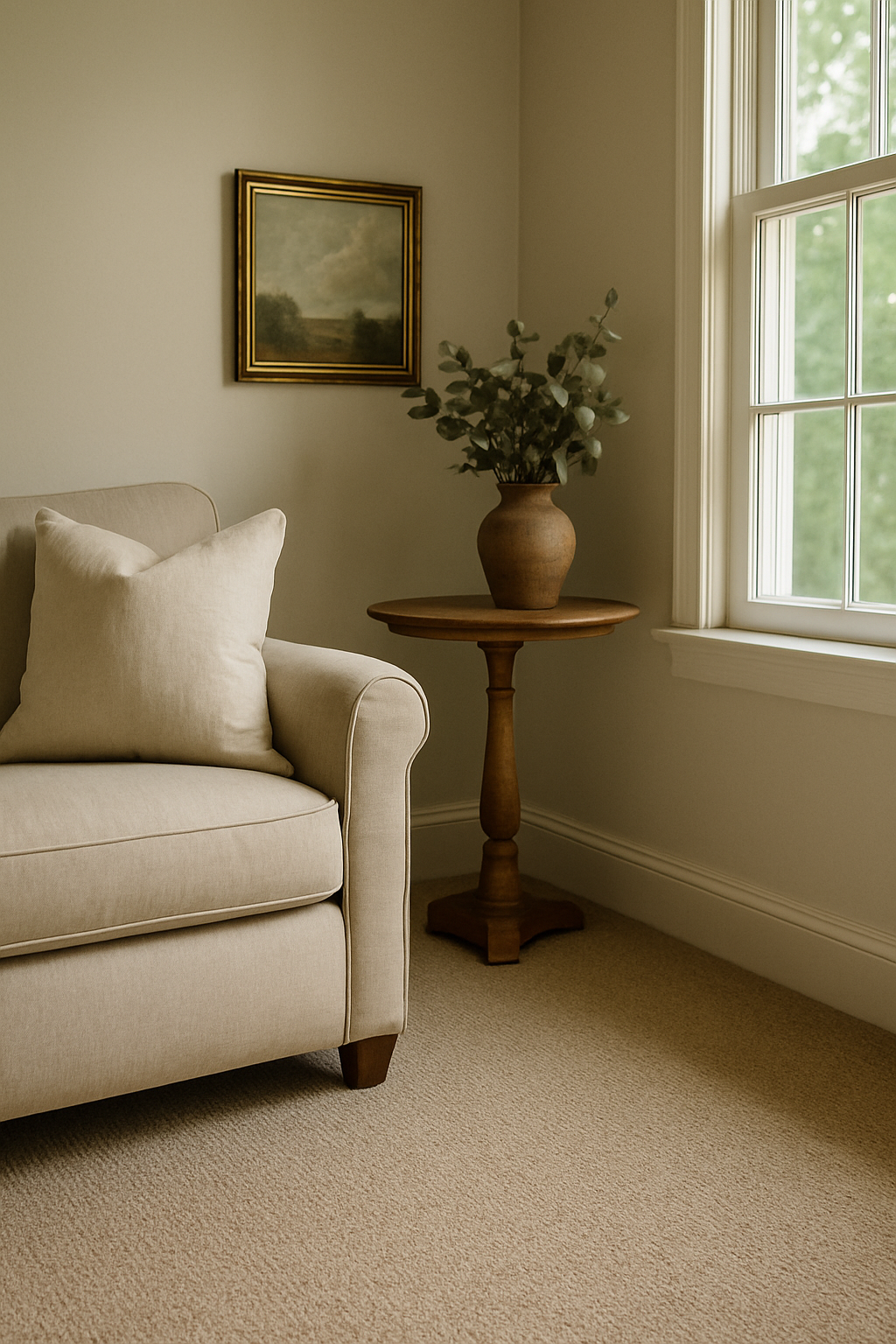
Number one on every list you’ll find for Edgecomb Gray carpet pairings is some version of “choose a greige or ivory carpet to complement the tone.” I understand the logic. I also think it produces ugly rooms.
Here’s what actually happens. Your wall is sitting at LRV 63 and your carpet lands somewhere close — say, Shaw Floors’ “Pebble Shore” greige, which comes in around LRV 58. You’ve got a contrast ratio of roughly 5 points between wall and floor. Anything below 15 LRV points of separation tends to read as muddy. Not cohesive, not minimalist. Muddy. Nothing for the eye to land on. Both surfaces start to look dirty rather than intentional.
Rooms under 200 square feet suffer the most from this.
My 160-square-foot bedroom got painted Edgecomb Gray and briefly carpeted in a soft greige loop pile. It looked smaller, dingier, slightly unwashed. My daughter said it looked like a hotel that had seen better days. She was eleven. She wasn’t wrong.
Matching the undertone is not the same as creating a workable palette. That rule gets repeated constantly and it leads people directly into greige-on-greige purgatory. You need contrast. You need something the room can push against. Edgecomb Gray’s warmth is honestly a gift here, because it opens the door to some genuinely beautiful carpet colors that people are too nervous to try.
Warm Saturated Carpets That Actually Work: Rust, Cognac, Terracotta
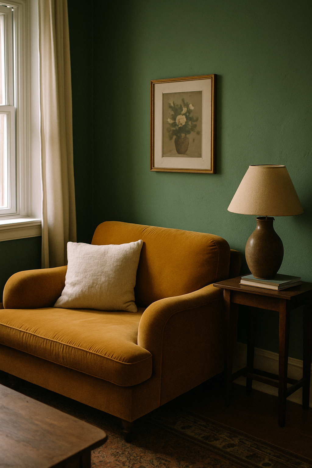
A cognac or rust carpet against Edgecomb Gray walls is the most underused combination in mainstream home decor, and it reads as intentional in a way greige never does. It looks like a choice. Because it is one.
Shaw Floors makes a carpet called “Rustic Revival” in Cinnamon Spice that I’ve recommended to three people in my neighborhood. It runs approximately $3.50 to $4.20 per square foot installed depending on your market. Against Edgecomb Gray it looks warm and grounded, full stop. The wall color stops shifting around and settles. Rooms feel finished in a way I can’t fully explain except that the contrast is doing the work it’s supposed to do.
Mohawk SmartStrand in the Autumn Harvest tones does something similar at a slightly lower price point, and the fiber holds up better than most things I’ve tested under a 70-pound dog who refuses to wipe his feet. Terracotta hues sitting in the Pantone 16-1546 family are your target range. Medium terracotta, not aggressively orange. Deep enough to provide contrast, warm enough to pull out the best version of the wall color instead of fighting it.
One practical note: keep pile height at 0.5 inches or less. A longer pile in a terra-toned carpet once competed visually with my walls in a way that felt claustrophobic — my contractor called it “two things yelling at each other.” He wasn’t wrong. Lower pile reads cleaner and lets the color do the work without the room feeling swallowed.
When Dark Carpet Works — and the Exact Shade That Does Not
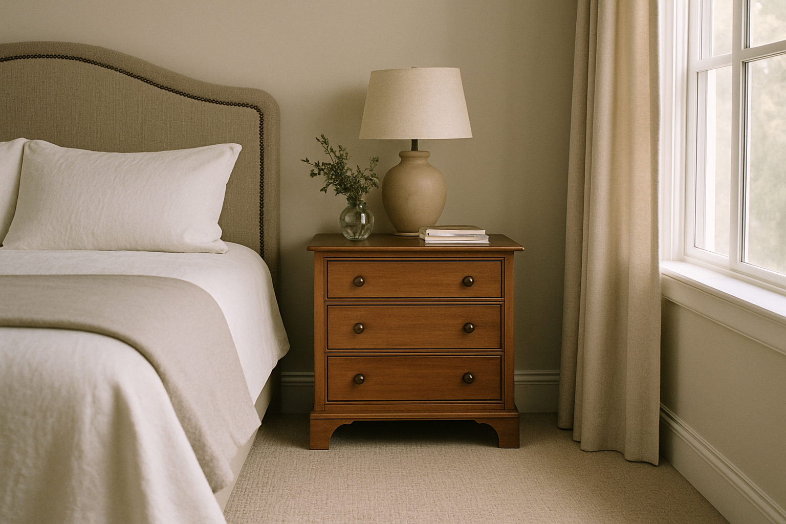
A near-black carpet is a braver and more successful choice with Edgecomb Gray than any mid-gray carpet will ever be. I know that sounds like a lot. It isn’t.
Carpets with an LRV below 20 create genuinely readable contrast against Edgecomb Gray’s LRV 63. Shaw Floors’ “Carbon Copy” charcoal sits at roughly LRV 12. Laid under Edgecomb Gray walls, it makes the room feel grounded and purposeful — honestly kind of sophisticated. Walls glow a little. Floor anchors. It works.
The problem zone is mid-tone gray carpet, specifically anything sitting in the LRV 35 to 45 range. Not light enough to read as contrast from above and not dark enough to create the separation the eye needs. It just sits there looking like a mistake. Not edgy, not neutral. Unresolved. Like you ran out of money or conviction halfway through a decision.
I’ve seen this in probably six different houses. It has never once looked on purpose.
If you’re going dark, commit. Espresso, deep charcoal, near-black in any warm-toned fiber. Stay below LRV 20 and you’re in safe territory. Mid-gray is the carpet equivalent of beige paint: it reads as indecision.
How Room Lighting Changes Which Carpet Color You Should Buy
Buying carpet based on a 3-inch sample under store lighting is the single most expensive mistake in home decor. I’ve made it twice. Edgecomb Gray is particularly unforgiving here because its undertone swing is wider than most people expect, and it will expose every mismatch.
Bulb temperature matters more than most people realize. At 2700K — the warm yellowish incandescent-style LED that most people use in bedrooms — Edgecomb Gray pushes toward yellow-beige. Cozy, but warm. In that light, a rust or cognac carpet looks incredible. At 4000K, the cooler daylight-style LED increasingly used in kitchens and home offices, the same wall pulls toward gray-green. A carpet that looked perfect under your 2700K floor lamp will look noticeably different by the kitchen pendants. Same paint. Different bulb. Different room.
So here’s what I actually do before spending a dime: bring home full-size samples and hold them against the wall for at least 24 hours. For a south-facing room, look at the combination at 10am and again at 4pm minimum. Light difference between those two times is not subtle. I’ve watched carpet samples shift through what looked like three entirely different colors between morning and late afternoon in my old living room — faces southeast, gets hammered by afternoon sun.
Carpet retailers will loan you larger samples if you ask. Some charge a small deposit, usually around $20. Worth every dollar.
Edgecomb Gray Bedroom vs. Living Room: the Carpet Rules Change
Bedrooms are the right place to try the bolder, saturated carpet color. Not the living room. You control the lighting almost entirely, traffic is low, and if you decide in six months you hate the rust carpet, the stakes and the footage are both smaller.
A bedroom handles a 28 to 32 oz face weight carpet just fine. That lighter weight works when you’re not running a path from the couch to the kitchen seventeen times a day. Colors can be more delicate, pile can be softer, and the room absorbs it.
Living rooms are different. You want carpet rated at 40 oz face weight or higher, and you want either depth of color or pattern to hide the wear lanes that develop in front of sofas and between doorways. A patterned Berber with terracotta and cream woven through it handles traffic lanes in a way a solid-color low-pile never will, and the terracotta in the pattern still pulls the best version of the Edgecomb Gray walls out.
My living room has had solid carpet twice and patterned Berber once. At year three, the Berber looked better than either solid carpet looked at year one. That’s the whole argument.
Three Combinations to Avoid Entirely, and Why They Keep Getting Recommended Anyway
These combinations keep appearing in roundups because bloggers copy each other rather than test the pairings. Honestly, a single afternoon with physical samples would eliminate all three from the list.
Cool gray carpet with an LRV above 50 creates an undertone clash with Edgecomb Gray’s yellow-beige base. Walls pull warm; carpet pulls cool. Neither wins. Benjamin Moore’s Wolf Gray family is the specific example I’d point to — blue-gray with a cool base creates a color temperature fight the room cannot resolve. Not subtle wrongness. Active, visible wrongness that gets worse in natural light.
Stark white carpet reflects the wall’s yellow undertone back at you and makes the walls look jaundiced.
I saw this in a staged home once and initially thought the seller had a water damage problem. They didn’t. Just white carpet under Edgecomb Gray walls with south-facing windows. Late afternoon light was doing something genuinely unflattering to the whole room — the trim looked gray-yellow and everything felt slightly sick.
Lavender-gray carpet is the third one. Sounds like it shouldn’t be a problem. It’s a significant problem. Cool violet base puts it in direct opposition to Edgecomb Gray’s warmth and neither color has enough saturation to carry the fight. Everything reads as faded, like it needs to be washed.
Assuming all greige and gray tones play nicely together is the root of all three of these mistakes. Undertone direction matters, LRV matters, and Edgecomb Gray has strong enough opinions about both that you can’t afford to be sloppy.