The beige carpet that looked perfect in the showroom turned the whole room the color of a fast-food booth the moment it met cherry wood floors. I know this because I did it. Paid $2,800 for wall-to-wall in my living room, lived with it for fourteen months, and then ripped it out. That’s the tax on not understanding what cherry wood actually is.
Why Cherry Wood Is a Harder Color Match Than People Expect
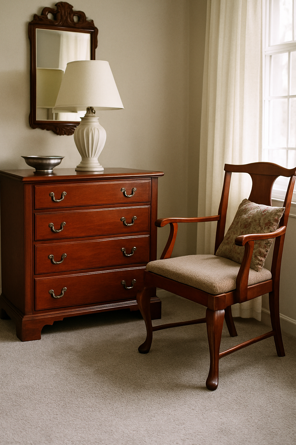
Most people call cherry “a warm brown” and move on. That’s the mistake. Cherry isn’t brown with red in it. It’s closer to a darkened red with brown as the secondary note, and that distinction wrecks every casual color decision you make around it. Its Munsell hue sits around 5R to 7.5R — red territory, not brown territory. Walnut lives comfortably in the yellow-red range and behaves like a neutral because it doesn’t fight you. Cherry fights.
It also changes. Cherry wood is photosensitive, and it shifts roughly 15–20% redder in hue within the first six months of light exposure. So the furniture you buy in January is not the furniture you’re decorating around by July. Most finished cherry reads between LRV 12 and LRV 22, which puts it in the dark, light-absorbing range. It’s not just sitting there being brown. It’s actively pulling red into whatever room it occupies, and it gets more aggressive over time.
Treat it the way you’d treat walnut or oak — some calm neutral anchor you build around — and you will be disappointed. Cherry demands to be accounted for, not accommodated.
The Warm Neutral Trap: Beige and Cream Are Usually Wrong
Beige carpet accounts for roughly 40% of all residential carpet sales in the US. That’s why this advice is everywhere. It’s not good advice. It’s volume-based advice that serves showroom photography and not actual rooms.
Here’s what happens at the undertone level. Beige, sand, ivory, most creams — these carpets carry a yellow-red undertone. Technically, carpets in the LRV 60–75 range with that yellow-red base are the worst offenders. When you put that carpet next to cherry, you’re not creating harmony. You’re stacking two warm-red-adjacent tones on top of each other, and the result reads as mud. The room shrinks visually, the wood loses its depth, and everything looks like it arrived from the same slightly unfortunate color family.
If you’ve ever painted a wall Benjamin Moore Pale Oak OC-20 in a room with cherry furniture and wondered why the whole thing felt dingy, that’s exactly this problem. That paint color has enough yellow-red in it to reinforce cherry’s undertones rather than contrast them. I had a paint sample of it taped up in my hallway for a week before I figured out why I kept walking past it feeling vaguely depressed. Multiply that across 300 square feet of carpet and you’re living inside a monochrome experiment that nobody signed up for.
Matching warmth to warmth sounds like harmony. With high-saturation wood tones it creates visual noise. The room feels smaller, flatter, somehow dirty even when it’s clean.
Cool Gray Is the Right Call, but Only the Right Gray
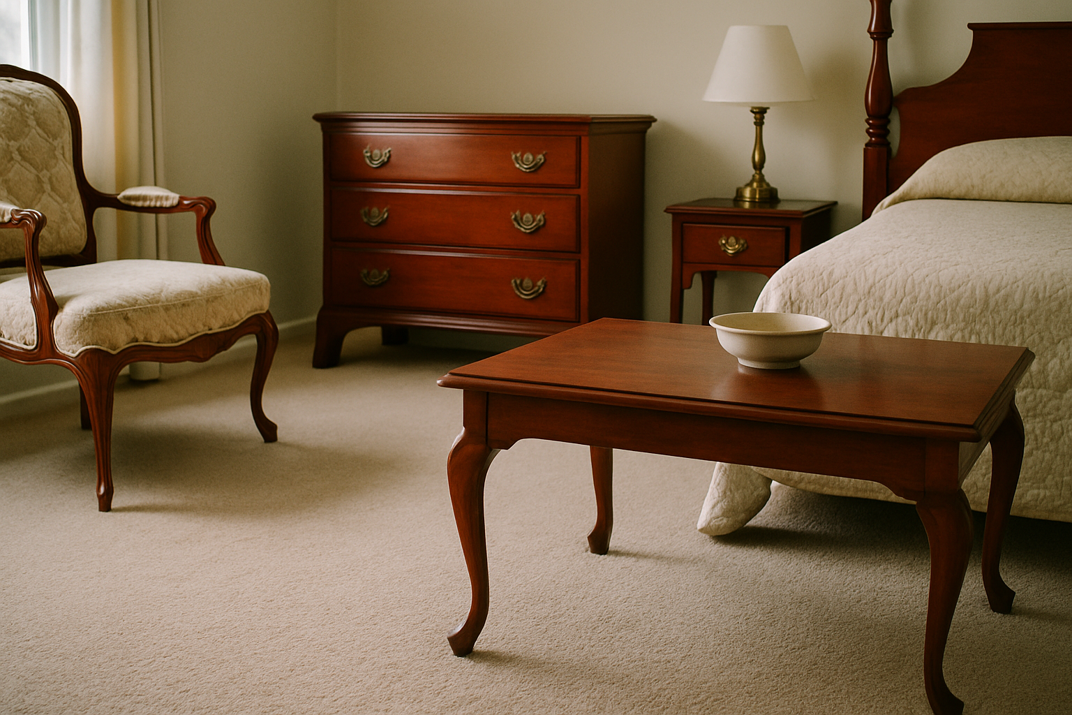
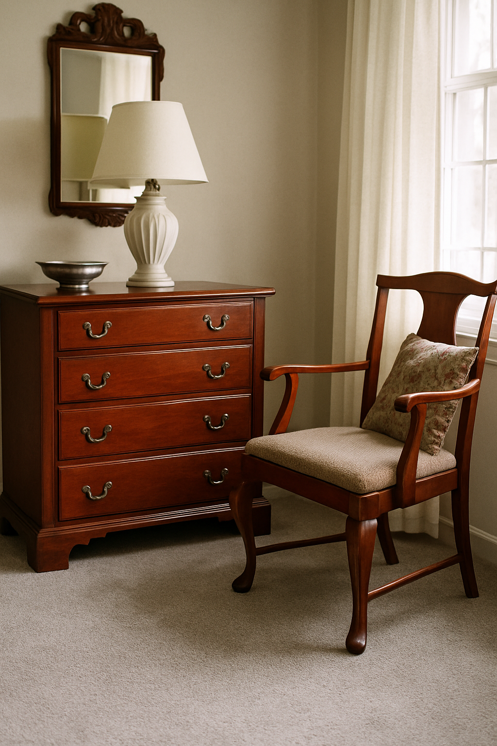
A true cool-to-neutral gray carpet is the single most sophisticated choice for cherry wood. Not a compromise. Not a safe fallback. The actual answer that high-end residential designers use when they’re working with serious cherry furniture and they don’t want the room to look like a furniture showroom.
The reason it works is contrast at the undertone level. Gray with a slightly cool or neutral base sits opposite cherry’s red-orange on the color temperature spectrum. It doesn’t fight the wood. It frames it. The cherry reads deeper and richer. The room has visual breathing room.
But you have to pick the right gray. Target an LRV between 45 and 58 for most room sizes — lighter reads washed out, darker starts competing with the furniture’s own depth. Shaw’s Quiet Comfort line in the colorway Pewter is a concrete example that works in practice. I’ve seen it in three different rooms with cherry and it holds up across lighting conditions. What you want to avoid is any gray with a b* value below -4 on the CIELAB scale. Those grays lean blue, and blue plus cherry’s red creates a visual tension that reads as purple at certain times of day. Not intentional purple. Accidental, unflattering purple.
Warm-gray and true greige carpets — emphasis on the gray side, not the beige side — thread this needle well. Pull paint chip comparisons if you need a reference. If the gray you’re considering looks noticeably pink or lavender next to a white card, pass on it.
Deep Jewel Tones That Actually Work: Navy, Forest Green, Plum
This is the option most homeowners won’t try. That’s too bad, because it works better than almost anything else.
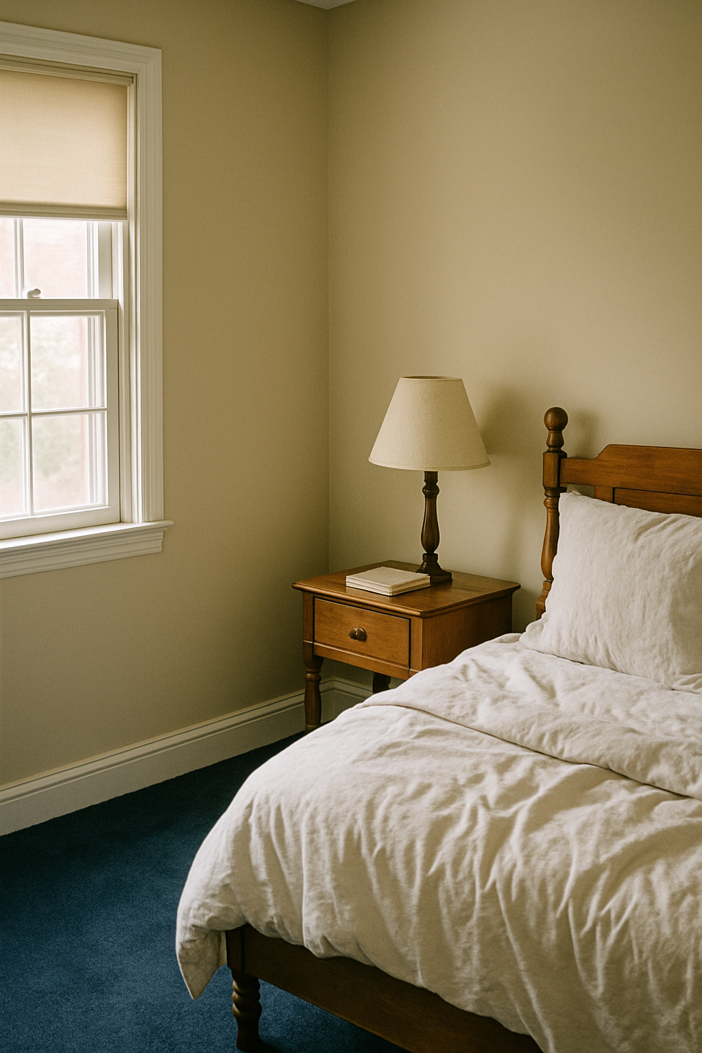
Navy carpet with cherry furniture gives the warm red tones something substantial to push against. In a room under 250 square feet, a navy carpet in a 40–50 oz face weight reads as a near-neutral anchor. It grounds the space without flattening it. Mohawk’s SmartStrand in Midnight Teal runs around $3.50–$4.20 per square foot installed, which is mid-range pricing for a result that looks genuinely intentional.
Forest green works too, but only with a blue undertone. Yellow-green is a mistake. It clashes at the undertone level for the same reason warm beige does. The green you want sits opposite red on the color wheel at roughly 150–165 degrees — blue-green territory, not lime, not olive. It creates real chromatic contrast and lets the cherry furniture be the warm element in the room without competition.
The objection I always hear is that dark carpet makes rooms feel small. That’s not quite right. LRV affects perceived ceiling height more than floor darkness does. A deep carpet with light walls actually expands vertical perception because your eye reads the room as tall before it reads it as dark. The rooms I’ve seen with navy carpet and pale gray or off-white walls feel larger than the same rooms with mid-tone beige throughout. Beige floor to beige wall to beige trim collapses the room into itself — I watched that happen in my own house before I repainted.
These rooms look like someone made choices. That’s the goal.
Texture and Pile Height Change the Color Equation
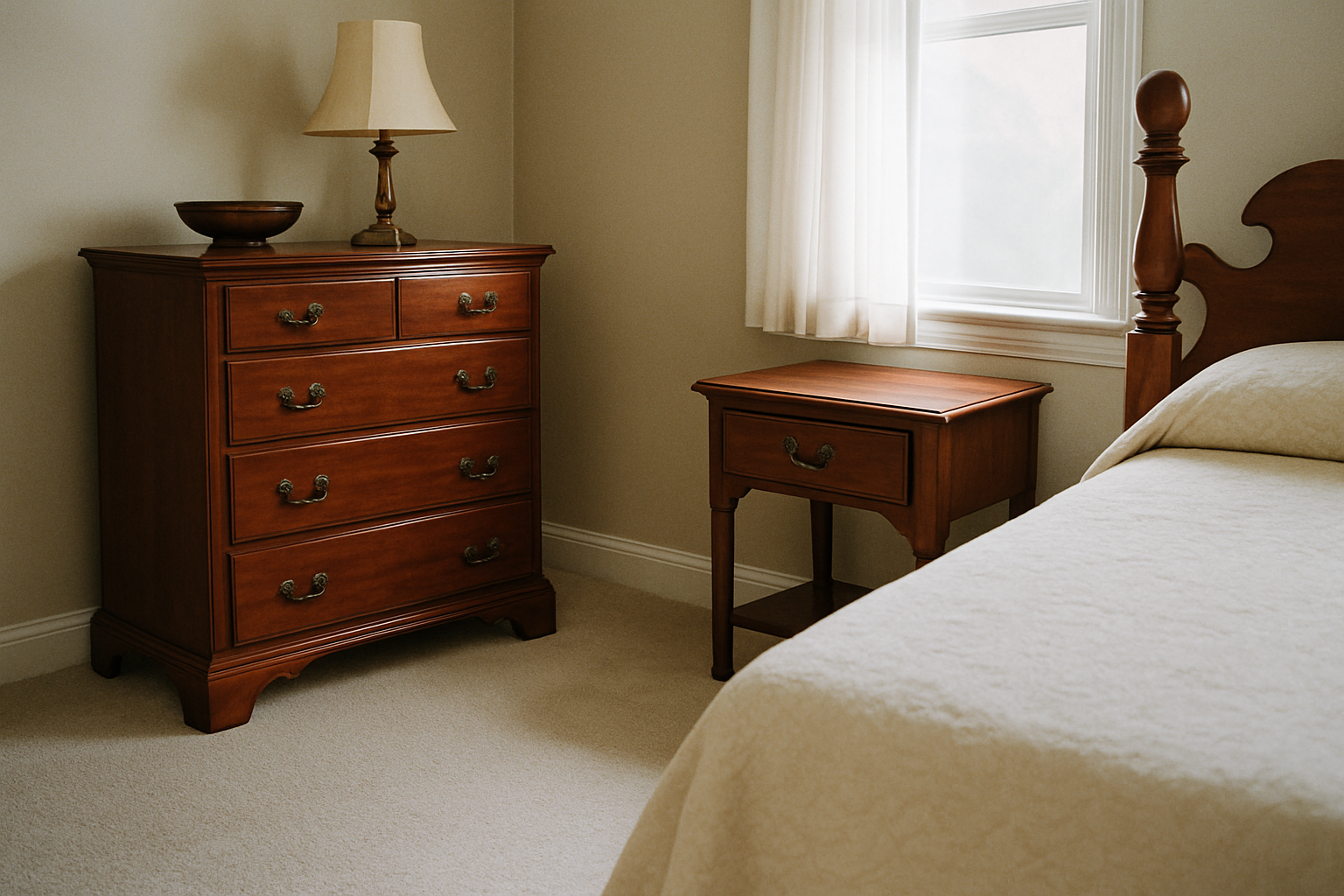
This part gets ignored constantly and it causes expensive regret. The dye lot doesn’t fully tell you what you’re getting, because pile structure changes how color reads.
A Saxony cut pile at 3/4 inch height reads roughly 10% lighter than a frieze cut from the same dye lot. The reason is light reflection. The upright fibers catch and bounce light, which lightens the apparent color. Frieze cuts have twisted, irregular fibers that absorb more light. No carpet pile type reliably matches paint swatches — textile and paint scatter light by fundamentally different mechanisms, so that comparison will mislead you regardless of pile height. The only way to assess undertone accurately is a large sample viewed in the actual room under its actual lighting.
High-pile shags absorb light and can shift apparent LRV by 8–12 points darker than what the swatch suggests. Honestly, I learned this the hard way — ordered a light gray shag sample that looked almost white in the store and landed in my bedroom looking like a storm cloud. Same color. Different pile. Completely different room.
One more thing on pattern carpets: anything with a repeat larger than 18 inches creates a competing focal point that pulls attention away from cherry’s grain. Cherry furniture is already a visual event. A large-repeat pattern carpet turns the floor into a second visual event. One of them loses.
Room Lighting Overrides Every Color Rule You’ve Read
The showroom where you’re looking at carpet is lit at approximately 4000K fluorescent. Almost no residential room matches this. So the color you’re evaluating under those lights is not the color you’re buying.
North-facing rooms receive daylight at roughly 6500K–7500K. That cool, blue-heavy light shifts warm wood tones toward red-purple. My house has a north-facing sitting room, and the cherry desk in there looks different in December at 4pm than it does in August at noon — darker, more complex, sometimes almost violet in the shadows. The carpet that looked like a balanced cool gray in the showroom may suddenly look lavender against that furniture in winter light.
South-facing rooms push cherry redder. More light, warmer light, more of cherry’s natural photosensitivity activated. The same furniture looks orange-red rather than burgundy-brown. Your carpet needs to account for that.
Evening is its own problem. Incandescent bulbs at 2700K can make a correctly chosen gray carpet appear beige in the evening. I’ve watched this happen in my own den. The carpet I specifically chose for its cool undertone goes golden at night under warm bulbs. Not wrong, but worth knowing before you commit.
Buying carpet based on a showroom sample is nearly useless for cherry wood rooms. The light conditions are wrong, the comparison pieces are wrong, and the sample is too small to give you accurate information. There’s only one method that works.
The One Test That Replaces All the Guesswork
Order a minimum 12×12 inch sample. Most retailers charge $5–$15 per sample and apply it toward your purchase. If a retailer won’t send a large sample to your home, find a different retailer. Full stop. A purchase that’ll last 10–20 years cannot be made responsibly on a 2×2 inch card. That size is too small to reveal undertone behavior, too small to show texture light interaction, and too small to tell you anything reliable.
Carpet One and LL Flooring both run sample programs that allow up to three free samples before purchase. Use them. Order all three at once if you’ve narrowed to finalists.
When the samples arrive, place them on the floor next to your actual cherry furniture. View them at 9am and again at 8pm in the actual room. Not the same day necessarily, but both light conditions before you decide. Morning light and evening tell completely different stories about the same carpet. Midday too, if you can manage it.
Here’s the specific test I use now, after the $2,800 beige mistake and two more smaller ones after that. Hold a piece of white paper next to both the carpet sample and the cherry furniture. If the paper looks yellow or pink next to that combination, the carpet is pulling warm and reinforcing cherry’s undertones — that’s the muddy effect in embryo. If the paper still reads as clean white or faintly cool, the carpet is sitting in contrast to the wood rather than agreeing with it. That’s where you want to be.
Cherry wood doesn’t give you much margin for lazy decisions. But it rewards the specific ones.