People are finally realizing that “fan room” doesn’t mean “kid room.”
I think it’s because so many of us grew up with this story, and now we’re decorating our first real homes.
We want our spaces to reflect us, not just our childhood bedroom wallpaper.
There’s something so satisfying about walking into a room and feeling both cozy and a little bit epic.
When my brother-in-law’s room was done, his fiancée actually said it felt like a boutique hotel with a secret.
That’s the vibe.
Not loud.
Not cluttered.
Just quietly confident, you know?
The trick is treating the theme like a whisper instead of a shout.
You lean on mood, materials, and a few iconic moments instead of covering every wall with logos.
It’s sort of like cooking with one bold spice instead of dumping the whole cabinet in.
A little goes such a long way.
And honestly, that restraint is what makes it feel expensive, even when it’s not.
I always tell people, the goal isn’t “themed room.”
The goal is “a room that happens to love something deeply.”
There’s a difference, and your eyes can feel it the second you walk in.
Start With a Color Palette That Feels Cinematic, Not Cartoonish
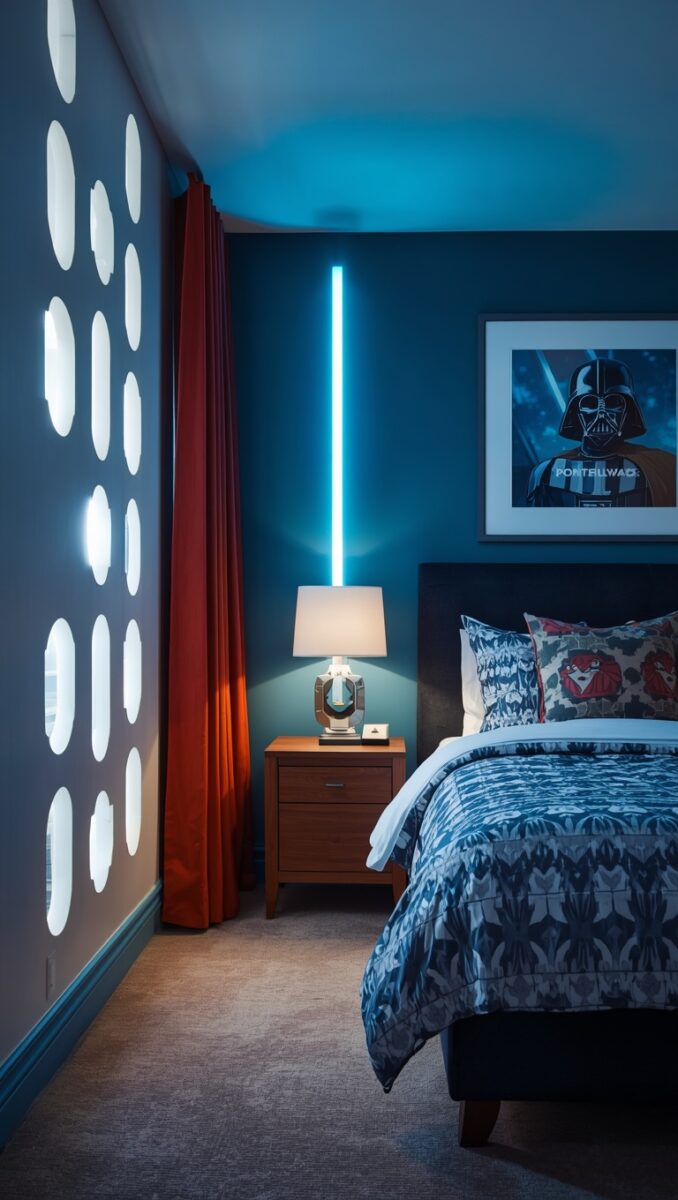
Forget primary colors.
Forget the bright yellow and red combo that screams playroom.
Think charcoal, deep navy, warm black, and a touch of bronze or brushed gold.
These are the tones straight out of the films themselves, the ones that feel like deep space and old leather and quiet power.
When I helped pick paint for that guest room, we landed on a soft graphite gray for the walls.
It felt moody in the best way, like dusk in a really good photograph.
Then we added warm wood tones for contrast, because all dark and cold can feel a little sterile.
A little brass lamp.
A leather chair.
Suddenly it’s warm again, not cave-like.
If you want a pop of color, pull it from a single source, like a deep red accent pillow or a rust-orange throw blanket.
One pop, not five.
My tip here, always test your paint swatch at night under lamp light, not just daylight, because that’s when this kind of room really gets to shine.
And if you’re renting and can’t paint, peel-and-stick wallpaper in a deep charcoal or starfield print can do almost the same trick.
It’s such an easy weekend project, and it instantly sets the tone for everything else in the space.
Let Lighting Do the Heavy Lifting
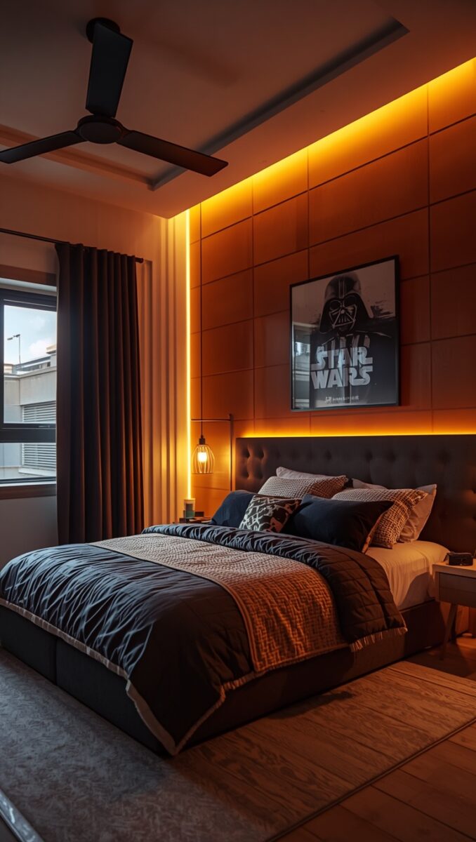
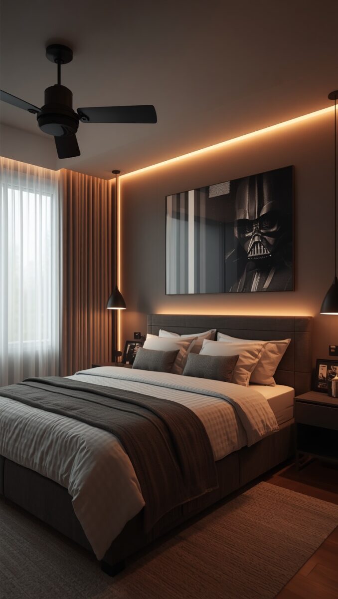
Lighting is honestly the most underrated trick in any themed room, and especially this one.
Skip harsh overhead lighting completely if you can.
Go for layered light instead, like a floor lamp, a desk lamp, and maybe some hidden LED strips behind a shelf or headboard.
Warm white, not cool blue, unless you’re specifically going for a more sci-fi glow in one corner.
I love a soft strip of LED tucked behind a headboard on a dimmer.
It creates this glow that feels like a spaceship cockpit at rest, calm but alive.
When my brother-in-law turned his on for the first time, he just stood there grinning like a kid, but the room still looked completely adult.
That’s the magic of lighting, it does emotional work that furniture alone can’t.
A small hack, use a warm-toned smart bulb you can dim from your phone, so the room can shift from “bright and functional” in the morning to “moody movie night” after dark.
If you want one slightly playful touch, a small lightsaber-shaped lamp on a nightstand is genuinely sweet without being over the top.
It’s a wink, not a costume.
And if I had a small bedroom to redo this weekend, lighting is the very first thing I’d tackle, before paint, before furniture, before anything else.
One Hero Piece Beats Ten Random Trinkets
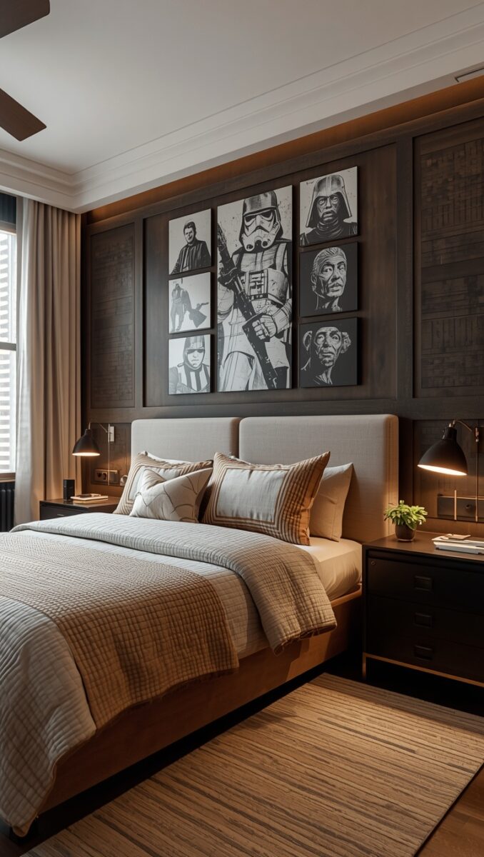
Here’s a rule I live by in basically every room I style, themed or not.
Pick one hero piece and let everything else support it quietly.
For a Star Wars room, that could be a beautifully mounted helmet replica, a large framed concept art print, or even a single iconic figure displayed like a sculpture, not a toy.
When we did my brother-in-law’s room, we chose a Mandalorian-style helmet on a simple black stand, lit from below with a tiny puck light.
It looked like something you’d see in a gallery, not a bedroom.
Everything else in the room got quieter once that piece had its moment.
Fewer posters.
Fewer figures left out on shelves.
Just space to breathe around the one thing that really matters to him.
My honest tip, choose the piece that means the most to your personal story with this universe, not just whatever’s trending.
Maybe it’s the ship your dad loved, or the character you dressed up as one Halloween.
That emotional thread is what makes a room feel like a memoir instead of a museum gift shop.
And displaying it well, with proper lighting and a little breathing room around it, instantly elevates the whole space.
It tells your guests this matters to me, rather than I bought a lot of stuff.
Vintage Poster Art Is My Favorite Cheat Code
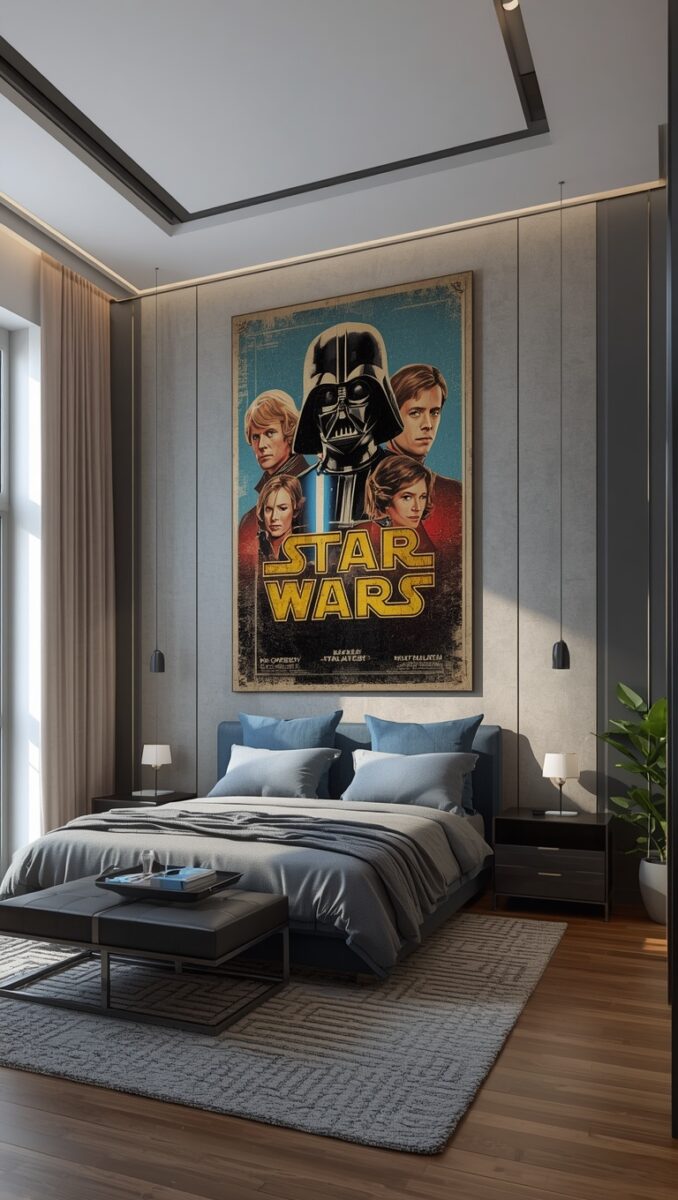
If I’m being honest, this is probably my favorite trick in the whole post.
Original-style movie posters, especially the vintage international ones, look like genuine art.
They’re painterly, sort of dreamy, with that hand-illustrated quality you just don’t get from modern glossy prints.
Frame one or two in simple black or walnut frames and hang them with real intention, not crammed together.
Give them space on the wall like you would a piece from a gallery.
I did this in my own reading nook with a totally different film, and people always ask where I got “that art,” not “that poster.”
That’s the compliment you’re going for.
A styling tip, choose a single large piece over a cluttered grid of small ones.
One big, beautifully framed print has so much more presence than six tiny ones competing for attention.
If budget’s tight, even a high-quality print from a poster shop in a great frame can look incredibly elevated.
The frame is honestly doing half the work here, so don’t skimp there if you can help it.
Matte black metal or a rich walnut wood both read as grown-up and intentional.
And avoid those plastic poster clips if you can, they instantly read as dorm room rather than dream room.
Built-In Shelving Turns Collectibles Into Decor
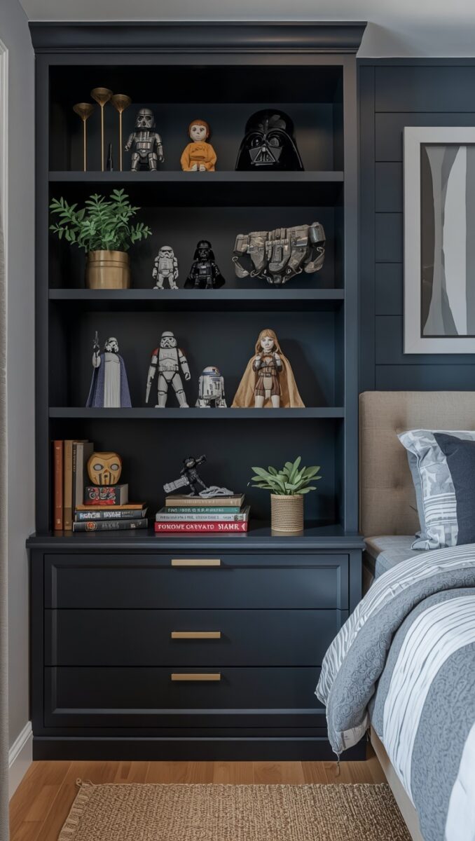
Open shelving is sort of a love letter to your collection, but only if it’s styled with care.
Random figures crammed onto a cheap shelf reads as clutter.
The exact same figures, spaced out with intention on a clean floating shelf, read as curated.
It’s wild how much display style changes the entire feeling of a room.
When I helped style my brother-in-law’s shelves, we used the rule of three, grouping items in small clusters of three with little gaps of negative space between them.
We also mixed in a few non-Star Wars objects, like a stack of books or a small plant, to keep it feeling like a real adult lives there.
That mix is everything.
It says, I love this thing, and I also have a whole life outside of it.
A little hack, paint the back wall behind open shelving a slightly darker shade than the rest of the room.
It creates depth and makes everything displayed there pop, almost like a little gallery wall within your wall.
Floating shelves in a warm wood or matte black both work beautifully here.
And please, for the love of cozy homes, dust them regularly, because nothing kills the elevated vibe faster than a dusty figure under a spotlight.
Mix In Textures Like Leather, Brushed Metal, and Concrete
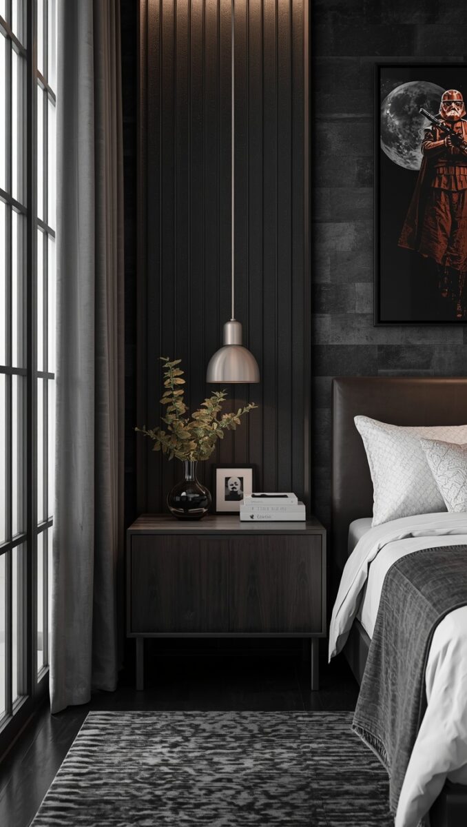
Texture is what separates a cool, layered room from a flat one.
Think about the actual world of this story for a second, all that worn leather, scratched metal, weathered stone.
You can bring that feeling in through your materials without a single logo in sight.
A leather accent chair.
A concrete-look side table.
Brushed steel drawer pulls instead of shiny brass ones.
These tiny choices add up to a room that feels lived-in and rich, almost like a set from the films themselves.
When we redid that guest room, we swapped the plain white closet doors for a Matte black hardware upgrade, just new handles and a little paint.
It cost barely anything, but it changed the whole feel instantly.
My tip here, walk around your space and touch everything.
If it all feels smooth and plasticky, that’s your sign to add one or two textured pieces.
A wool throw blanket, a leather journal on the nightstand, a rough linen pillow cover.
These little tactile moments make a room feel expensive and intentional, even on a real budget.
And texture photographs beautifully too, so if you ever post your space, this is what makes people stop scrolling.
Create a Little Cantina Corner for Reading or Unwinding
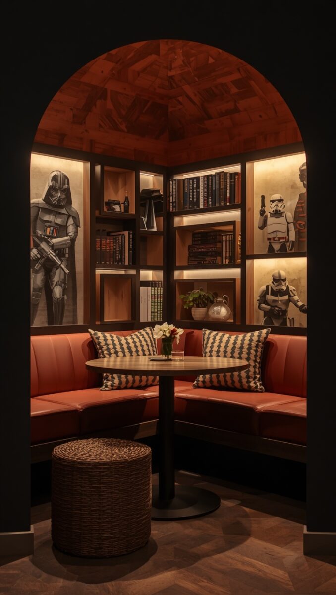
Every great room needs a spot that’s just for you, somewhere to curl up and exist for a minute.
I call this the cantina corner, your own little hideaway with a story to it.
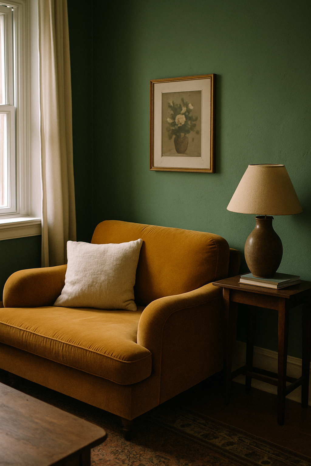
A worn leather armchair, a small round side table, maybe a string of warm fairy lights tucked along a shelf edge.
Add a soft throw blanket and a stack of your favorite books or comics nearby.
This corner doesn’t need to be themed loudly at all.
It just needs to feel like a place you’d actually want to disappear into with a cup of tea.
When I set one up in my own apartment years ago, it became my favorite five square feet in the entire place.
I’d sit there most evenings, and it genuinely felt like my own little hideout from the world.
A small tip, layer in a rug underneath, even a small one, because it grounds the whole corner and makes it feel like its own defined space rather than a random chair shoved in the corner.
If you want a subtle nod to the theme here, a single small model ship on the side table is plenty.
Resist the urge to add more.
This corner is about feeling, not about decoration.
A Galaxy Map or Blueprint Wall Can Replace a Headboard
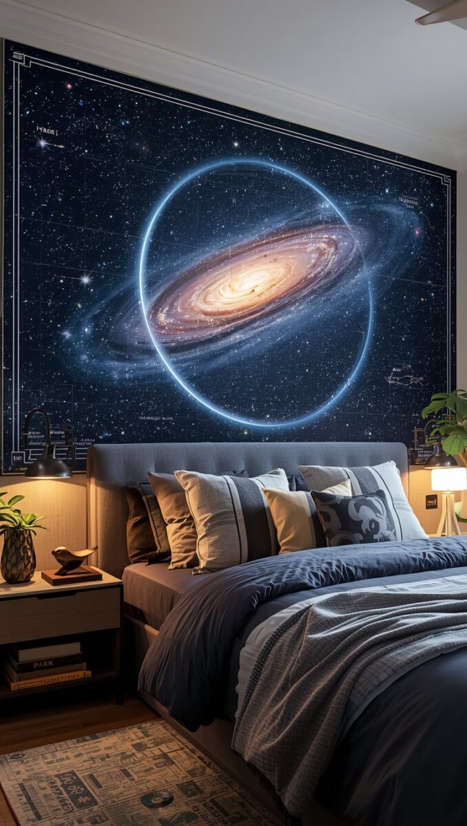
If you want a real wow moment without buying expensive furniture, try this one.
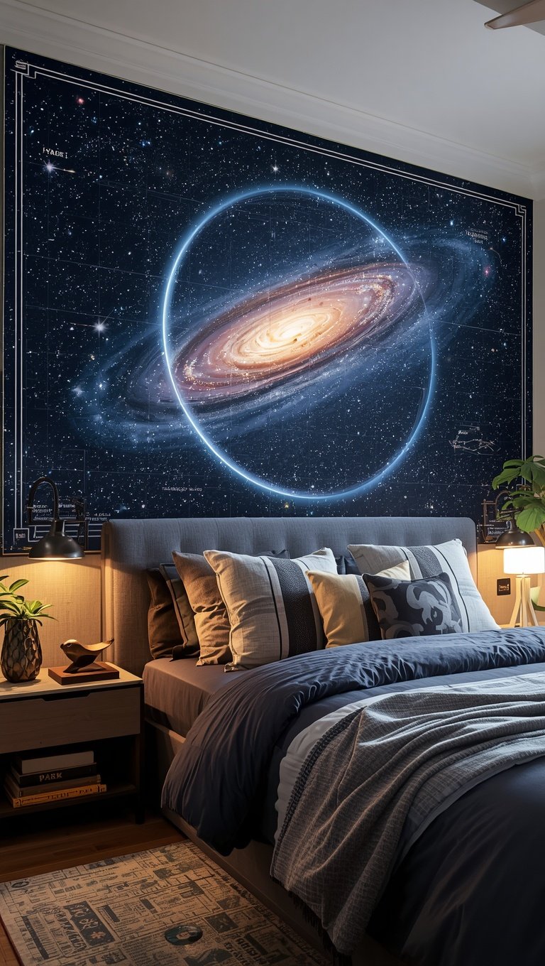
Instead of a traditional headboard, create a large-scale wall feature behind the bed.
A blown-up star map, a ship blueprint print, or even hand-painted constellations can all work beautifully here.
It draws the eye immediately and gives the whole room a focal point that feels custom, even if it wasn’t expensive.
I did something similar with a vintage map in my own bedroom, just on a totally different theme, and it instantly became the first thing every guest commented on.
People always assume it cost so much more than it actually did.
A tip, you can find large blueprint-style or star-chart prints from poster shops and have them mounted on foam board for a clean, gallery-style finish.
It looks custom-framed without the custom-framed price tag.
Keep the rest of the wall bare around it, no extra art competing for attention.
Let that one piece breathe.
This is one of those ideas I genuinely recommend even outside of a themed room, because a giant, beautiful print behind a bed just elevates everything instantly.
It’s such an easy, high-impact swap for a weekend project.
Keep Bedding and Textiles Soft and Muted
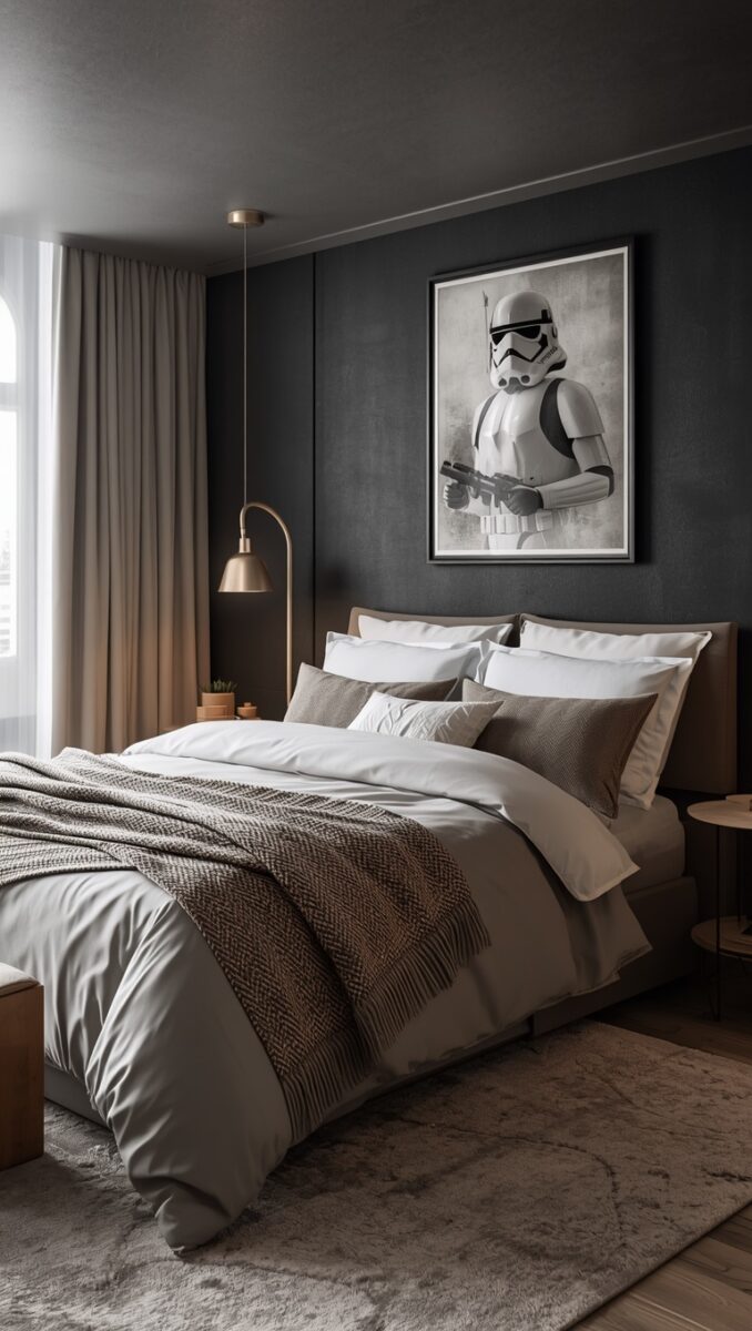
Bedding is where so many themed rooms go wrong, with bright printed sheets that instantly read as juvenile.
Skip that completely.
Go for solid, soft, hotel-style bedding in cream, charcoal, deep navy, or warm taupe instead.
Then bring in the theme through texture and small accent pieces, like a single charcoal throw pillow with subtle embroidery, or a textured wool blanket folded at the foot of the bed.
This is honestly the easiest swap on this whole list, and it makes the single biggest visual difference in the room.
When we redid my brother-in-law’s bed, we just swapped his old printed comforter for a simple matelassé coverlet in deep gray.
The room aged up by about ten years overnight, in the best way.
My tip, invest in one really good quality solid sheet set rather than several cheap printed ones.
It softens the whole room and gives your eye somewhere calm to land after taking in everything else.
You can always add a small themed accent pillow if you want a playful touch, just keep it to one, maybe two at most.
Cozy and grown-up can absolutely coexist on the same bed.
A Tech Nook That Feels More Millennium Falcon Than Man Cave
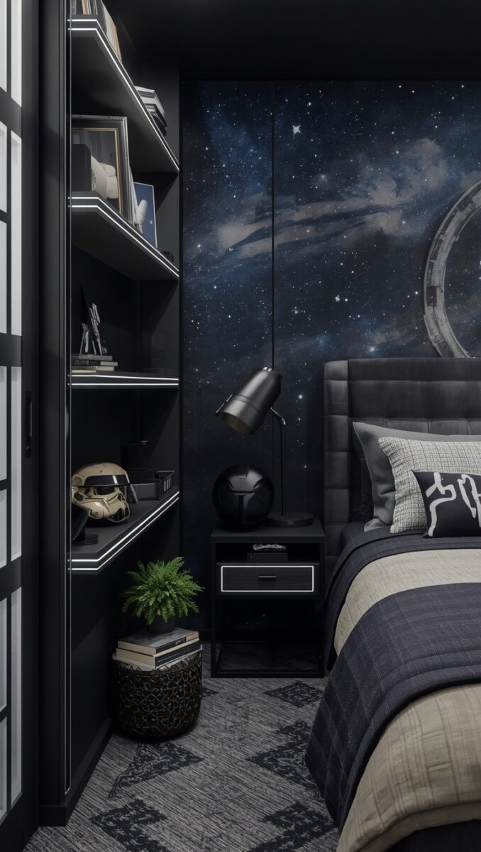
If your room includes a desk or gaming setup, this is your chance to lean into the theme in a really satisfying way.
Think warm task lighting, cable management that’s actually tidy, and a few carefully chosen accent pieces instead of a desk covered in clutter.
A small LED strip behind a monitor in a warm amber tone can instantly make the whole setup feel more like a cockpit and less like a teenager’s homework station.
Add a leather desk mat instead of a plastic one.
Swap a generic desk lamp for something with a little more character, maybe brass or matte black.
When my brother-in-law set his desk up this way, it genuinely looked like something out of a design blog, not a gaming forum.
My hack here, hide your cables completely, even cheap cable sleeves make a massive visual difference.
A cluttered cord situation will undo all your other styling work in about two seconds flat.
Keep the desk surface mostly clear, with just your hero piece and maybe one small plant for life and softness.
This little corner can absolutely be your favorite spot in the whole room if you give it the same care as the rest of the space.
Let It Still Feel Like Your Home, Not a Set
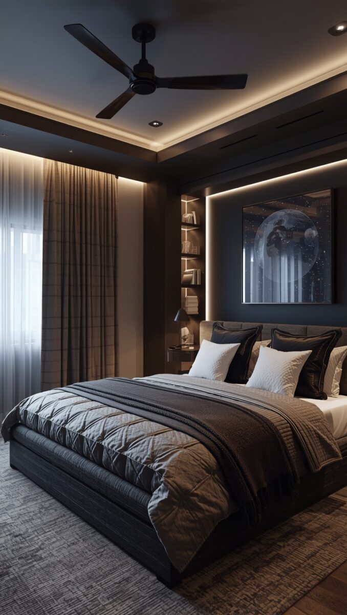
At the end of the day, my favorite themed rooms are the ones that still feel deeply personal beyond the theme itself.
Mix in family photos.
Mix in books you actually love that have nothing to do with this universe.
Mix in a plant, a candle, a blanket your grandma made.
This is what keeps a themed space from feeling like a stage set or a fan convention booth.
When my brother-in-law’s room was finally finished, what struck me most wasn’t the helmet or the lighting or any single piece.
It was how much it still felt like him, just a slightly more elevated, more intentional version of him.
His fiancée moved in two months later, and she told me she actually loved the room too, which honestly surprised both of us a little.
My last little tip, before you call a themed room finished, walk in and ask yourself if a stranger would know this is your home, not just a tribute room.
If the answer is yes, you’ve absolutely nailed it.
And if it’s still feeling a touch too costume-y, just pull one or two themed pieces out completely.
Sometimes less truly is the secret to a room that feels both deeply loved and beautifully grown-up.