I’ll be honest — my living room used to give me a low-key headache every time I walked in. Not because it was ugly, exactly. It just felt… off. Like a sentence missing a word. I’d been collecting pieces I loved individually, but together they looked like a garage sale had opinions. Then someone in my favorite home decor group mentioned the 60-30-10 rule, and I sort of rolled my eyes. A formula for color? Really? But I was desperate enough to try anything, so I committed to a full 30 days of living inside this rule and documenting everything. What happened surprised me more than I expected.
What the 60-30-10 Rule Actually Is (No Design Degree Required)

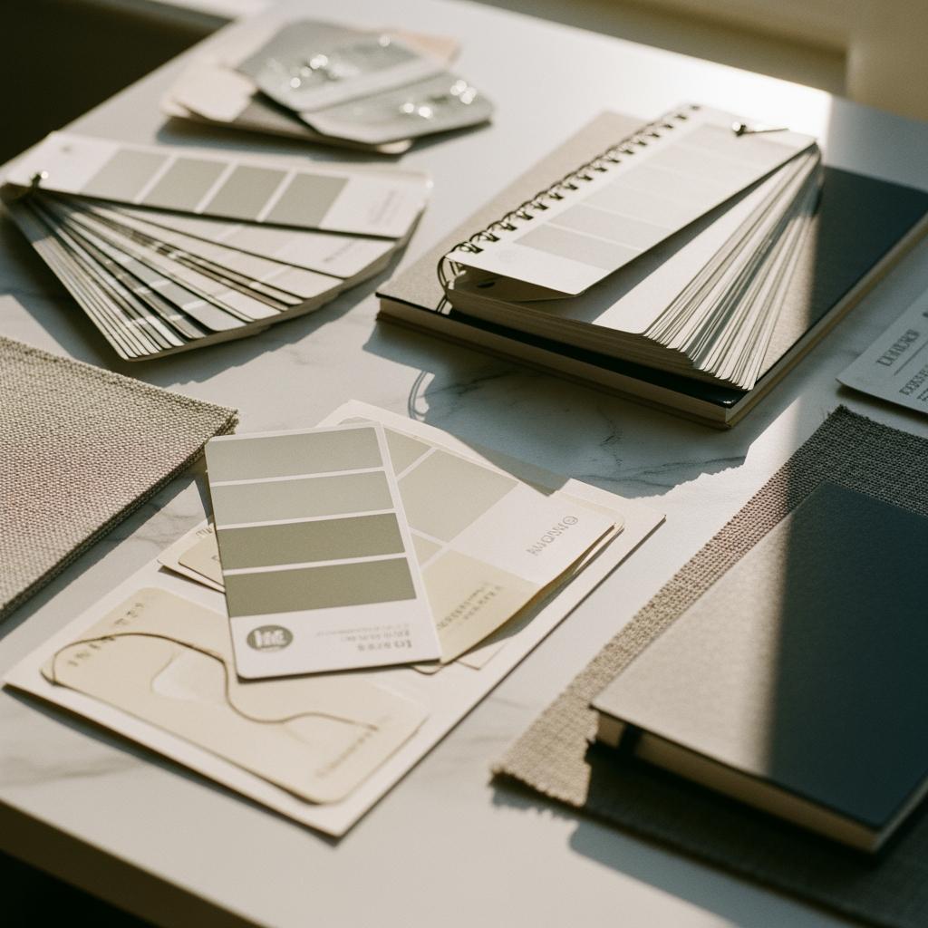
The concept is simple. Sixty percent of your room’s color is your dominant hue — walls, large furniture, rugs. Thirty percent is your secondary color — accent chairs, curtains, a bookshelf. And ten percent is your pop color, the stuff that makes you say ‘oh, that’s intentional.’
I’d seen it mentioned in passing a hundred times but never actually sat down and mapped it out for my own space. Big mistake. Because once you understand the proportions, you start seeing every room differently.
It’s a guideline, not a law. And I think that distinction matters a lot.
When I first read about it, I assumed it was just for people doing full renovations. Turns out you can apply it to what you already own. That’s what I did.
My Starting Point Was… Not Great
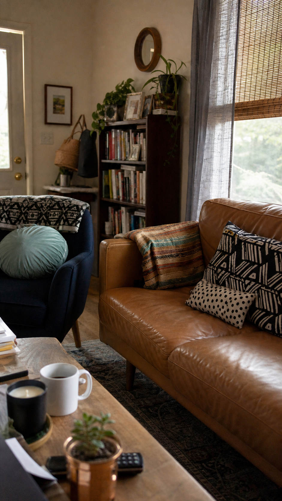
Okay, real talk. My living room before this experiment was a mix of sage green walls, a warm caramel sofa, a navy accent chair I bought on impulse, two different wood tones in the furniture, and a rug that I loved in the store but was sort of pulling in its own direction at home.
Every single item was something I’d chosen intentionally. But together? Chaos.
When I actually sat down and tried to identify my 60-30-10 split, I realized I didn’t have one. I had more like a 30-25-25-20 situation, which isn’t a color palette — it’s an argument.
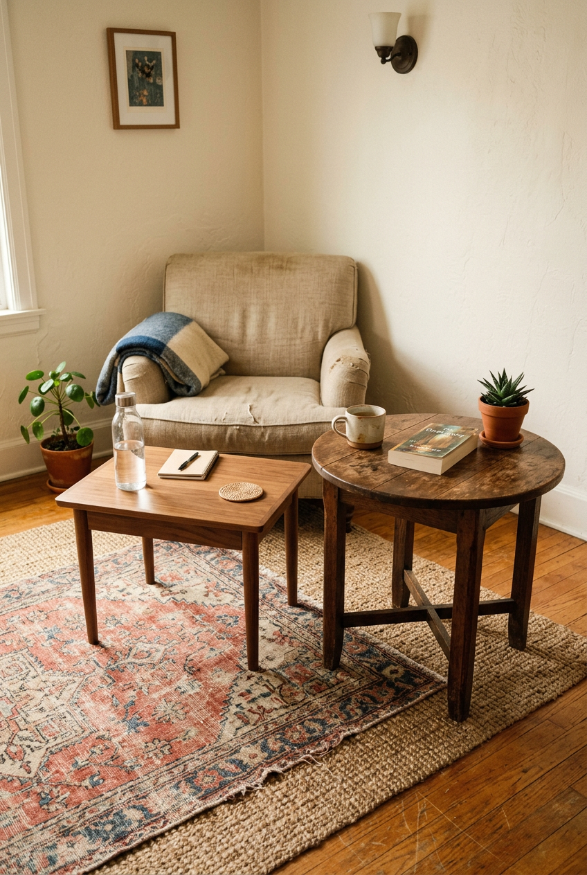
That was the wake-up call. Not that my taste was bad, but that I’d never given any one color permission to lead.
Choosing My Dominant 60% Color
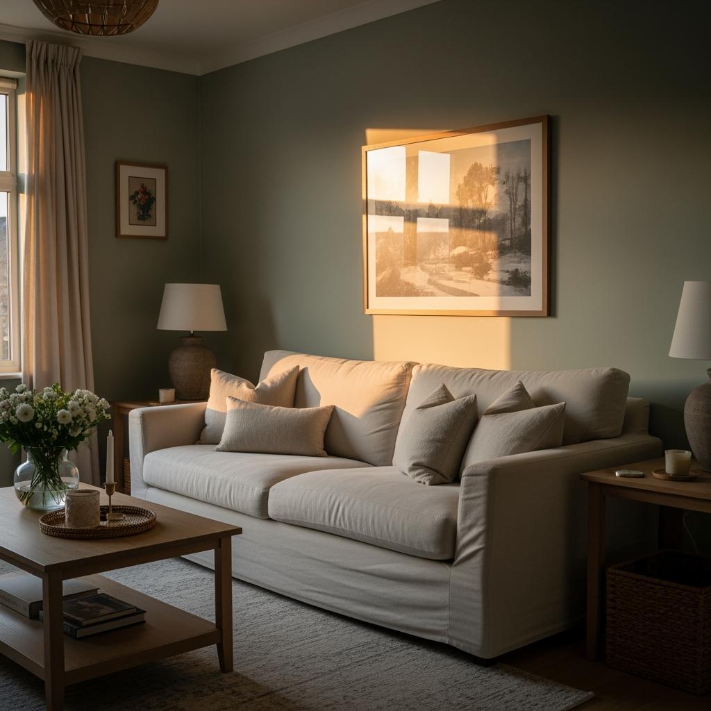
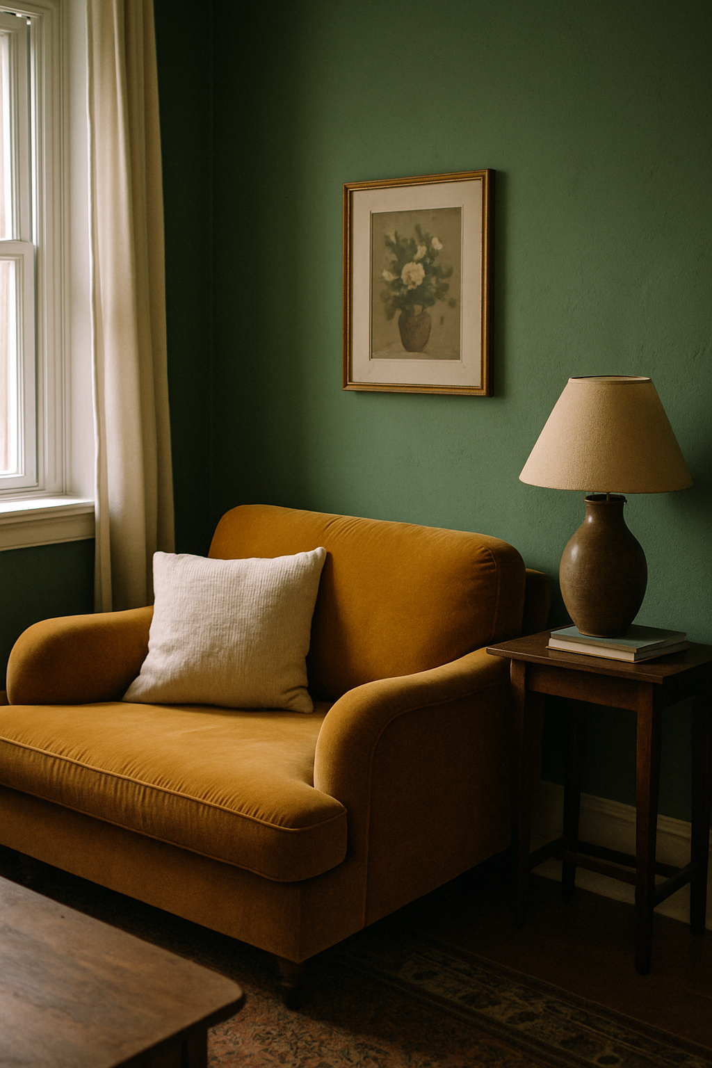
This was harder than I thought it’d be. The sage green walls were already there and I wasn’t repainting — not in 30 days, not with two kids and a dog. So sage green became my 60% by default.
But here’s where I made my first real decision: I swapped out my warm caramel sofa slipcover for a soft, slightly cooler linen in a creamy warm white. That one move made the sage feel intentional instead of accidental.
The whole room started breathing differently. I don’t know how else to say it.
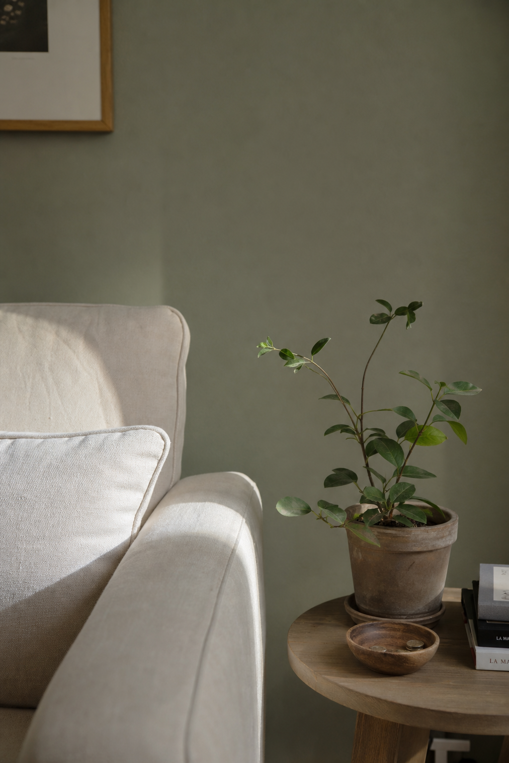
Sage green is forgiving in a way I hadn’t appreciated. It works with warm neutrals, cool grays, and even some blush tones. Once it had room to be the dominant story, it stopped fighting with everything else.
Finding the Right 30% Secondary Color

The navy accent chair had to go. I loved it, but it was pulling too much attention and fighting the sage in the worst way. I moved it to my home office (where it now looks incredible, by the way).
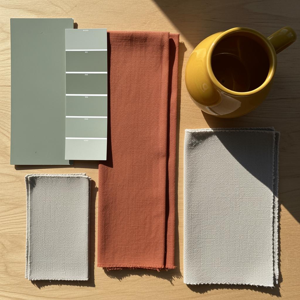
For my 30%, I went with a warm terracotta. This was a gut decision more than anything calculated. I pulled in terracotta through curtain panels, a chunky woven throw, and two larger throw pillows on the sofa.
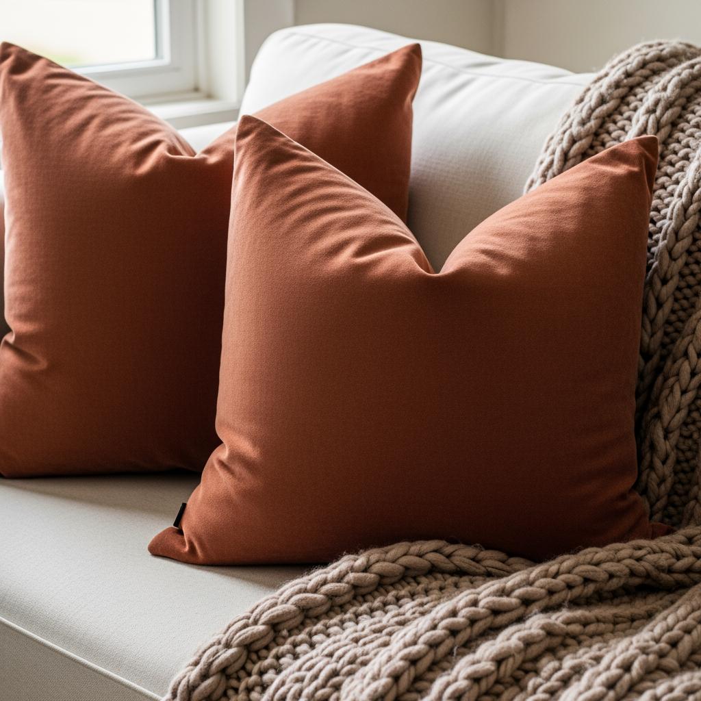
Sage and terracotta together are kind of perfect. It’s earthy, warm, feels grounded.
I’ll admit I was nervous. Terracotta can tip into ‘trying too hard’ really fast. But at 30% it stayed in its lane, and the room started looking like someone actually thought it through.
The 10% Pop That Changed Everything

I’m obsessed with this part. The 10% is where personality lives.
I chose a warm mustard yellow. Just a little. A ceramic vase on the coffee table, a mustard linen napkin folded into a book stack display, and one small throw pillow tucked at the end of the sofa.
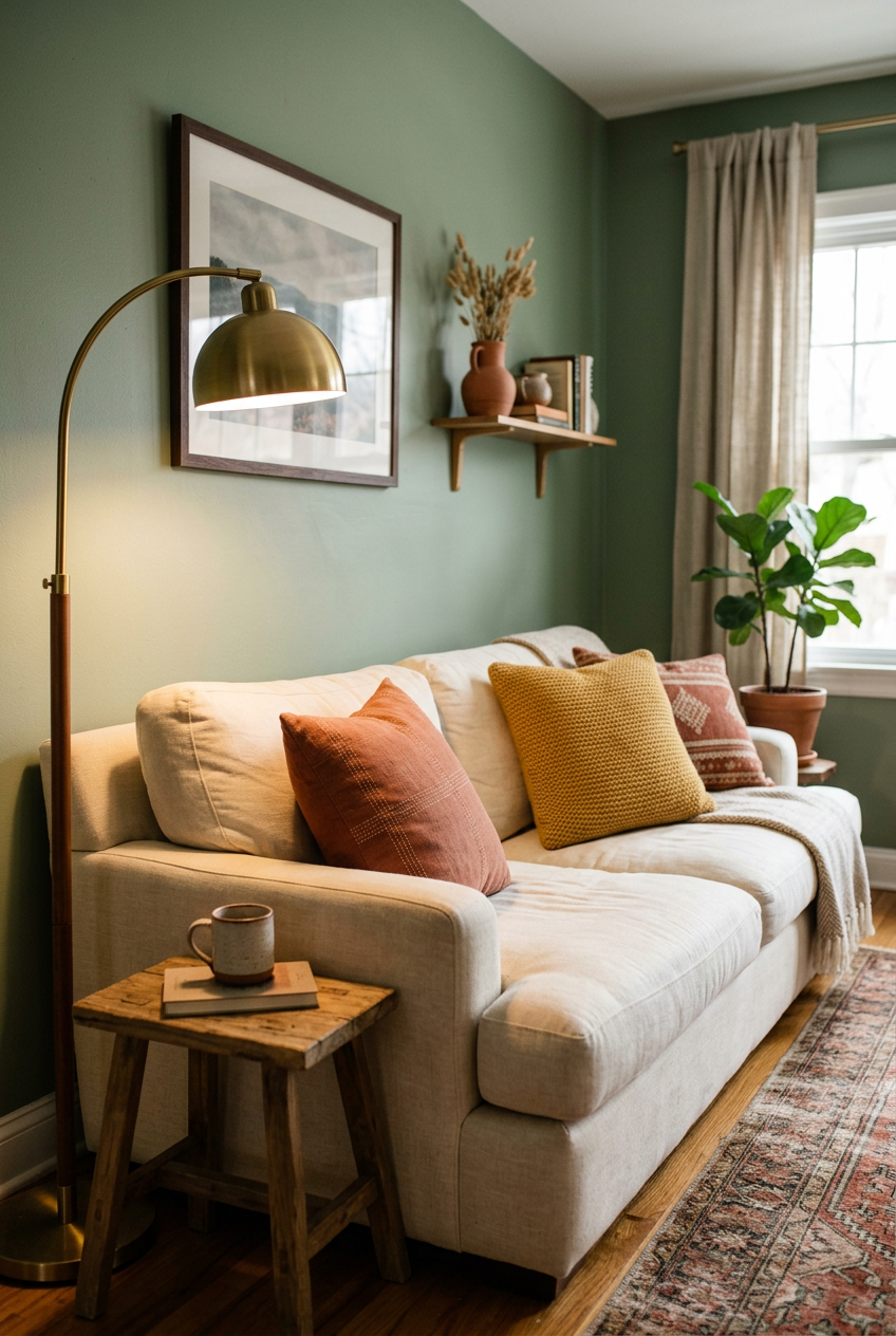
It sounds like nothing. It looks like everything. That small pop made the whole room feel finished in a way I’d been chasing for two years.
If you’d told me mustard yellow in a sage and terracotta room would work, I’d have been skeptical. But at 10%? It’s just a wink. Not a shout.
Week One: Everything Felt Wrong First
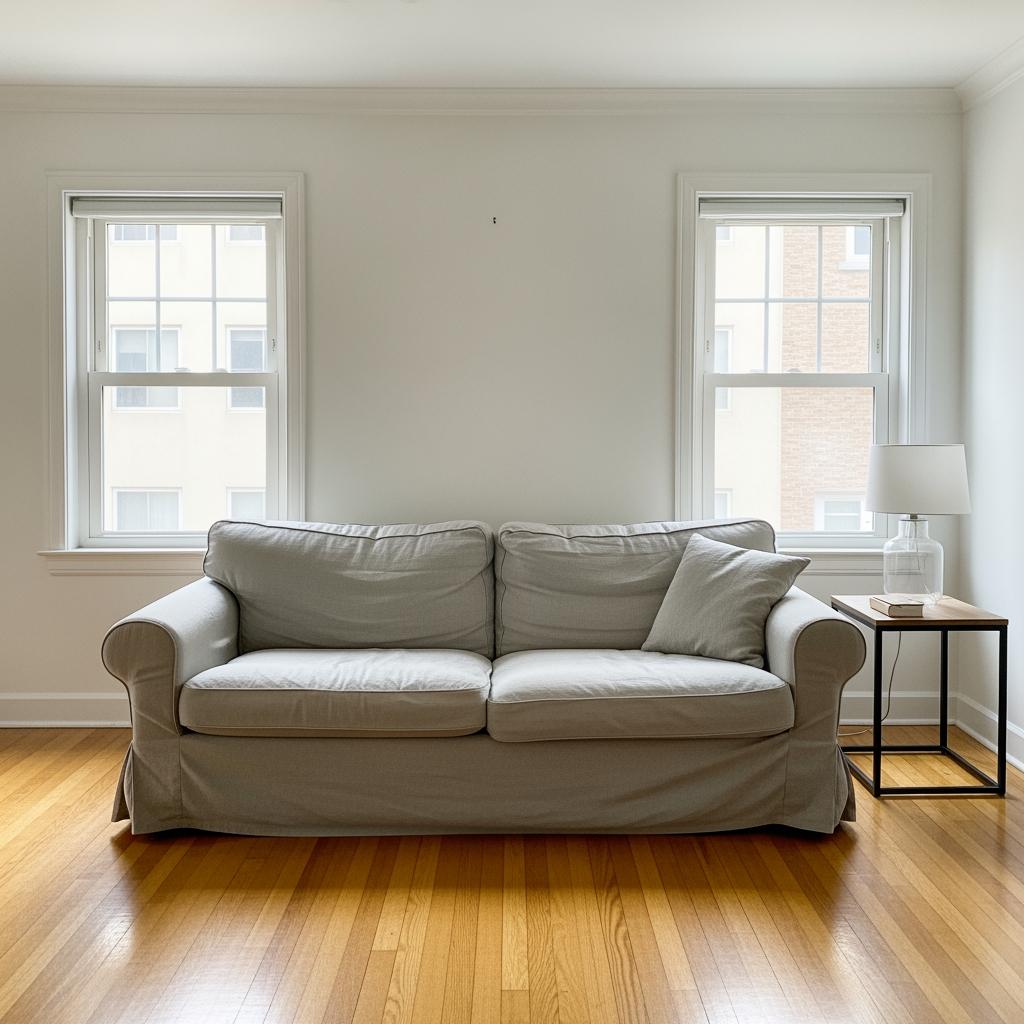
I want to be honest here because nobody tells you this part. The first week, I hated it.
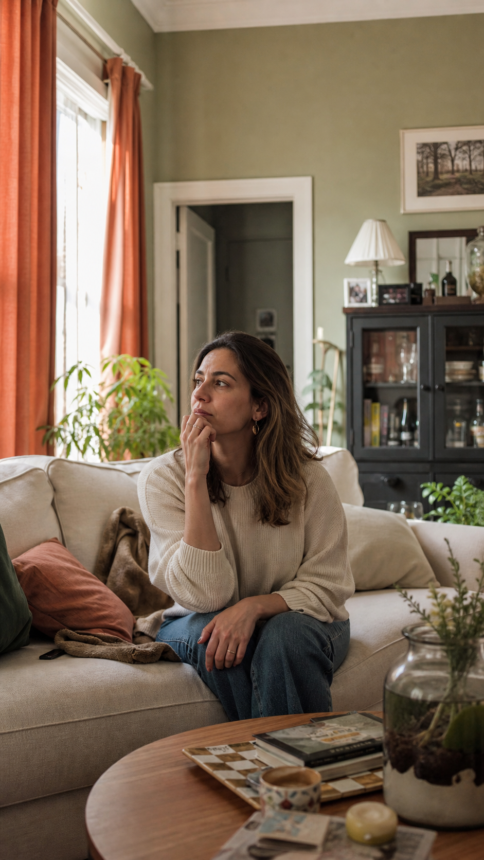
Stripping out the navy chair, swapping the slipcover, adding the curtains — it all happened at once and the room looked bare to me. Too simple. I kept second-guessing the terracotta and thinking it looked like a fall display at a home goods store.
My husband walked in and said ‘oh, did you change something?’ Which is either the most supportive or the most unhelpful thing you can say.
I almost quit. Genuinely. But I’d committed to 30 days, so I left it alone and tried to stop fussing.
Week Two: My Eyes Started Adjusting

Something shifted around day ten. I stopped noticing what was missing and started noticing what was working.
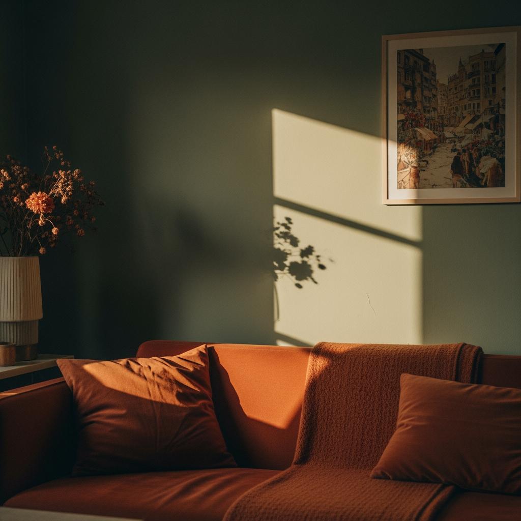
The sage walls looked more intentional. The terracotta curtains glowed in the late afternoon when the sun hit them — that warm, reddish-orange light felt almost like a sunset was happening inside the room.
I started lingering in the living room more. Just sitting there with coffee. That hadn’t happened in a while.
It’s funny how a room you’ve been in a hundred times can suddenly feel new. Not because everything changed, but because the proportions finally made sense.
The Mistake I Made With Textures

Here’s something the rule doesn’t tell you: color proportion only works if your textures are also considered.
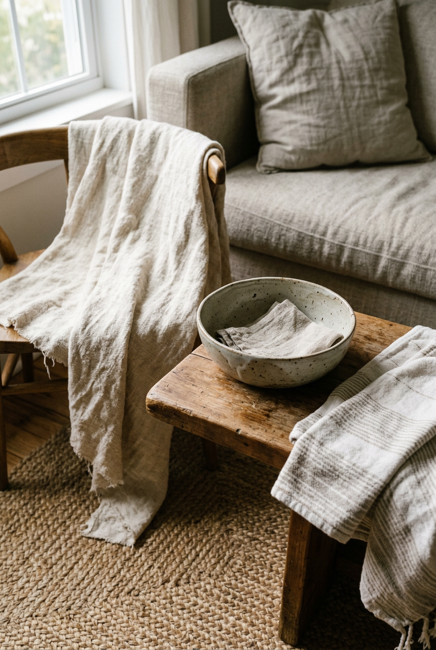
I had a chunky jute rug, a smooth ceramic vase, linen curtains, and a velvet throw pillow all going at once. The colors were right, but the textures were competing in the same chaotic way the old colors had been.
I swapped the velvet pillow for a woven cotton one. Small change, massive difference. The room stopped feeling visually ‘loud’ even though the palette hadn’t shifted at all.
Texture is basically a secret color. I’ll never stop thinking about it that way now.
How I Handled Wood Tones Without Losing My Mind
Wood tones are technically neutrals, but they still have undertones that can mess with your palette if you’re not careful.
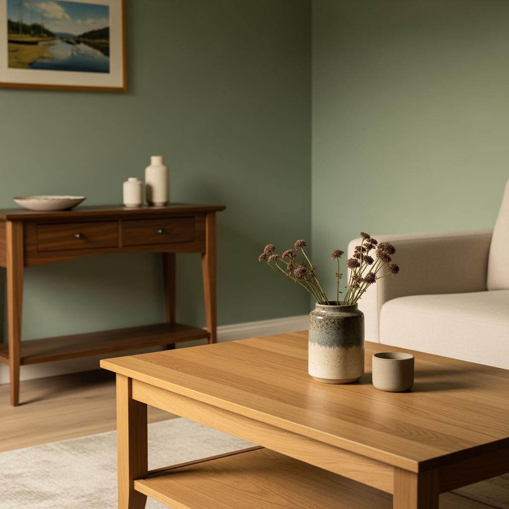
I had a light oak coffee table and a darker walnut TV console. Two different wood tones in one room. Design rule-followers will tell you that’s a problem.

I actually kept both. What I did instead was make sure neither wood tone was competing with my 60-30-10 colors by keeping them close to the floor and walls — not at eye level. It works. I think.
Honestly, mixed wood tones can feel collected and lived-in rather than mismatched, as long as they’re not the loudest things in the room. Mine aren’t.
What Happened to the Room’s Natural Light

This blew my mind a little. The same windows, the same orientation, but the room felt lighter after the palette change.
The terracotta curtains replaced some dark charcoal linen panels I’d had up, and that alone added so much warmth to the space. The sage green walls seemed to pull in the light rather than absorb it.
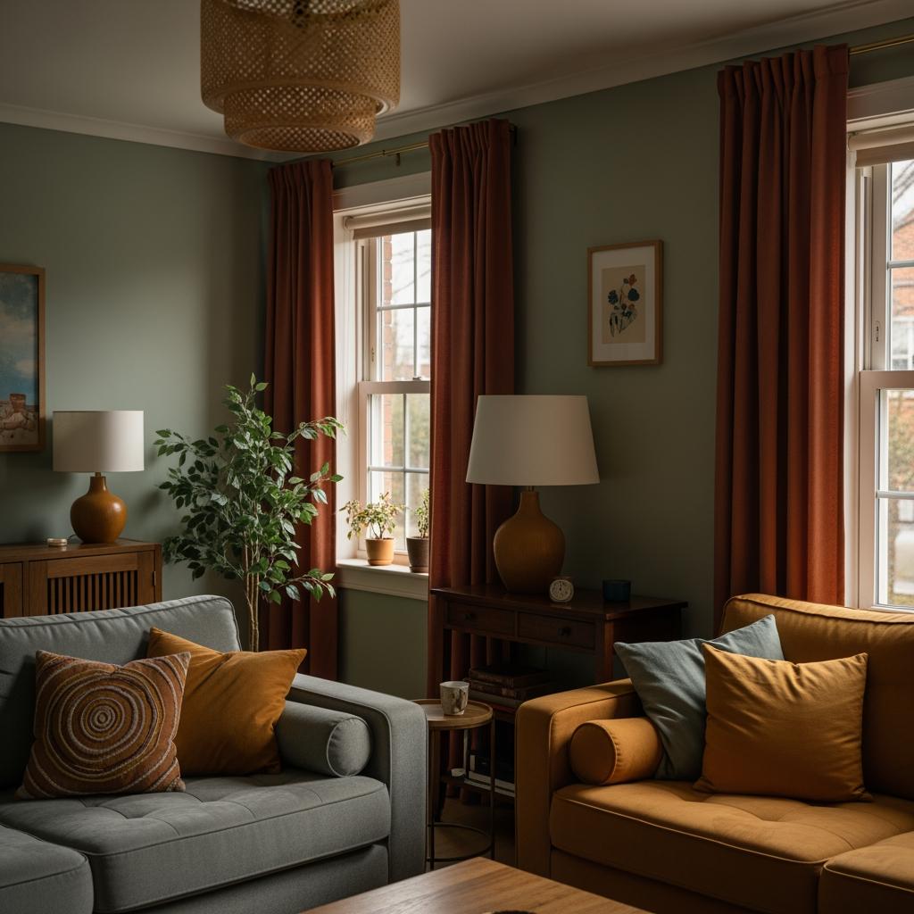
My living room faces east, so it gets that cool, bright morning light and then dims out by early afternoon. The terracotta and mustard accents make the afternoon feel less flat. It’s a small thing but you notice it.
I never expected a color experiment to change how light felt in a room. But it did.
The Unexpected Thing That Completed the Room

Plants. I know everyone says plants, but hear me out.
I added a single large fiddle-leaf fig in a terracotta pot in the corner that gets harsh afternoon light. The height broke up the room in a way no throw pillow ever could.
The green of the plant echoed the sage walls but in a different tone and texture. It added a layer that made the room feel like it had been styled by someone who really thought it through.
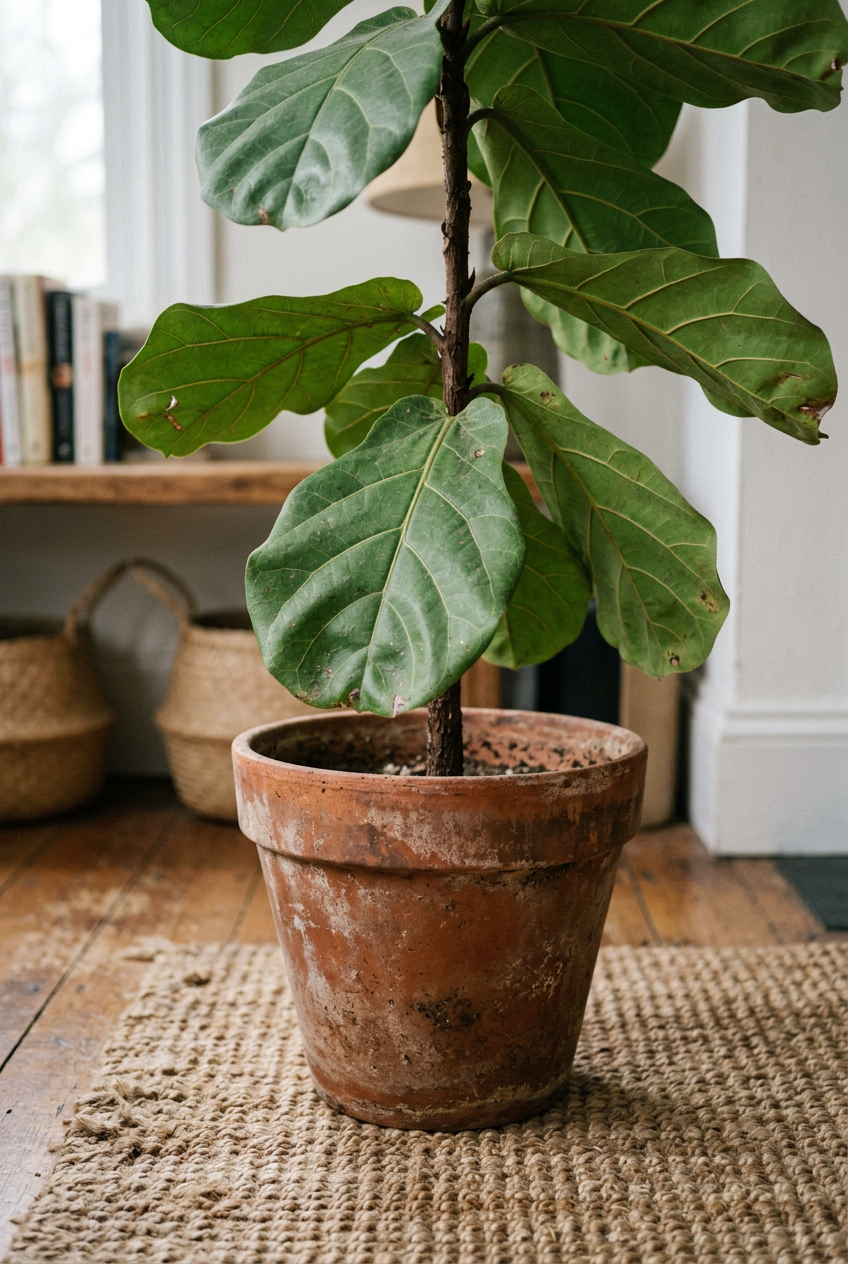
I’d resisted plants for years because I convinced myself I couldn’t keep them alive. The fiddle-leaf has been there three weeks. It’s fine. We’re fine.
How the Room Feels to Actually Live In Now
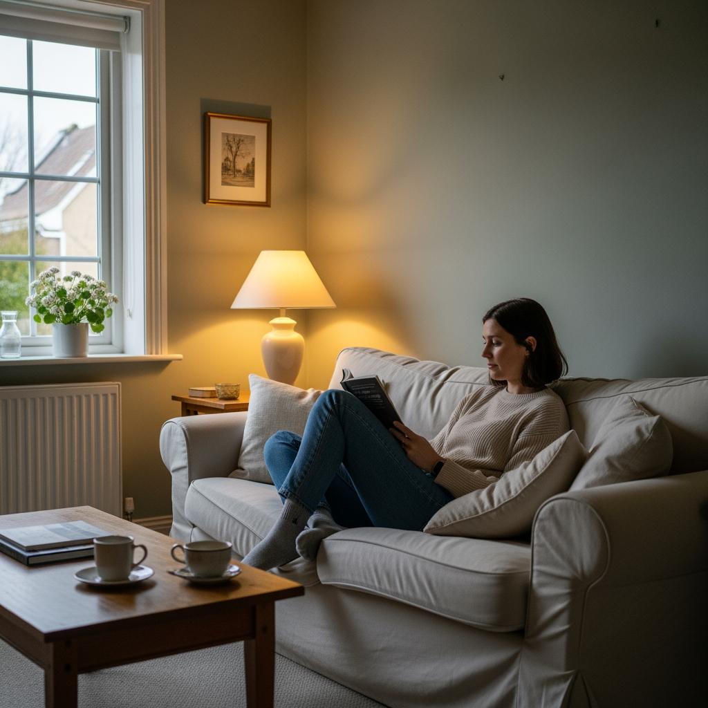
This is the part I wasn’t expecting to care about. I thought this experiment was about aesthetics. It turned out to be about comfort.
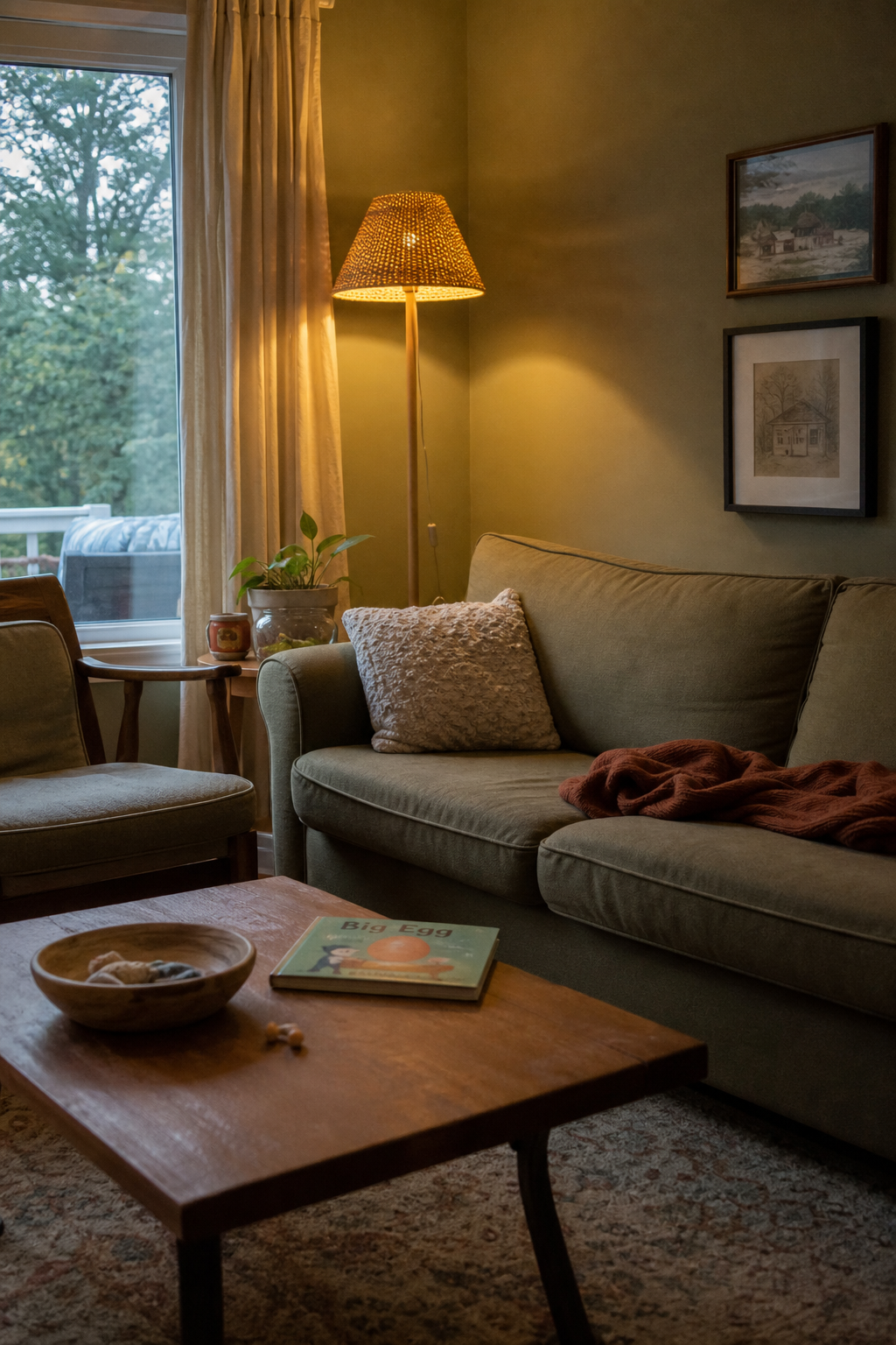
I sit in that living room every evening now and I feel… calm. That sounds dramatic but it’s true. The colors are cohesive enough that my brain isn’t working to make sense of the space, I think.
My kids even commented. My nine-year-old said it looked ‘like a magazine’ and then immediately put her feet on the sofa, so.
The room doesn’t feel decorated. It feels like mine. That’s a distinction that took me way too long to understand.
Would I Recommend the 60-30-10 Rule to You?

Yes. But with a caveat.
It’s not magic on its own. You still have to choose colors that actually speak to you, not just colors that look good in theory. I could have followed the proportions perfectly with a palette I didn’t love and it still would’ve felt wrong.
The rule gives you structure. It tells you how much, not what. That difference matters a lot.
If I had a living room I kept fussing with and couldn’t figure out why it felt off, this is literally the first thing I’d try. Map out your current proportions and see if you even have a dominant color. Most of us don’t, and that’s the whole problem.