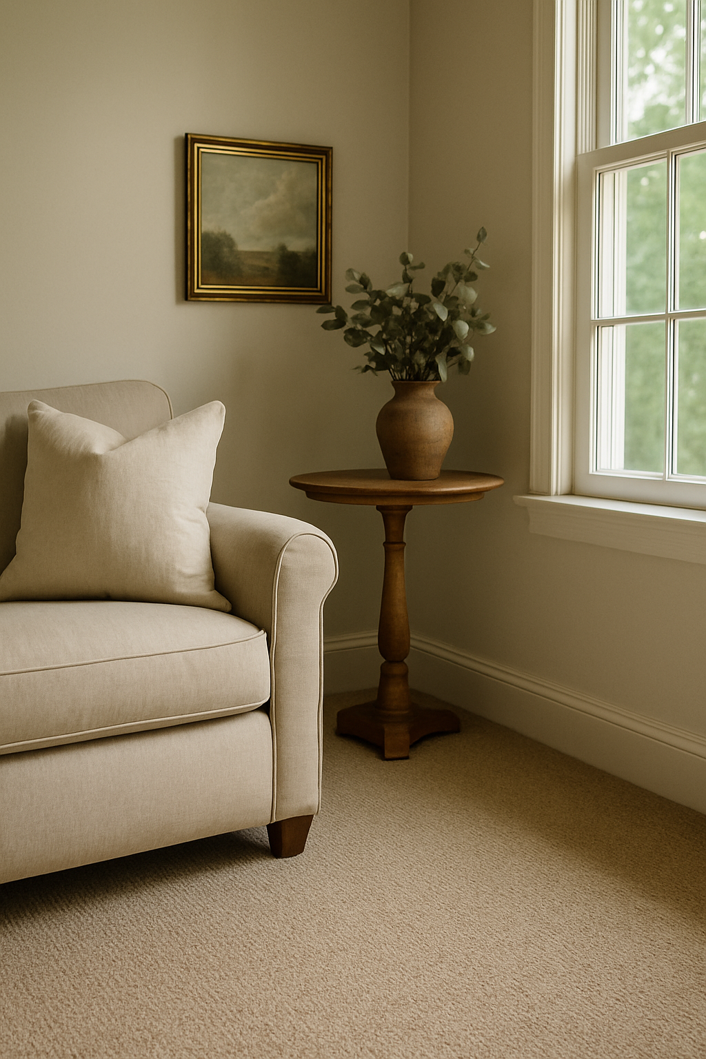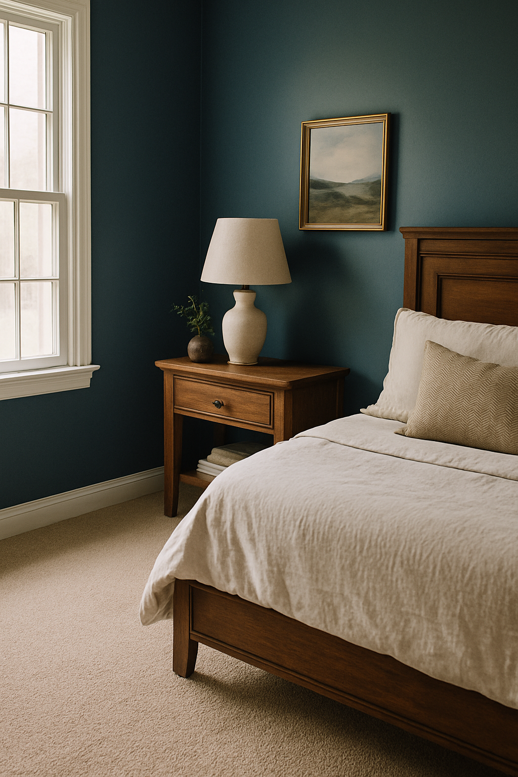
The beige carpet in my first apartment made my navy walls look like a bruise, and every design blog I consulted at the time was the reason I bought it. I spent $800 on wall-to-wall greige carpet, moved my furniture in, and stood in the doorway thinking I’d made a terrible mistake. I had. It took me two more apartments and this house to understand why.
Why Beige and Grey Carpet Fail Dark Blue Walls
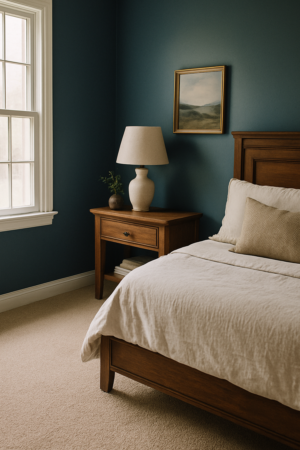
Here’s the actual problem, and it has a number attached to it. Dark blue walls — navy, slate, indigo, anything in that family — sit at an LRV (light reflectance value) of roughly 5 to 15. Almost as dark as you can paint a wall. A standard greige carpet lands between 50 and 65 LRV. That’s a contrast gap of more than 40 points, and that gap is why the combination looks institutional instead of intentional.
When the LRV spread between your walls and floor clears 40 points, your eye doesn’t read “sophisticated contrast.” It reads “that floor doesn’t belong in this room.” Dark walls recede, light carpet jumps forward, and the whole space flattens into something that looks like a Holiday Inn corridor renovated on a budget.
What you actually want is tonal anchoring, where the floor color shares enough value or temperature with the wall that the two surfaces feel like they chose each other. Beige can’t do that with dark blue. It’s not a matter of taste; it’s arithmetic. A white t-shirt at a black-tie event isn’t edgy, it’s just wrong for the context.
The Case for Warm-Toned Carpet: Terracotta, Rust, and Burnt Orange
This is the one I get pushback on every time, and I don’t care, because I’ve seen it work in my own guest room for six years and counting.
Warm earth tones like terracotta, rust, and burnt orange create what color theory calls temperature opposition with dark blue. They don’t match it. They balance it. Blue recedes cool and deep, rust grounds the floor with warmth, and together they create a tension that reads as designed rather than accidental. Contrast here is emotional rather than value-based, which means it doesn’t blow the LRV math the way beige does.
Shaw Floors makes a loop pile in “Terracotta Clay” that runs about $3.50 per square foot, basically the same price as the boring greige options. Pile height matters here: stay at 3/8 inch or under for a warm-toned loop. Anything higher and the floor starts to feel heavy in a way that competes with the walls instead of settling under them. For a reference rust shade, Pantone 18-1244 Marsala is about as close to the sweet spot as I’ve found: not orange enough to feel dated, not brown enough to go muddy against blue.
In a bedroom especially, this is the highest-ROI swap you can make. Same budget as beige, completely different result. Room stops looking accidental.
Forest Green Carpet Is the Underrated Answer Nobody Recommends
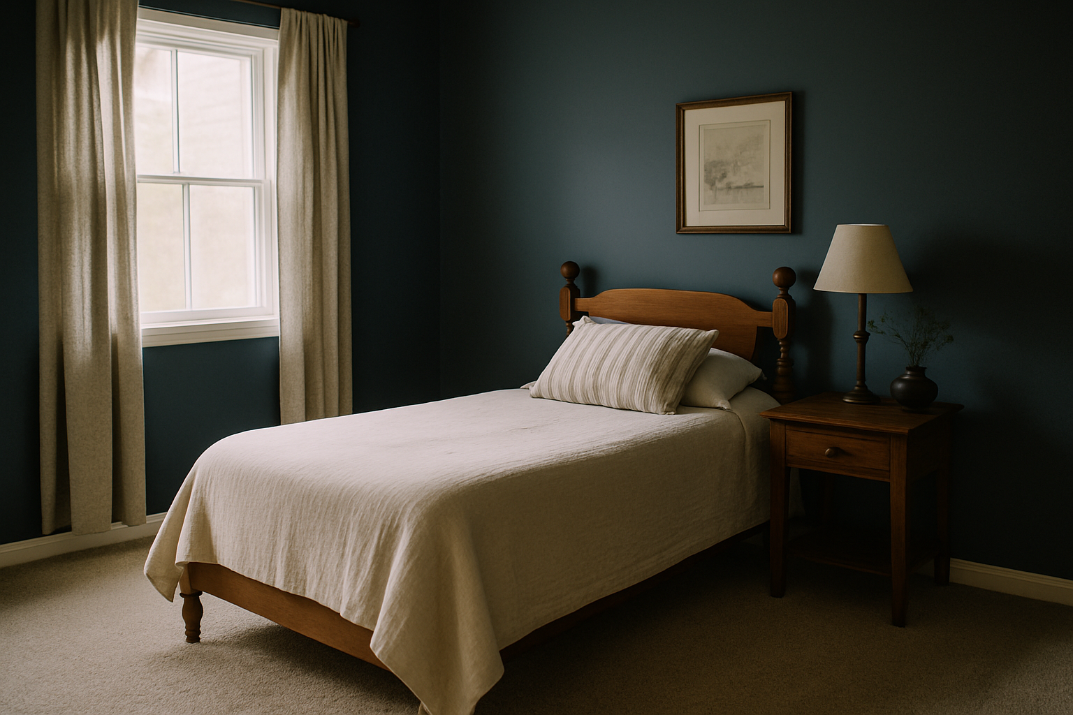
I almost didn’t try this. Green carpet sounds like a 1970s mistake, and my house was built in 1978, so I’ve seen the evidence firsthand. But there’s a specific kind of green that does something remarkable under dark blue walls, and it’s not the green your grandmother had.
Hunter green and forest green sit at an LRV of roughly 8 to 12. That puts them in almost the same value range as dark blue walls, which is exactly why they work. Nothing splits into a dark top and a light bottom. Everything stays deep and settled. Mohawk SmartStrand makes a “Deep Forest” option that holds up better than any wool I’ve had with a dog in the house (I have a 70-pound shepherd mix and she has opinions about carpet).
Greens to avoid are anything with LRV above 30 against dark blue walls. Kelly green, sage, mint: all of them create the same split problem as greige, just with a green cast. You want dark green. Specifically. Depth is the whole point.
Most design content calls this combination “bold,” which is backwards. LRV proximity actually makes it one of the most tonally stable pairings you can do with dark blue walls. It’s less of a risk than beige, not more.
How Room Size and Natural Light Change the Entire Calculation
Everything I just told you shifts depending on the room you’re standing in.
Small north-facing rooms are a special category of hard. Under 150 square feet, north-facing windows that receive under 300 lux on average (which is most north rooms in winter, frankly) — no carpet color is going to fully rescue that situation. Dark blue walls in that context weren’t the right call to begin with, and the carpet is being handed a problem that started upstream. I’ve seen people try five different rugs in a room like that, spending $200 to $600 each time. Nothing changes; it just gets more expensive.
South-facing rooms are a completely different animal. One with adequate glazing — rough rule of thumb is at least one window per 100 square feet of floor space — can hit over 1,000 lux at midday. That light is what lets you use the warm and dark carpet colors I’m recommending without the room feeling like a cave. Light does the lifting.
Don’t grab a carpet recommendation off a list without knowing which direction your windows face. Most posts skip this entirely. Not a minor variable.
Texture and Pile Type Matter More Than Color in Dark Rooms
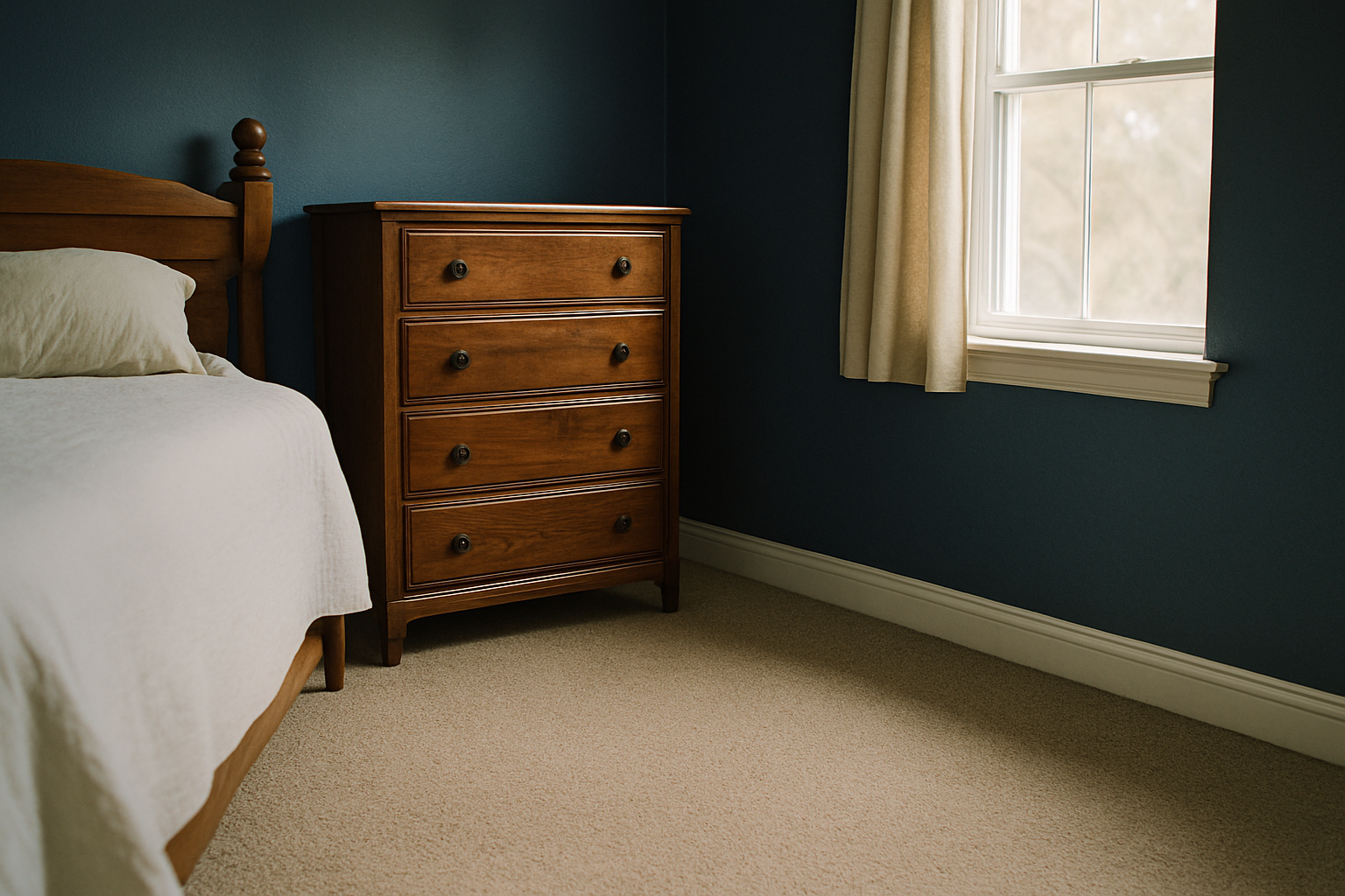
I bought a sample of the same color in three different pile types once, just to settle an argument with myself. Same dye lot. All three looked completely different.
In a low-light room with dark walls, loop pile reflects approximately 15% more light than cut pile in the same color. Not trivial. A loop pile in rust reads lighter and more energetic than a cut pile in the same shade, which matters a lot when you’re deciding how much warmth to add versus how grounded you want the floor to feel.
Cut pile in the 1/2 to 3/4 inch height range absorbs more light, reads darker, and has a softness underfoot that works well in bedrooms. If you want texture without pattern and you’re looking at frieze, find a twist count of 7 to 9 per inch. Enough to break up the surface visually without making the floor look busy from across the room.
Picking a carpet color without specifying pile type is like picking a paint color without specifying finish. Swatch is only half the decision. Test your samples under the actual lighting conditions in the room: morning light, 3pm light, lamp on at night. Not on the showroom floor under fluorescent tubes.
The One Scenario Where Light Neutral Carpet Actually Works
I’m not going to pretend it never works. It does. Once.
Natural undyed wool berber sits around 60 to 68 LRV, firmly in the “high contrast with dark blue walls” zone. But in a room with ceilings at 9 feet or higher, generous natural light, and furniture that actively bridges the contrast gap — dark walnut, charcoal upholstery, anything with an LRV below 20 — a light floor reads as ground rather than intrusion. Interface makes a “Textured Weave Natural” option that’s one of the few light carpets I’ve seen hold this look without reading sterile.
Furniture placement is non-negotiable here. Without at least one or two dark anchor pieces, light carpet and dark walls just stare at each other with no middle ground. Furniture creates the visual bridge; high ceilings give the contrast room to breathe.
If your ceilings are 8 feet, your room gets limited afternoon light, or you’re furnishing in mid-tone woods and grey upholstery, this combination will look exactly like it does in every bad before photo. Magazine version of this room requires the magazine version of this architecture.
A Room-by-Room Decision Guide: Bedroom vs Living Room vs Hallway
Three genuinely different problems. Stopping treating them like one.
Bedroom: rust or burgundy, pile height at least 1/2 inch. You’re barefoot in here, so the tactile component matters. Burgundy specifically is underused with dark blue walls: it reads as rich rather than dark, and it makes the whole room feel warmer at night when you’re working with lamp light only. This is where I’d spend the money on a nicer cut pile, even if it means stretching to $5 or $6 per square foot.
Living room: forest green loop pile at 3/8 inch. Foot traffic, furniture legs, probably a dog (I do), and you need durability. Loop pile handles all of that better than cut pile in a high-use space. Forest green keeps the depth of the room working in your favor without the floor looking like it’s fighting the walls.
Hallways are where everyone applies the wrong logic. A typical hallway runs 36 to 42 inches wide and maybe 12 to 18 feet long. You’re not sitting in it; you’re moving through it. In that context, matching the carpet tone to the wall darkness, charcoal or near-black at LRV 10 to 18, creates atmosphere rather than claustrophobia. Narrow proportions plus dark continuity feel intentional and dramatic instead of cramped. My upstairs hallway has dark teal walls and a charcoal runner, and every single person who comes to the house comments on it before they comment on anything else.
Don’t use living room carpet logic in a hallway. Light behavior is different, dwell time is different, and the psychological effect of color in a space you pass through for 4 seconds is fundamentally different from a space you sit in for two hours.