I used to think more was more. Every shelf in my first apartment was basically a graveyard of cute things I couldn’t say no to — candles, little ceramic animals, a bowl I bought at a farmers market that served zero purpose. And it all just looked… cluttered. Stressful, actually. It wasn’t until I stood in front of my living room bookcase one Saturday morning, coffee in hand, genuinely feeling anxious looking at my own shelves, that I realized something had to change. Turns out, there’s a real logic to shelf styling. Not a rigid rule, but a formula. And once I understood it, everything clicked.
Why Most Shelves Feel “Off” (And It’s Not Your Taste)
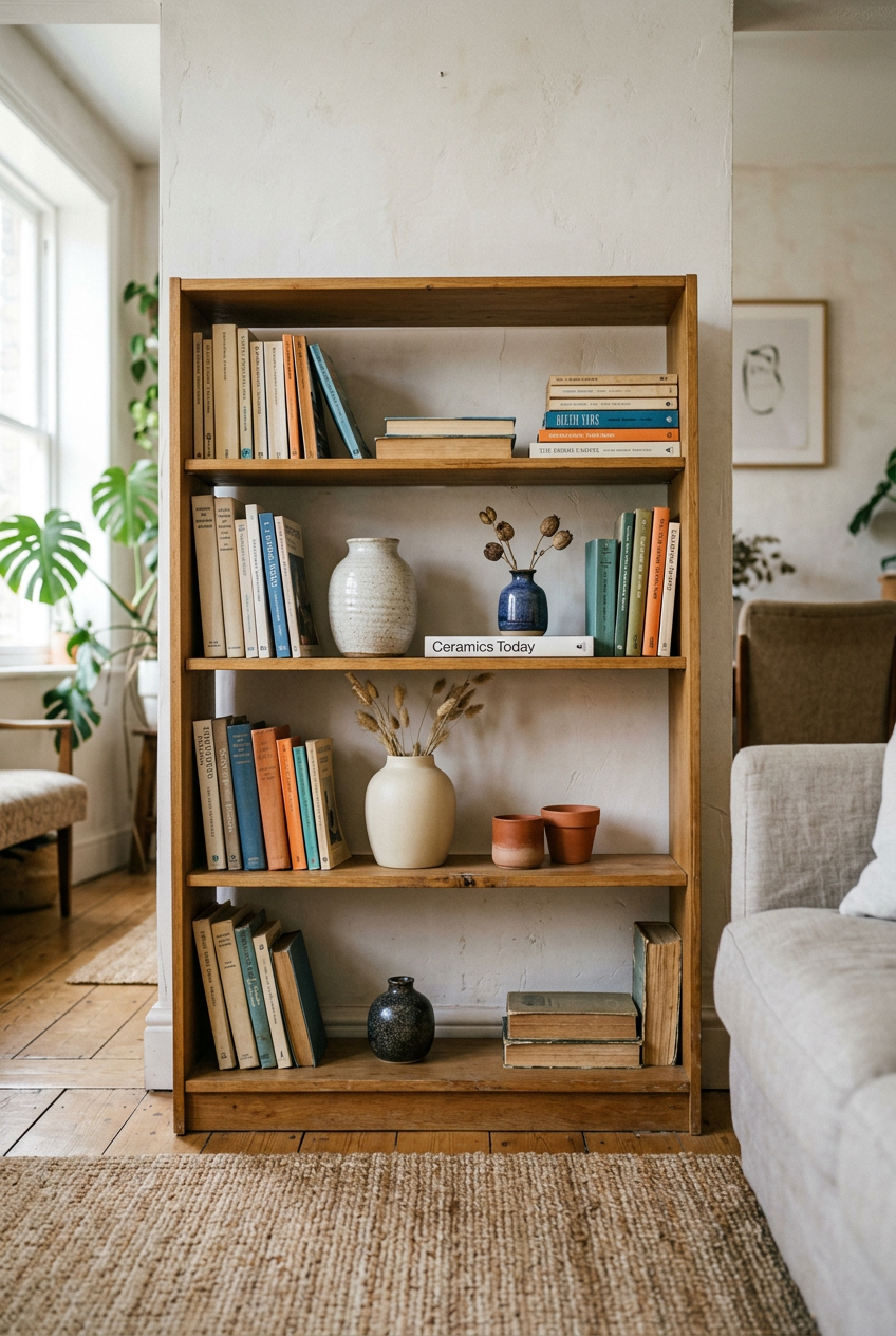
Here’s something I wish someone had told me sooner: a cluttered shelf isn’t a taste problem. It’s a math problem.
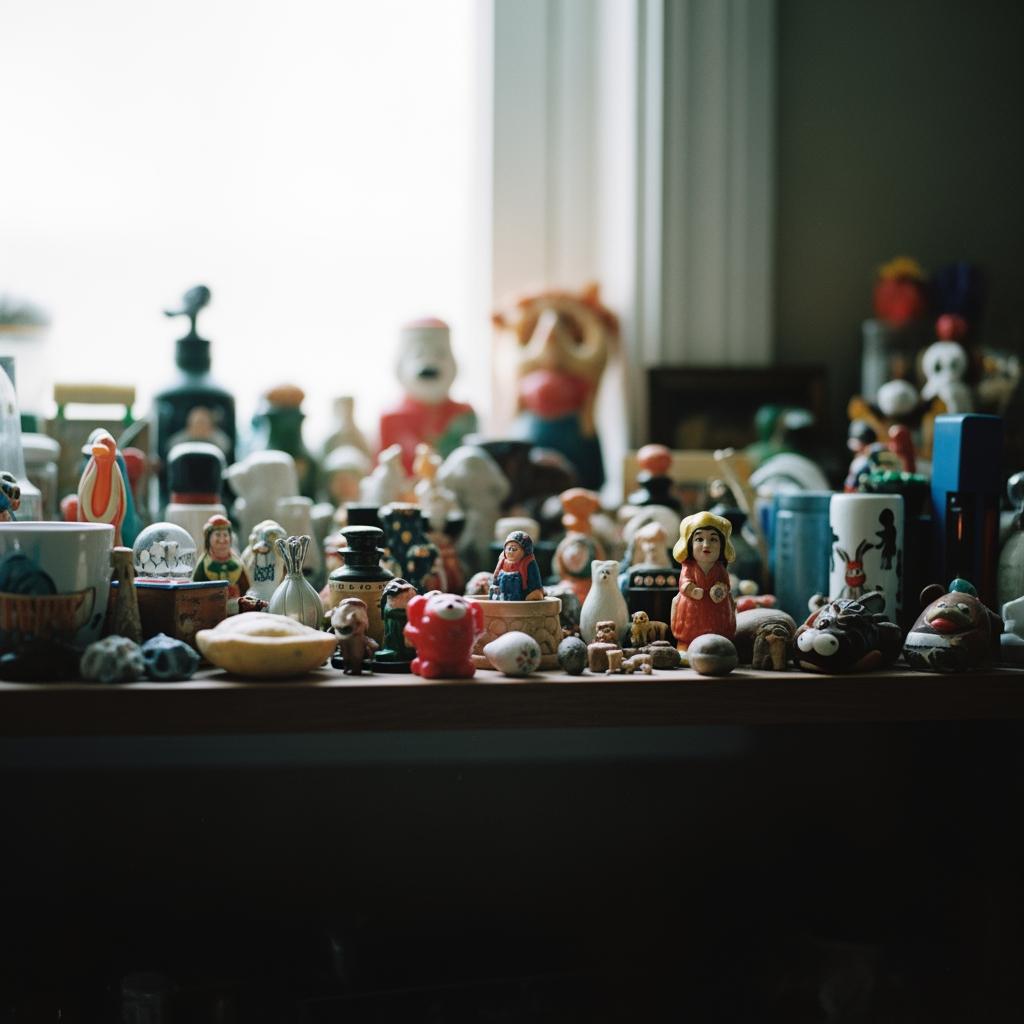
When we fill every inch of a shelf, our eyes don’t know where to rest. There’s no visual pause, no breathing room. Everything competes for attention, and nothing wins. The result feels chaotic even when every individual object is genuinely pretty.
I learned this the hard way after buying what I thought was a gorgeous gallery of little objects for my office shelves. Individually? Adorable. Together? A mess. It looked like a flea market, not a home.
The fix isn’t always removing things, though sometimes it is. It’s about understanding how objects relate to each other, and to the empty space around them.
The Simple Formula I Actually Use
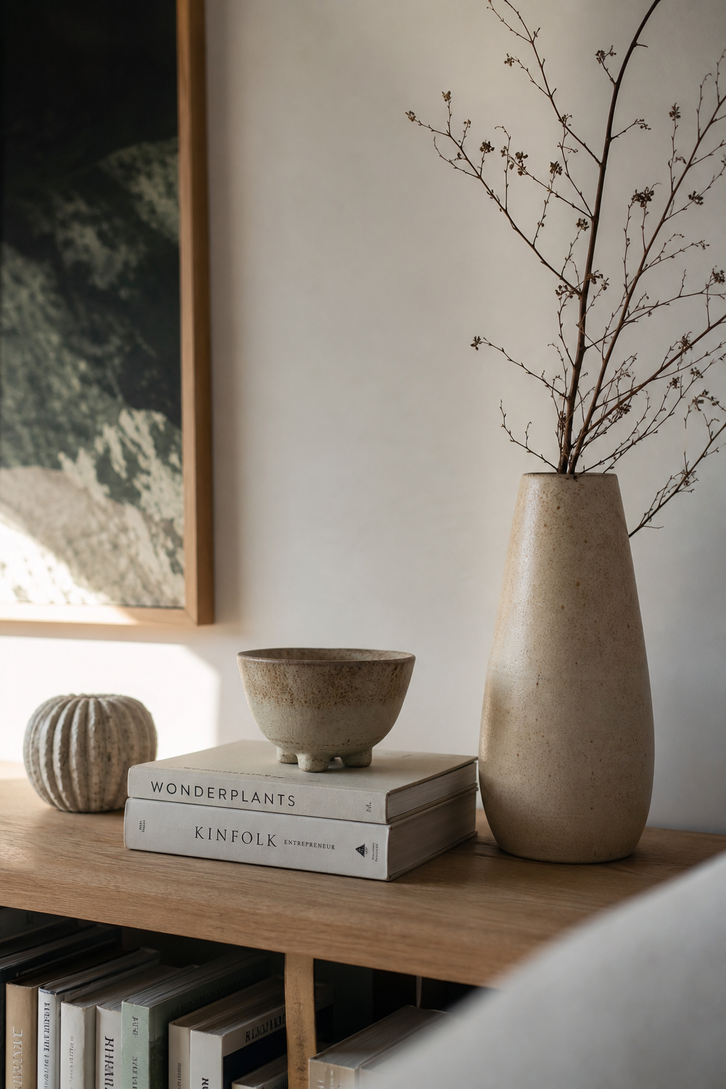
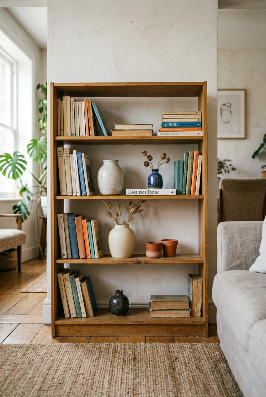
Okay, so here it is. The formula I keep coming back to: group objects in odd numbers, vary height within each group, and leave at least one third of the shelf visually empty.
That’s it. Three parts. And no, it doesn’t mean every shelf has to look the same.
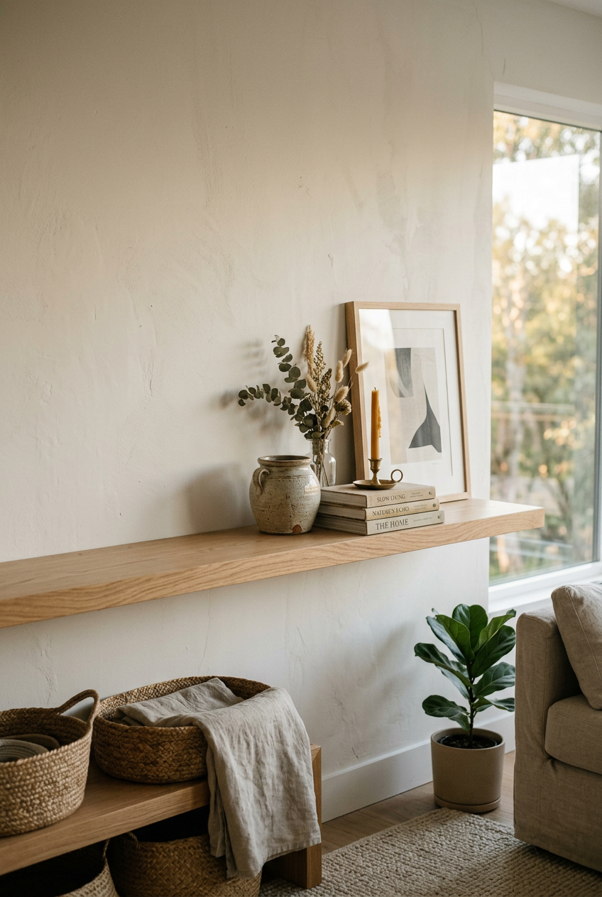
The odd-number thing isn’t just designer speak. Groups of three or five feel more organic to the eye than pairs or even fours. Even numbers feel staged. Odd numbers feel found.
The height variation is what adds life. A tall vase next to a short stack of books next to a small sculptural object creates a little skyline effect. Your eye moves across it naturally, like reading a sentence.
And the empty space? Non-negotiable. That breathing room is what makes the objects you do display feel intentional and worth looking at.
What Counts as a “Decorative Object” Anyway
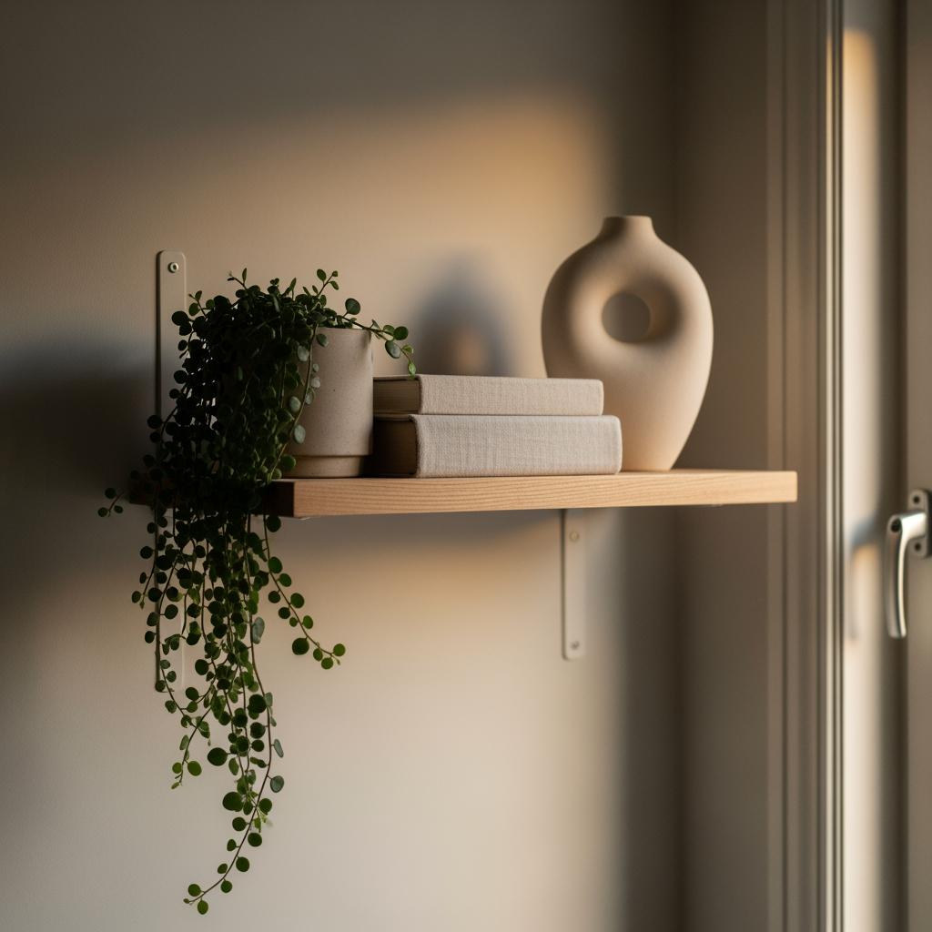
This tripped me up for a while. I kept thinking decorative objects meant just the pretty things. The candles, the figurines, the little trays.
But books count. Plants count. A framed photo counts. Even a basket tucked on a lower shelf is part of the visual equation.
Once I started seeing everything on the shelf as part of the composition, my styling got so much better. Books especially, because they bring color, texture, and serious height variation without you having to spend a single extra dollar.

If I had only one shelf to work with right now, I’d probably use one plant, one stack of books, and one interesting object. Three things. Vary the heights. Done.
The “One Third Empty” Rule in Real Life
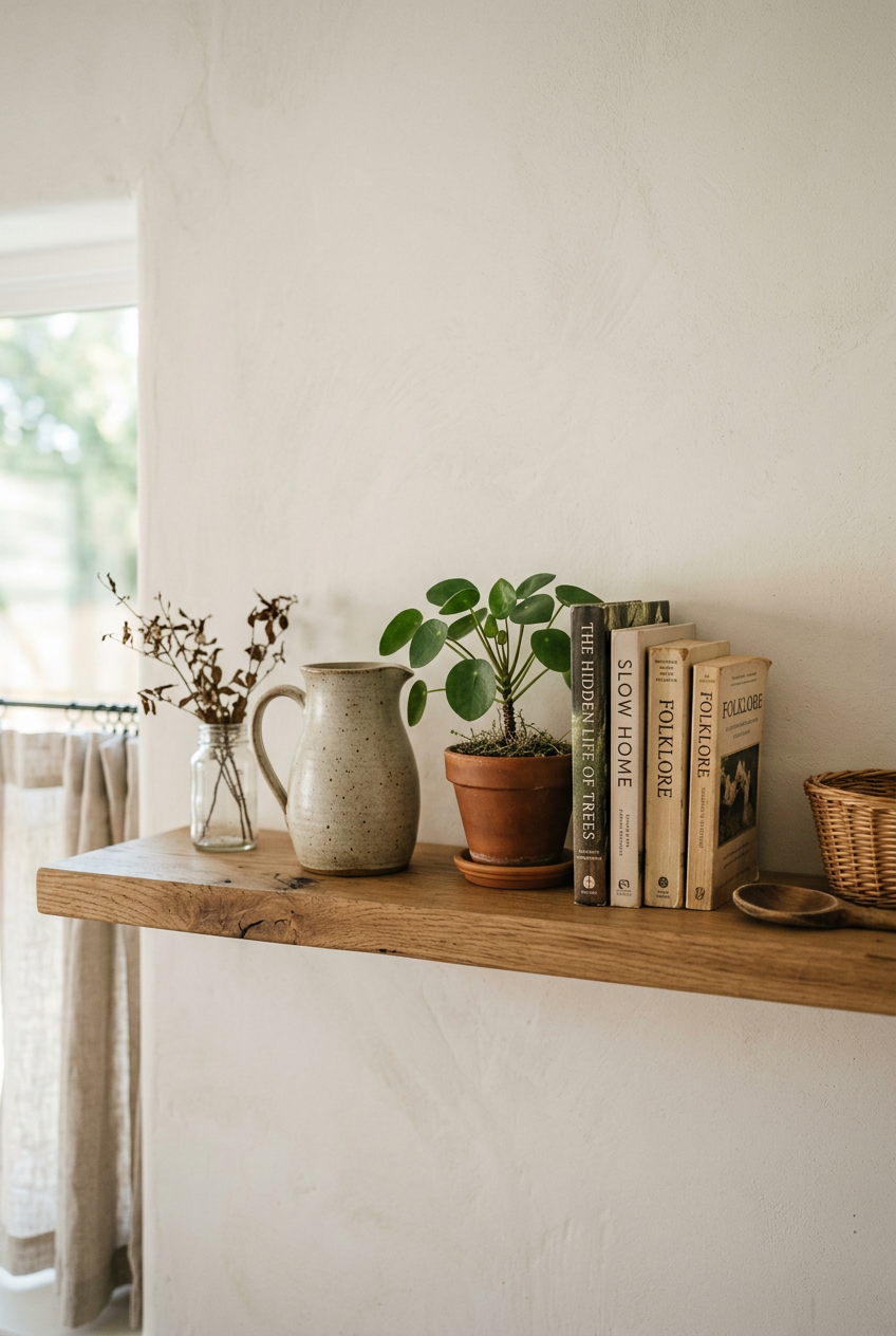
I’ll be honest. The first time I heard “leave a third of your shelf empty,” my reaction was basically: that sounds wasteful.
But empty space isn’t wasted space. It’s breathing room. It’s what gives your eye permission to slow down.
When I cleared out about a third of my office shelves last fall, the whole room felt bigger. Like the walls exhaled. It was sort of shocking, honestly.
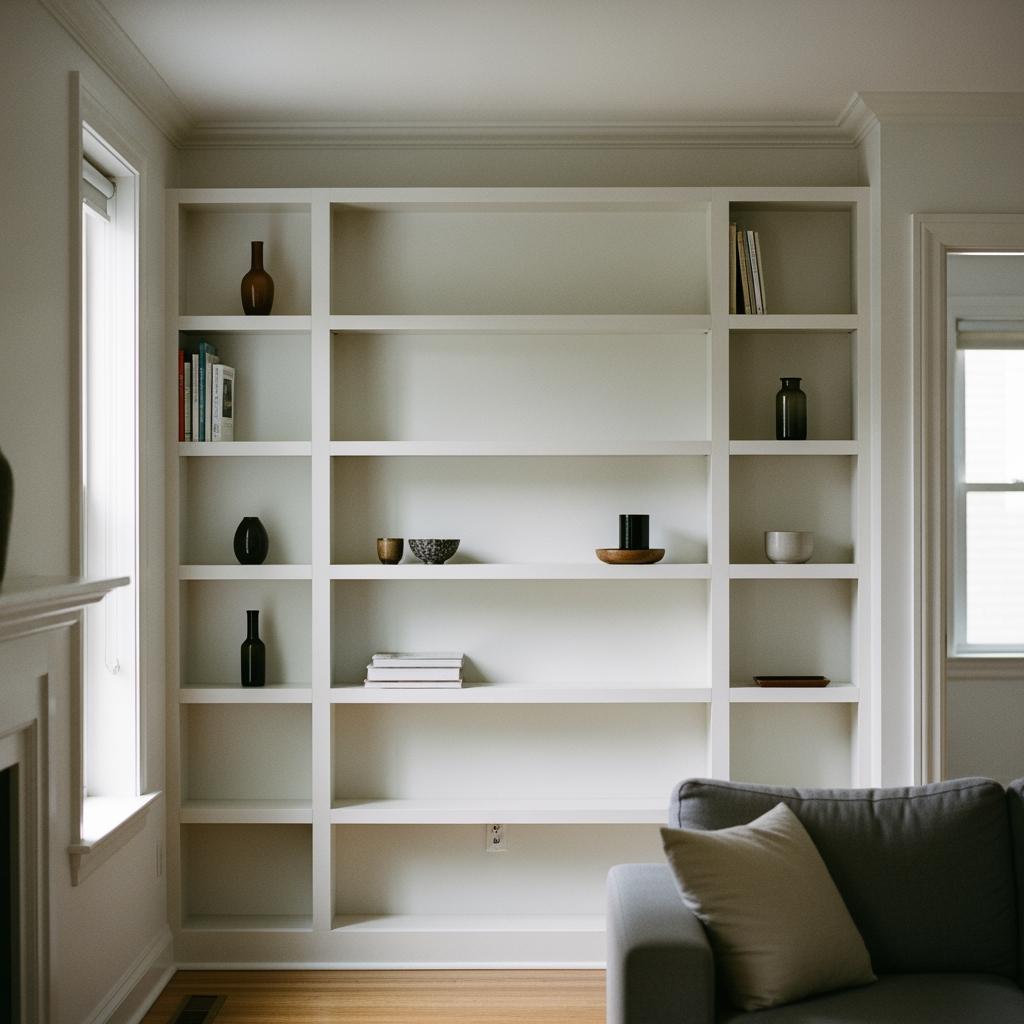
The trick is to think of the empty shelf surface as part of the design, not an accident. Leave it deliberately. Resist the urge to fill it.
How Height Variation Changes Everything
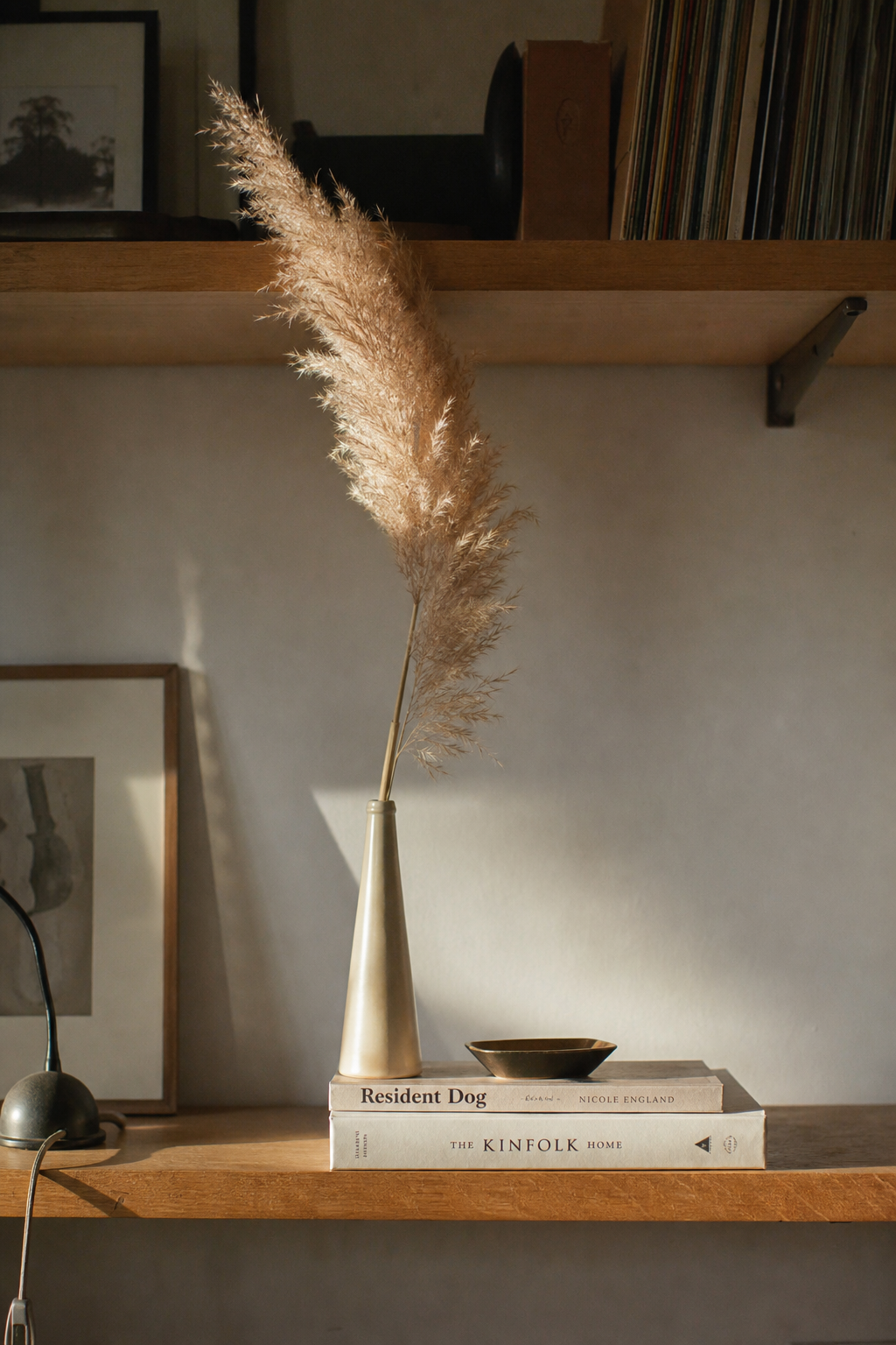
Height is honestly the most underrated part of shelf styling. And it’s so easy to get right once you see it.
Think about it like a skyline. A flat horizon of same-height objects looks boring and static. But a little variation, something tall here, something low and wide there, creates visual movement.
When I tackled my guest room shelves last spring, every object I owned was sort of medium-sized. No extremes. The shelf looked flat and dull. I added one tall dried pampas stem in a thin vase and immediately the whole thing woke up.
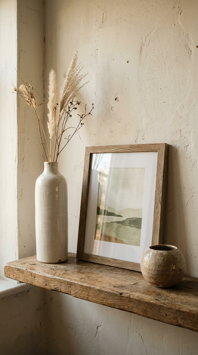
You don’t need to buy anything new to fix this. Just stack books horizontally to create a platform for a small object. Instant height variation.
The Magic of the Odd Number Group
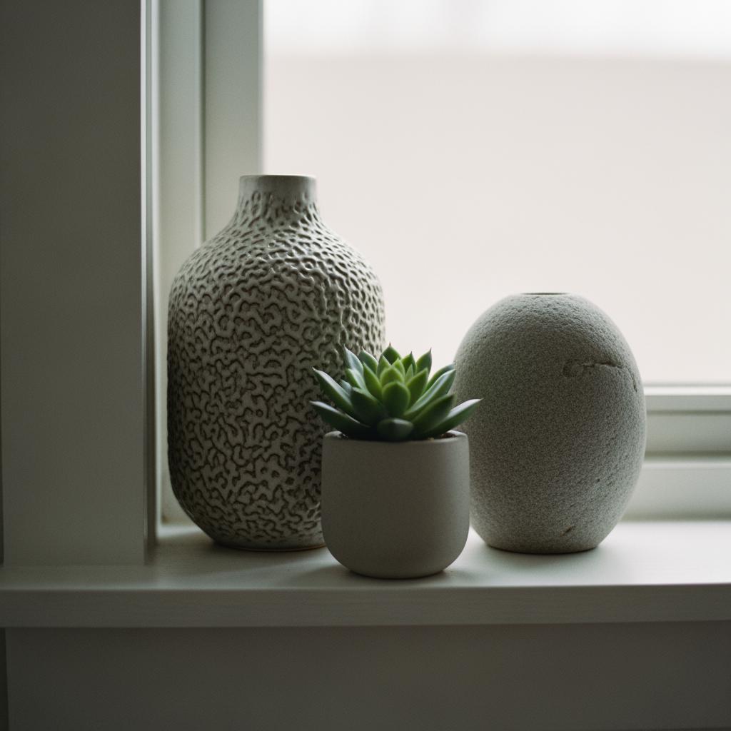
Groups of three. I keep coming back to it because it genuinely works every single time.
Something about three objects feels collected rather than deliberate. It doesn’t look like you placed them there, it looks like they belong there.
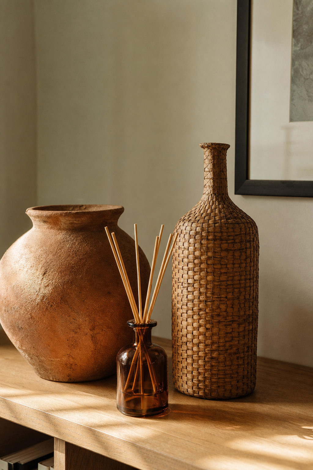
I style almost every surface this way now. My bathroom counter, my nightstand, even the little ledge above my kitchen window. Three things, different heights, and I’m done.
Five works too, especially on a longer shelf. But if you’re not sure where to start, just do three. You can always add or remove from there.
I tried working with four objects once and it always felt like one was extra. Even numbers have this weird symmetry pressure that makes everything feel posed.
Mixing Textures Without Making It Look Chaotic
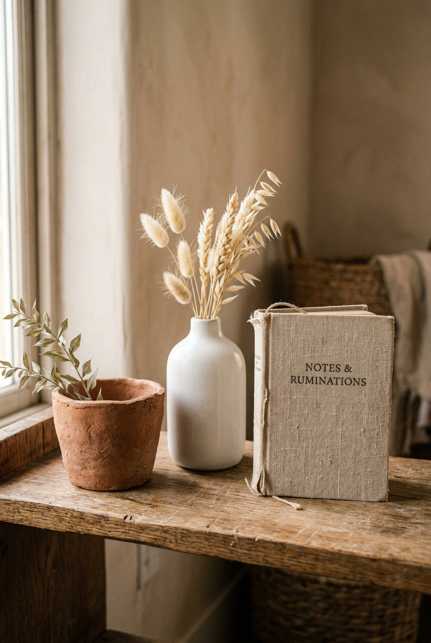
Texture is what gives a shelf soul. All smooth, all glossy, or all matte just feels flat. You want contrast.
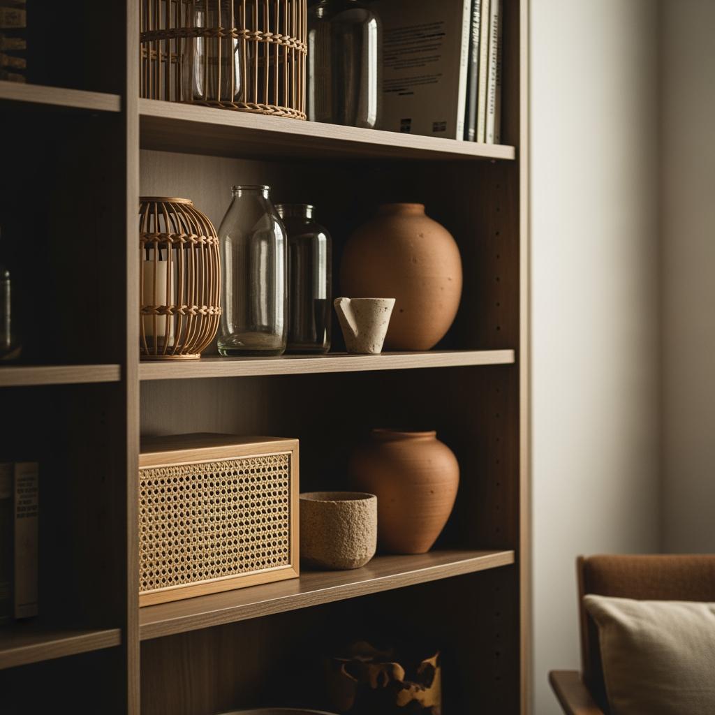
My favorite combinations: something rough or organic (a rattan basket, raw clay pot) next to something smooth (a glass bud vase) next to something soft (a small folded linen or book with fabric cover).
When everything has the same surface finish, your eye sort of glazes over. But when textures mix, each object feels distinct. Worth noticing.
The rule I follow loosely: no more than two objects with the same texture in one grouping. Even that small boundary makes a huge difference.
Color: How Much Is Too Much
Color on shelves can feel intimidating. Too many colors and it’s a mess. But too few and it feels sterile.
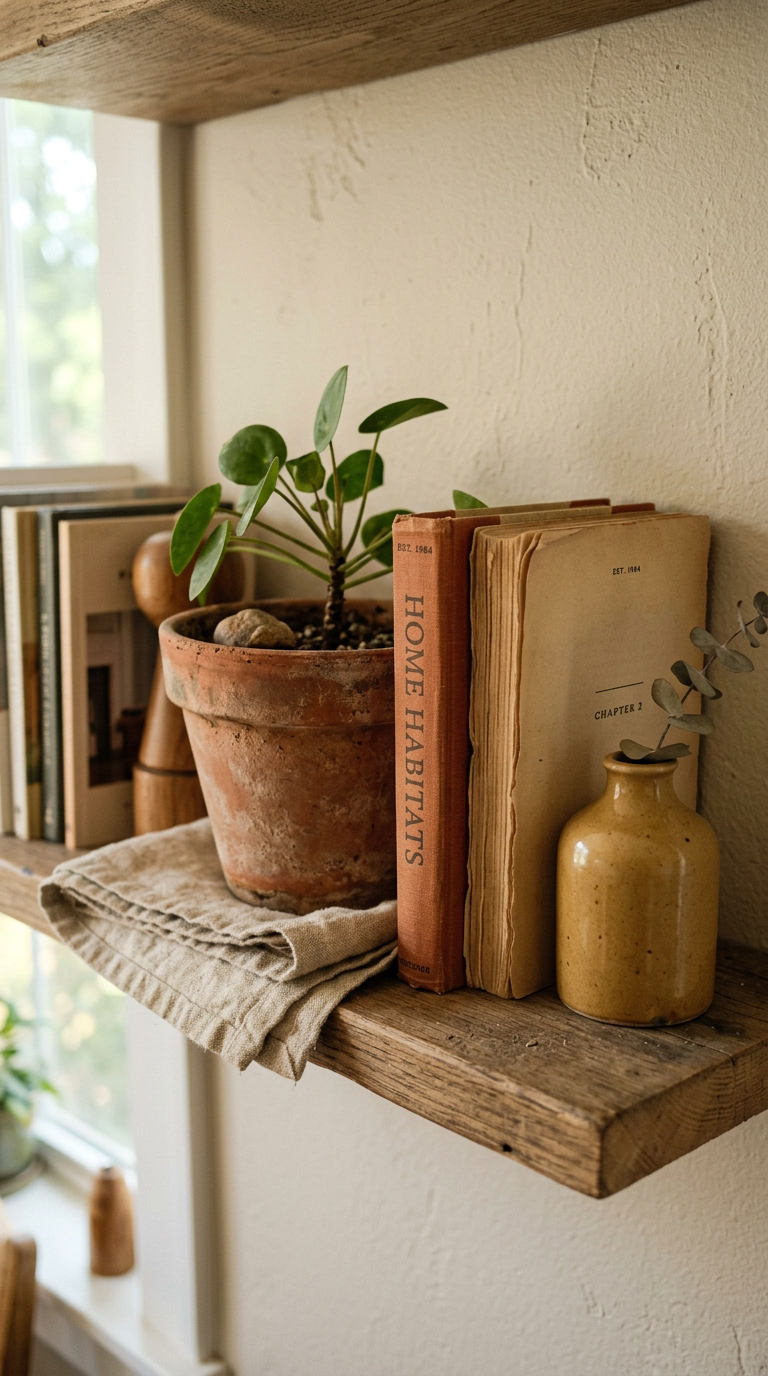
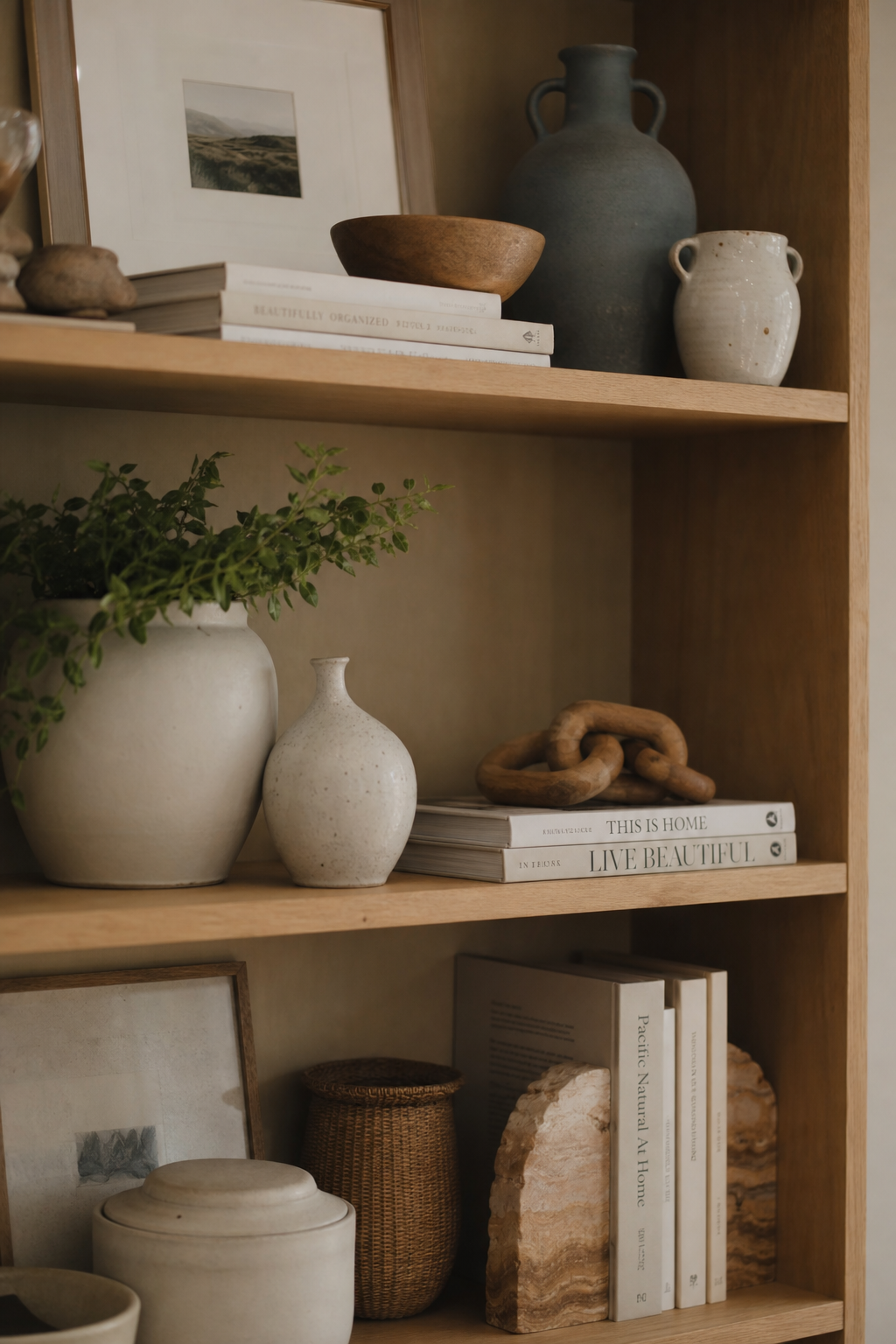
My personal formula: pick two or three colors that repeat across the shelf. Not in a matchy-matchy way, just in a echoing way. A dusty blue in one vase, then again in a small bowl on the other end. A warm terracotta pot and a book with a similarly warm spine.
Neutral objects, think white, cream, natural wood, soft grey, are your reset buttons. Drop one into a grouping that feels too loud and it calms everything down instantly.
I tend to anchor my shelves in warm neutrals and then add one accent color. That’s it. One. More than that and things start fighting.
What to Do With a Really Deep Shelf
Deep shelves are tricky. They feel generous until you realize you’ve created a chaotic two-row display of objects you can barely see.
The front row should always be your star players. Tallest or most interesting pieces. The back row, if you use it at all, should be lower so it peeks out without competing.
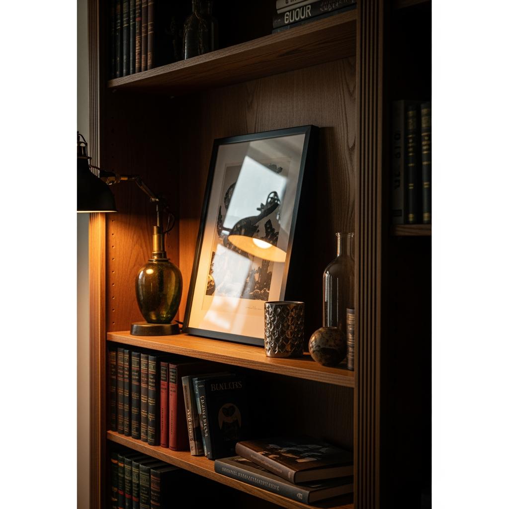
Honestly? I barely use the back half of deep shelves. I push things slightly forward and let the depth create shadow behind the objects. That shadow adds so much visual depth and warmth.
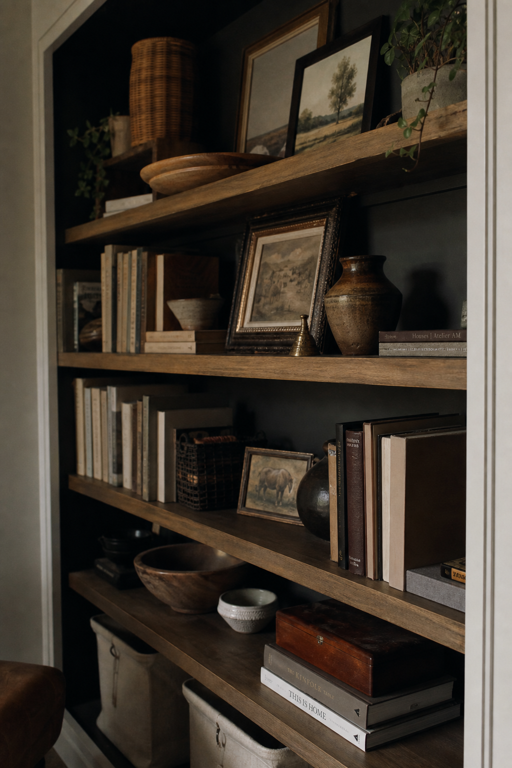
One thing I do love for deep shelves: leaning a framed print or small artwork against the back wall and placing objects in front of it. Layering, basically. It fills the depth without crowding.
The Shelf That’s Just Books (And Why That’s Okay)
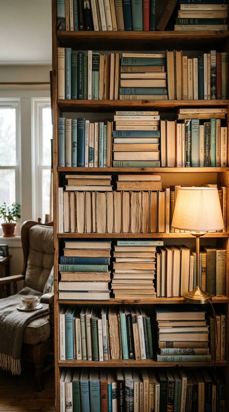
Sometimes the best shelf is a book shelf. An actual one. No vases, no candles, no tiny ceramic animals.
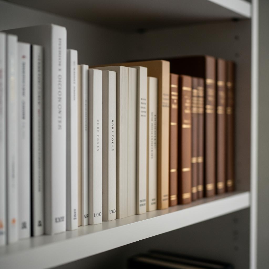
Books have color, texture, and height already built in. They don’t need supporting characters.
That said, there are easy ways to make a book-heavy shelf feel styled without adding a ton of stuff. Mixing vertical and horizontal stacks creates instant visual interest. Grouping books by color creates a calm, graphic look. Facing a few books backwards (spine hidden) adds a soft neutral break in a colorful lineup.
I keep one shelf in my home purely for books and I genuinely love looking at it more than some of my most decorated shelves. Simpler isn’t less.
The Biggest Styling Mistake I See (And Made Myself)
Matching sets. I’m talking about those little sets of three graduated vases in the exact same shape and color that you buy together.
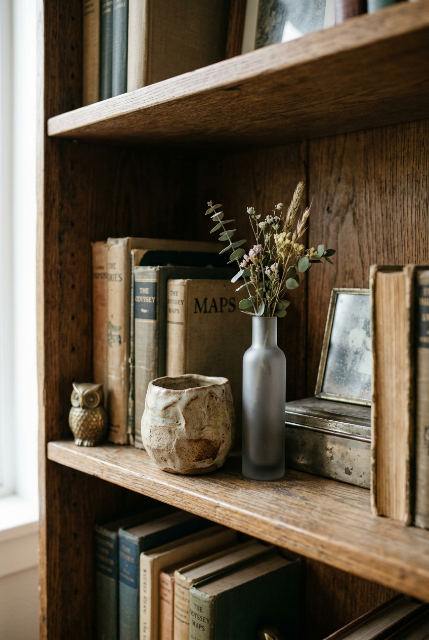
They seem like a solution, right? They come pre-grouped, they’re already the same aesthetic, easy. But they almost always make shelves look like a store display rather than a home.
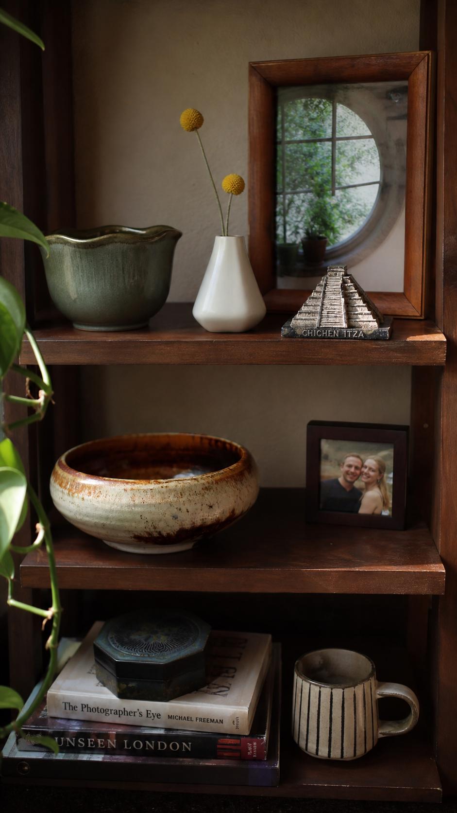
The magic of a shelf comes from the feeling that you collected these things over time. Mix a thrift store find with something new. A souvenir with a high-street vase. That combination feels real.
I have a $4 ceramic bowl I found at a church sale sitting next to a nicer piece on my living room shelf, and people always comment on the bowl. Specificity beats perfection.
How to Edit Your Shelf Without Starting From Scratch
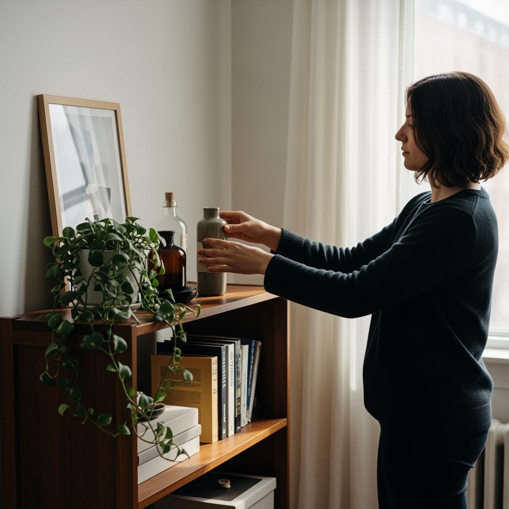
You don’t have to tear everything down to fix a shelf. Sometimes small edits make the biggest difference.
Start by removing any duplicate shapes. Two of the same type of object in one grouping is almost always one too many.
Then step back and squint. Literally. Squinting blurs the details and shows you the overall shape and balance. If one area looks heavy or dense, that’s your edit zone.
The last thing I do is walk away for ten minutes and come back with fresh eyes. Sounds silly but it works. You see the shelf the way a guest would see it, not the way someone who’s been staring at it for an hour would.
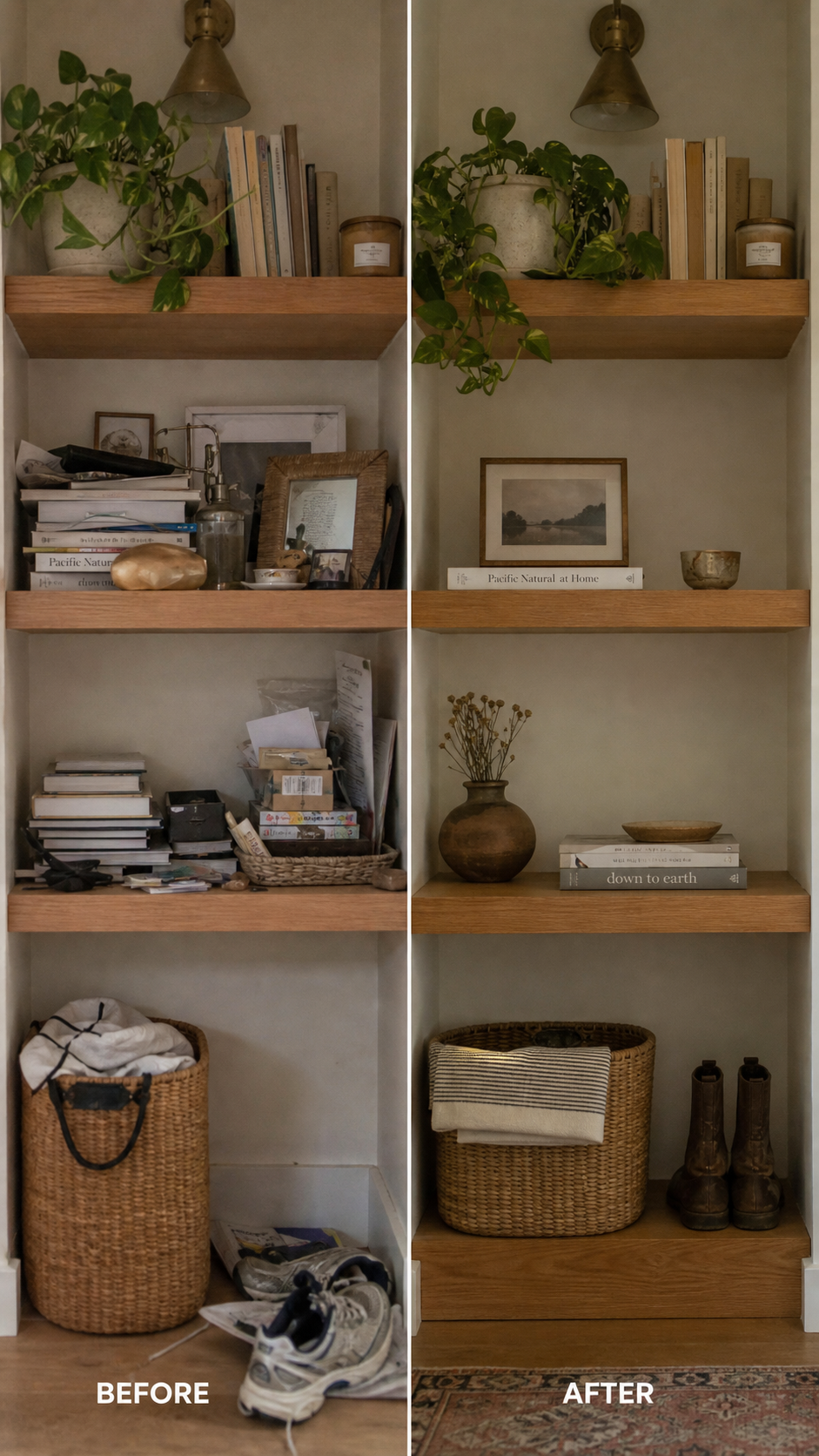
Making the Formula Work for Your Style
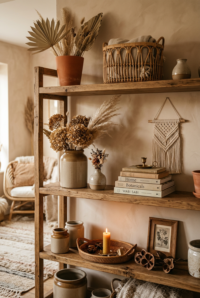
The formula (odd numbers, varied heights, one third empty) works across every aesthetic. Boho, modern, traditional, maximalist. You just apply it differently.
Maximalist shelves can have more objects, but they still benefit from varied heights and some intentional breathing room within groupings. Even busy shelves need pauses.
Minimalist shelves might use the formula and stop at three objects total. That’s not under-decorated. That’s confident.
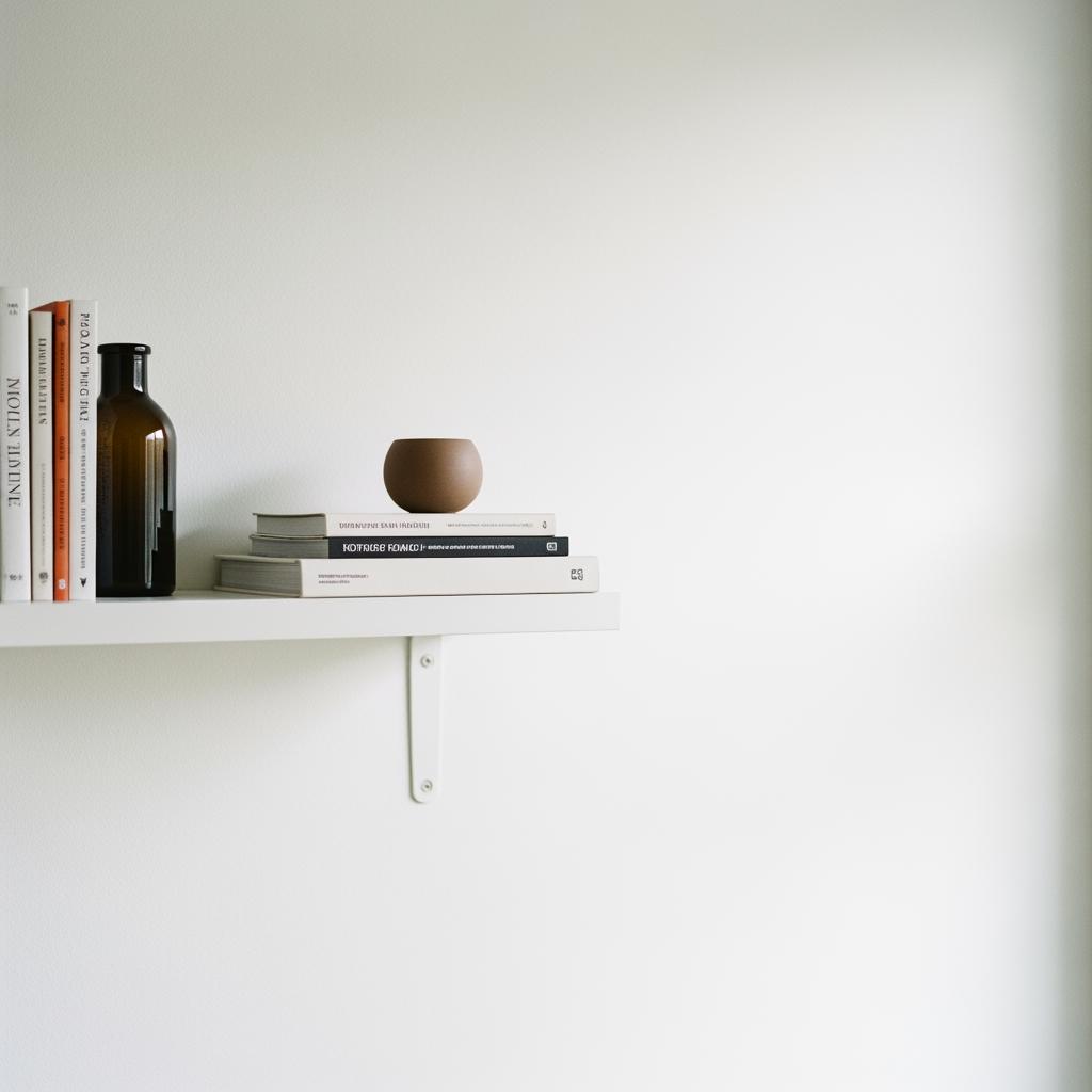
The point isn’t to follow a rigid script. It’s to understand why certain arrangements feel good so you can make your own decisions from a place of actually knowing what you’re doing.
Your shelf should feel like you. Just a more intentional, slightly edited version of you.